Creating great icons is an essential part of any design project, whether for websites, apps, or print materials. Icons help communicate ideas quickly and can greatly enhance user experience. However, designing effective icons isn't just about making them look good; there’s a process involved that ensures they are both functional and visually appealing.
In this article, we’ll guide you through the complete design process checklist for icons. Whether you’re a beginner or looking to refine your skills, this checklist will be a valuable resource for creating stunning icons that stand out and serve their purpose effectively.
What is Icon Design?
Icon design involves creating simple images that represent objects, actions, or ideas for use in digital platforms. These icons play a vital role in helping users understand what to expect from a button or feature at a glance.
A well-designed icon can quickly and effectively convey a message, making it easier for users to navigate through an application or website. This clarity is especially important in graphic design and user experience (UX) design, as it helps create a smooth and enjoyable experience for everyone. Overall, good icon design enhances communication and improves usability.
A Comprehensive Checklist for Icon Design
1. Research & Planning
☐ Determine the icon's function and its context within the application or website.
☐ Understand the target audience and their needs.
☐ Review similar icons in your industry for inspiration and to ensure uniqueness.
2. Concept & Ideation
☐ Create rough sketches or doodles of possible icon concepts.
☐ Choose the best concepts and refine them based on feedback or further research.
3. Design Principles
☐ Ensure the icon is clear and easily recognizable.
☐ Maintain consistency with other icons in the set or design system.
☐ Design with scalability in mind, ensuring the icon looks good at various sizes.
☐ Ensure the icon is easily identifiable and understandable.
4. Design Execution
☐ Use a grid system for alignment and proportion.
☐ Follow a cohesive visual style (3D, flat, outline, filled, etc.).
☐ Choose a color scheme that aligns with the overall design and maintains sufficient contrast.
☐ If the icon includes text, ensure it is legible and complements the icon’s design.
5. Refinement & Testing
☐ Gather feedback from stakeholders or users and make necessary adjustments.
☐ Test the icon at various sizes to ensure it maintains clarity and effectiveness.
☐ Verify how the icon appears on different devices and operating systems.
6. Finalization
☐ Export the icon in multiple formats (SVG, PNG, etc.) for different use cases.
☐ Provide icons in different resolutions to accommodate various display requirements.
☐ Use clear and consistent naming conventions for easy identification and use.
7. Documentation
☐ Create documentation outlining proper usage, sizing, and placement of the icon.
☐ Ensure the icon is integrated into the design system or style guide.
8. Delivery
☐ Deliver all necessary files and assets to the development team or client.
☐ Be available for any questions or adjustments needed during the implementation phase.
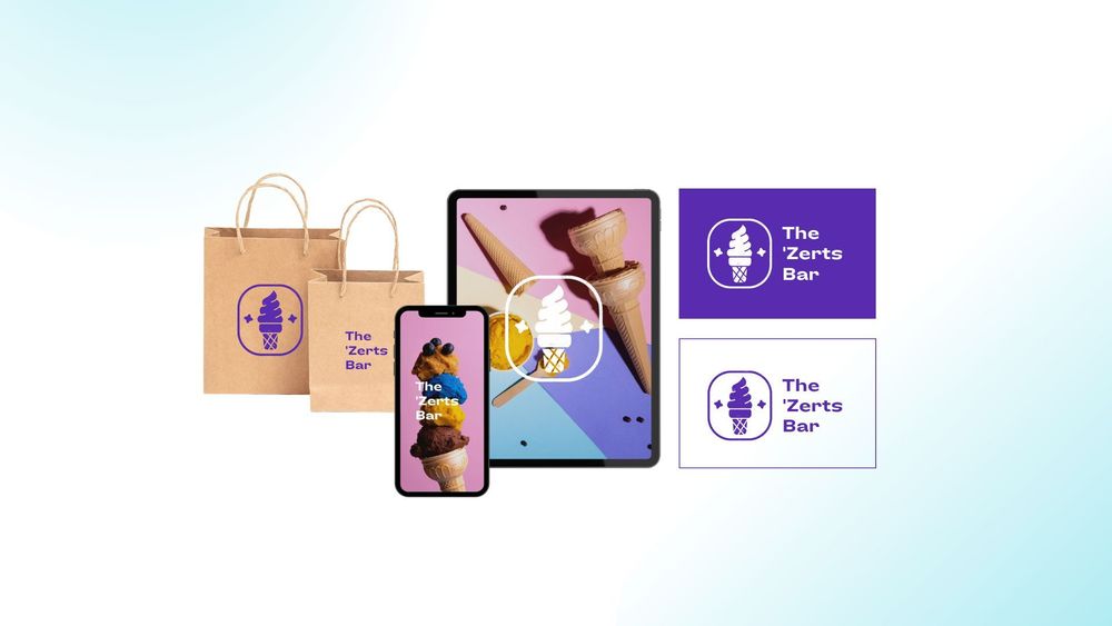
On Pixcap, you can find 15,000+ 3D icons and icon sets designed by professionals. All icons are customizable and available in various formats. Try it out today!
The Icon Creation Process
The icon creation process typically involves several key stages to ensure that the final icon is functional, visually appealing, and aligned with the design goals. Here’s a detailed breakdown of the icon creation process:
1. Research & Discovery
Defining the purpose of your icon is the first step in the design process. You need to know exactly what the icon is for—whether it's for an app, a website, or your branding. Understanding its purpose will guide your design choices and ensure it functions well.
Next, identify your audience. Consider who will use or see the icon. Understanding their preferences and needs will help you create an icon that resonates and communicates your message effectively.
Finally, conduct a competitive analysis. Look at similar icons in your industry or related fields to spot trends and ensure your design stands out. By combining these elements, you can create a well-thought-out icon that is both appealing and effective.
2. Concept Development
This step involves coming up with many different ideas and concepts based on research. It's a time to think creatively and explore all the possibilities.
Once you have a variety of ideas, the next step is sketching. This means making rough drawings to help visualize the different concepts. Sketching is important because it allows you to see how each idea might look and explore different design directions.
After sketching, it's time for concept selection. In this stage, you review the sketches and pick the most promising ideas. These chosen concepts are then refined and improved, taking them one step closer to the final design.
3. Design Execution
There are many popular software options like Adobe Illustrator, Sketch, or Figma rhat can help you create a professional-looking icon.
It's important to start with a grid system. This will help you keep everything aligned and proportional, which is essential for making sure your icon looks good at any size. As you create your icon, use basic shapes, lines, and colors. Keeping your design clear and simple will make it more effective and easier to recognize. Finally, pick a color palette that fits well with your overall design. Make sure the colors you choose have good contrast so that your icon is easy to see and understand.
4. Refinement & Iteration
Share your initial designs with stakeholders or potential users. This could involve conducting internal reviews or user testing to understand how well the designs resonate with others.
Once you've collected feedback, it's time to make revisions. Use the insights you've gained to adjust the icon, improving its effectiveness and visual appeal. This step is crucial for ensuring that the icon communicates its message clearly.
Don't forget to test the icon in various sizes and contexts. Check how it looks on different devices and in various user interface environments. This helps ensure that the icon remains clear and recognizable, no matter where it's used.
5. Finalization
Consider using SVG format if you want to scale without losing quality. PNG is perfect for raster images, while ICO is specifically designed for application icons.
Additionally, providing icons in various resolutions is crucial. This ensures that the icon appears sharp and clear, no matter what screen or device it’s viewed on.
6. Documentation
This step is optional but recommended. Creating a style guide or documentation that outlines the design decisions and guidelines for using the icon can be helpful for maintaining consistency in future designs. It also serves as a reference for anyone who needs to use the icon in different contexts.
A Note on Designing Icon Sets
If you are designing a set of icons, it's important to maintain consistency in style and visual language. The icons should all feel like they belong together and represent a cohesive set. This could involve using consistent colors, shapes, and design elements throughout the set.
It's also crucial to consider the context of each icon within the set. The icons should work well individually as well as together when used in a group or sequence. They should also be adaptable to various sizes and contexts.
A well-designed icon set can enhance the user experience and bring a sense of cohesiveness to the user interface. It can also make it easier for users to navigate and understand the system.
Best Practices for Icon Design
- Keep it simple: Icons should be easily recognizable and understandable at a glance. Avoid cluttering the design with too many details.
- Choose appropriate colors: Colors can convey meaning and evoke emotion, so choose them carefully to enhance the message of your icon.
- Consider multiple perspectives: Your icon may be viewed from different angles or on different devices. Make sure it's clear and recognizable in all contexts.
- Test, test, test! It's important to test your icon in various sizes and environments to ensure it remains clear and recognizable. This could involve testing on different devices or printing it out and viewing it from a distance.
- Take cultural context into account: Icons can have different meanings in different cultures. Make sure your icon is universally understood and does not unintentionally offend or exclude any group.
Conclusion
We hope this design process checklist for icons has been helpful in guiding you through creating a successful icon set. Remember to always prioritize simplicity, consistency, and usability when designing icons for your projects. With these best practices in mind, you can create icons that are not only visually appealing but also effectively communicate their intended message to users.