Choosing the right color palette is like picking the perfect outfit for an occasion—it speaks volumes without saying a word. Color influences mood, evokes emotions, and can dramatically elevate the appeal of your design, making it unforgettable.
Whether you're designing a sleek business website, a cozy interior, or a stunning poster, the perfect blend of colors can transform the mundane into the magnificent.
Here, we've curated a collection of 10 aesthetic color palettes that promise to breathe life into your projects. These aren't just combinations; they're a carefully selected symphony of colors designed to captivate and inspire. Ready to elevate your design? Let's explore these palettes together, and unlock the magic of colors!
What are Aesthetic Colors?
Aesthetic colors are a combination of hues that are visually appealing and pleasing to the eye. They have a harmonious balance of contrast, saturation, and brightness that creates a sense of beauty and elegance. These colors can vary from soft pastels to bold and vibrant tones, depending on the overall aesthetic you want to achieve.
As designers, it's essential to understand the psychology behind colors and how they can impact the overall visual appeal of a design. Aesthetic colors not only add an element of beauty but also help convey emotions and set the tone for your project.
We also have an article about Aesthetic Fonts if you're interested to learn more.
10 Aesthetic Color Palettes for Your Next Design Project
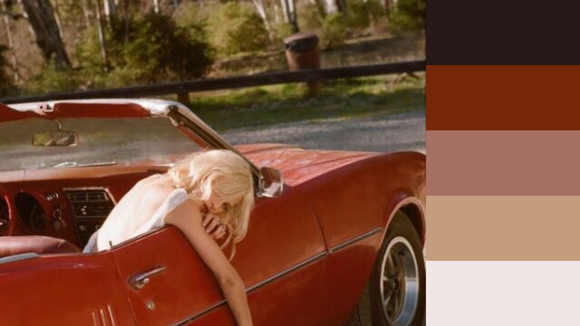
Red Aesthetic Color Palette
Red color palette makes a statement. It's where elegance meets audacity. In design, it stimulates and draws the eye. Use it sparingly in interior design for a touch of drama, or generously in branding for a confident, inescapable message.
Hex codes: #271918, #762708, #A47063, #C49D7E, #F0E6E5
Orange Aesthetic Color Palette
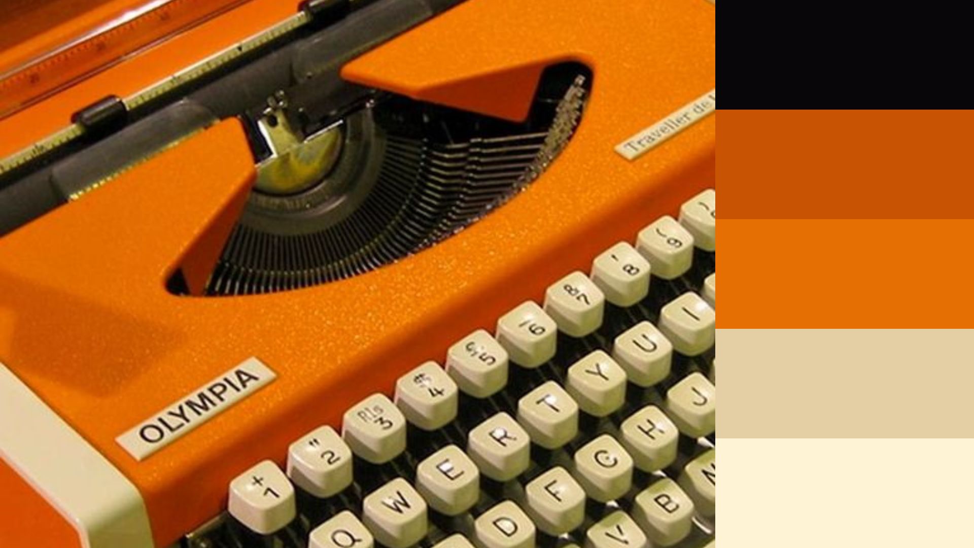
With its rich, full tones and bold proclamation, the Orange aesthetic color palette elicits a feeling of comfort and energy. Think terracottas, burnt siennas, and peachy corals. This palette is a favorite among those looking to infuse their spaces with a touch of the organic.
In interiors, it marries well with luscious greens and deep purples, creating rooms that feel both grounded and lively. For graphic designers, it's a showstopper in creating earthy, fun, energetic branding.
Hex codes: #080609, #C85303, #E56F03, #E4CFA4, #FEF3D5
Brown Aesthetic Color Palette
Brown color palette, as well as fall color palette, are the safe ground to balance less grounded, livelier colors. Comprising warm browns like chestnut brown and cool browns like espresso, these natural earth tones bring a sense of comfort.
Graphic designers can use it to ground and enhance more energetic color choices, making them more approachable to the viewer.
Hex codes: #664B36, #846247, #B9A389, #ADB6B1, #AAA494
White Aesthetic Color Palette
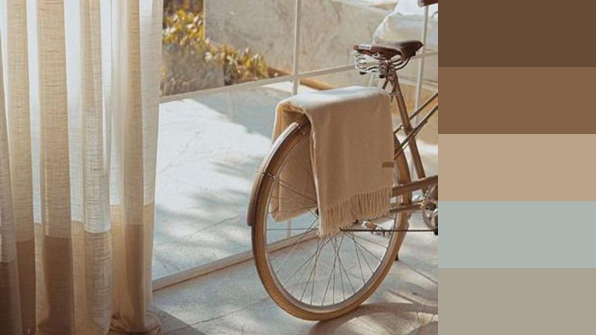
An absence of color, perhaps, but in design, white is a shape-shifter. It is the clean, modern simplicity at home in contemporary interiors and the fresh, airy freedom adored by graphic designers for its ability to emphasize. The Pure White palette boasts possibilities—pair it with any color to see it transform.
Hex codes: #3F402E, #908371, #D5D7E3, #DAD9D7, #E8E9EC
Yellow Aesthetic Color Palette
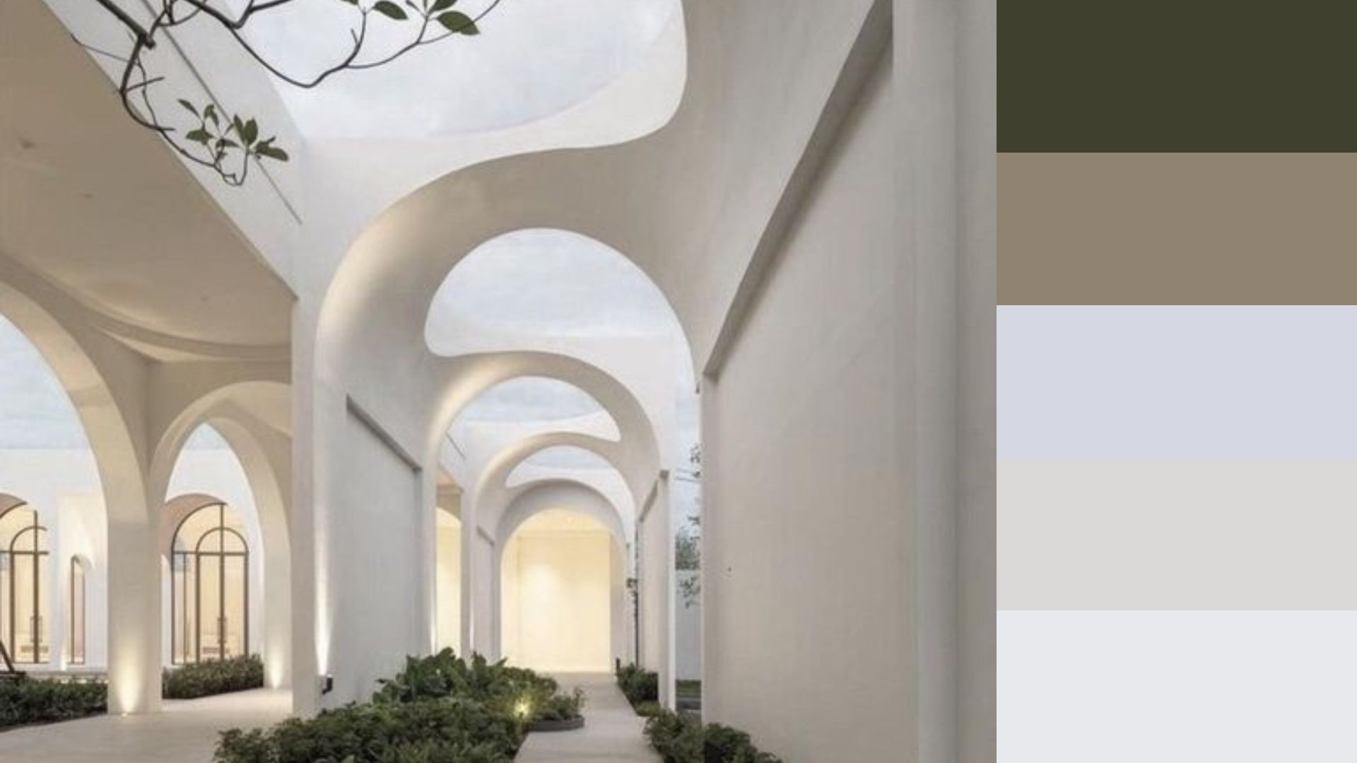
Yellow is the herald of joy. This color palette twinkles with the brightness of summer sun, daffodils, and buttercups. In design, it's the spark—perfect for adding a playful touch to children's rooms, the optimism essential to branding, or the energy young companies want to express.
Hex codes: #D69948, #F5D684, #FEF2E6, #B3CBED, #A85A4D
Blue Aesthetic Color Palette
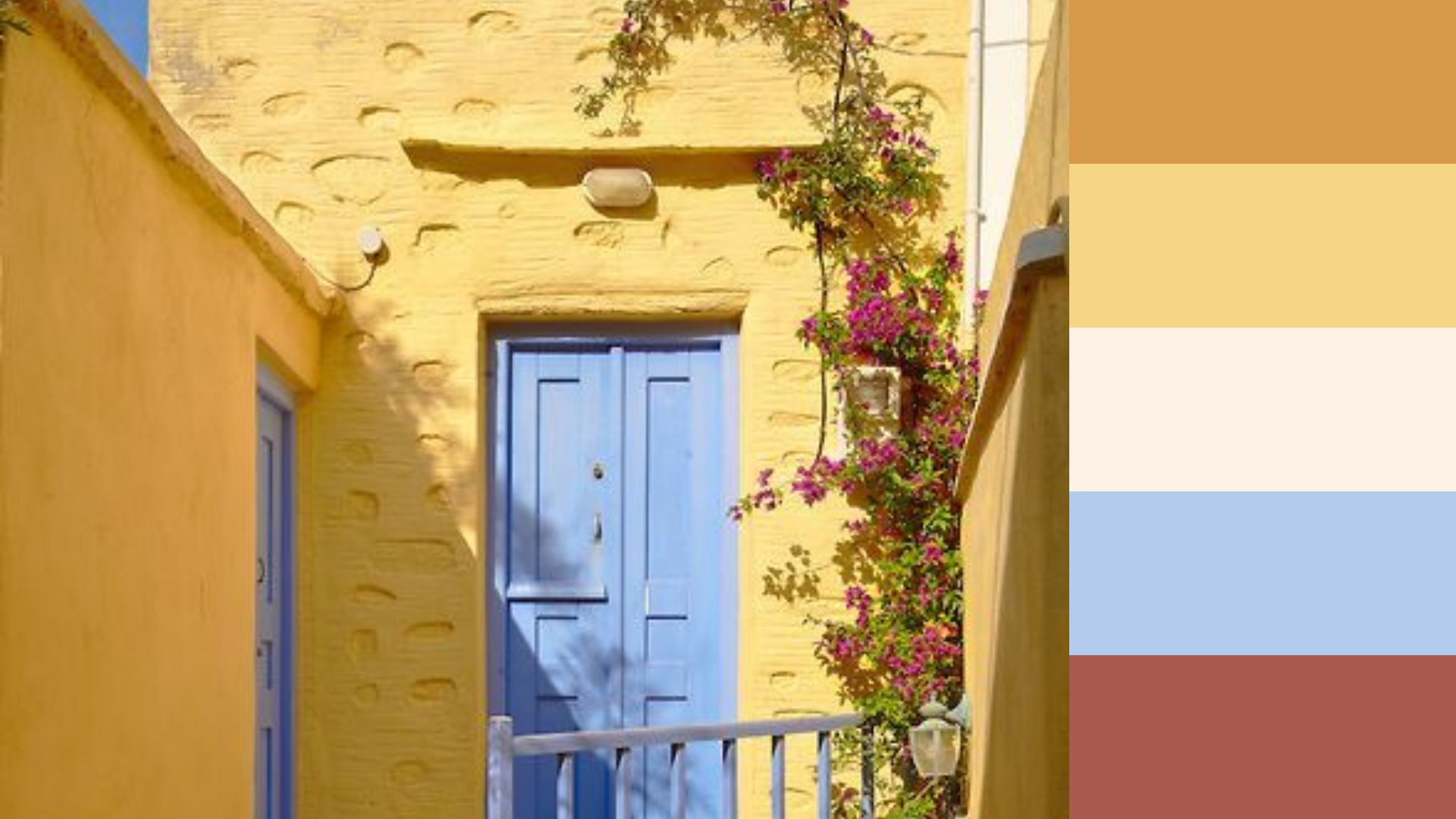
Blue—the color of the sky and the sea—is a universal favorite. This blue color palette offers depths that range from the tranquility of a cloudless sky to the mystery of the ocean's abyss. It compliments every other color on the wheel, making it incredibly versatile in design.
Hex codes: #648072, #B7806C, #B5AFAD, #7298AD, #AEC1D2
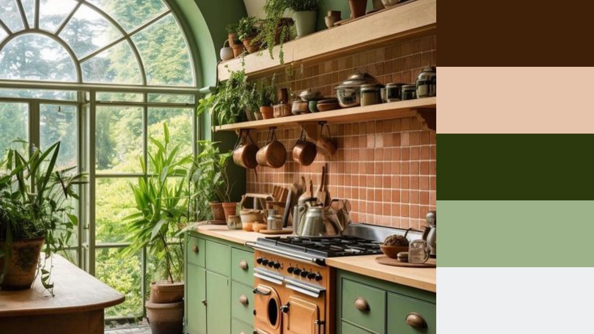
Green Aesthetic Color Palette
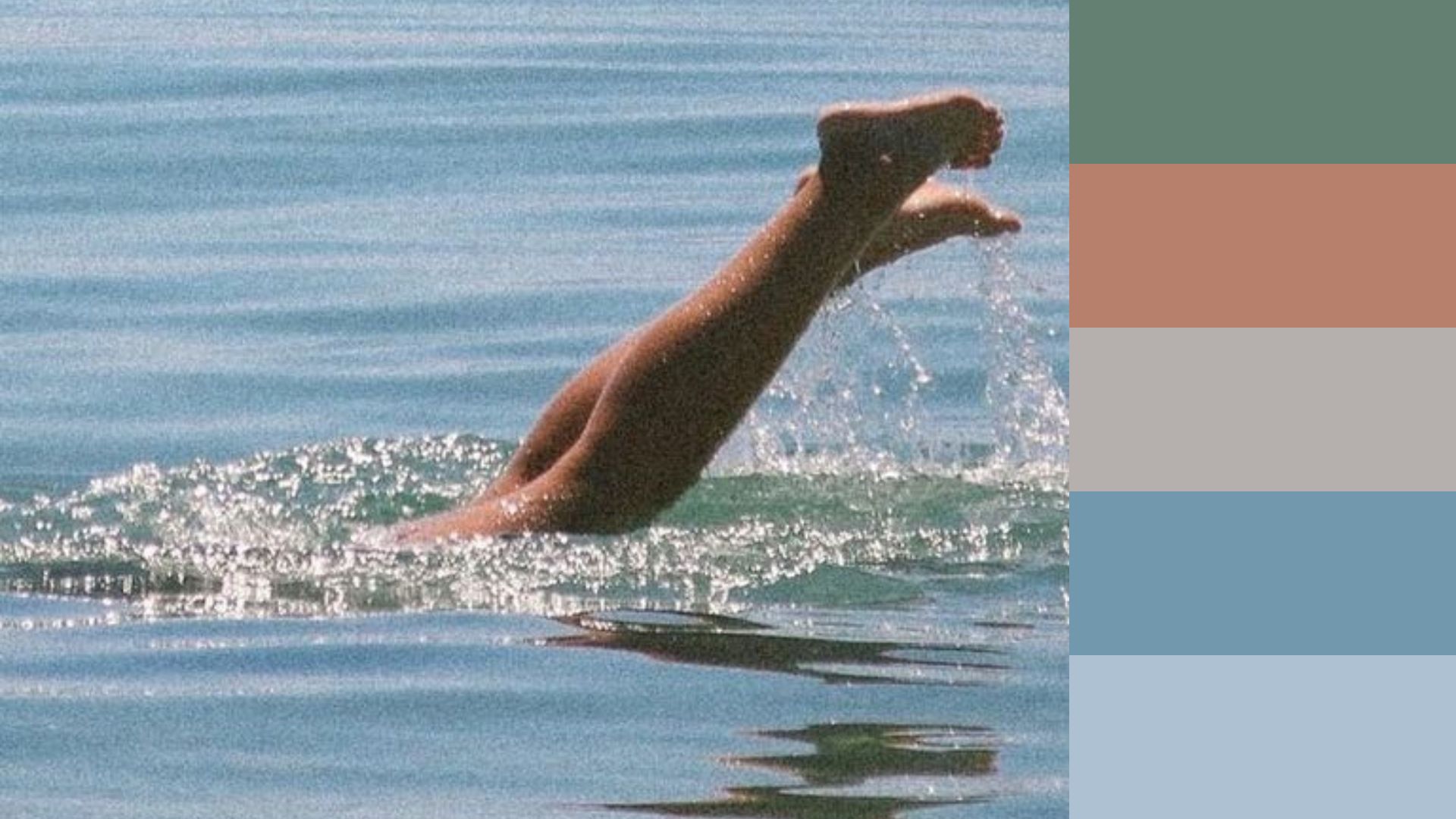
Green is the color of life and nature. It reminds us of trees, grass, and leaves. It's great for spaces where you want to relax, enjoy, and feel at peace. Green goes well with other colors, making things look balanced and nice. It's perfect for creating a calm and soothing vibe, whether it's in a room or a logo.
Hex codes: #3E2008, #E6C4AB, #2C390D, #9DB289, #EEEFF1
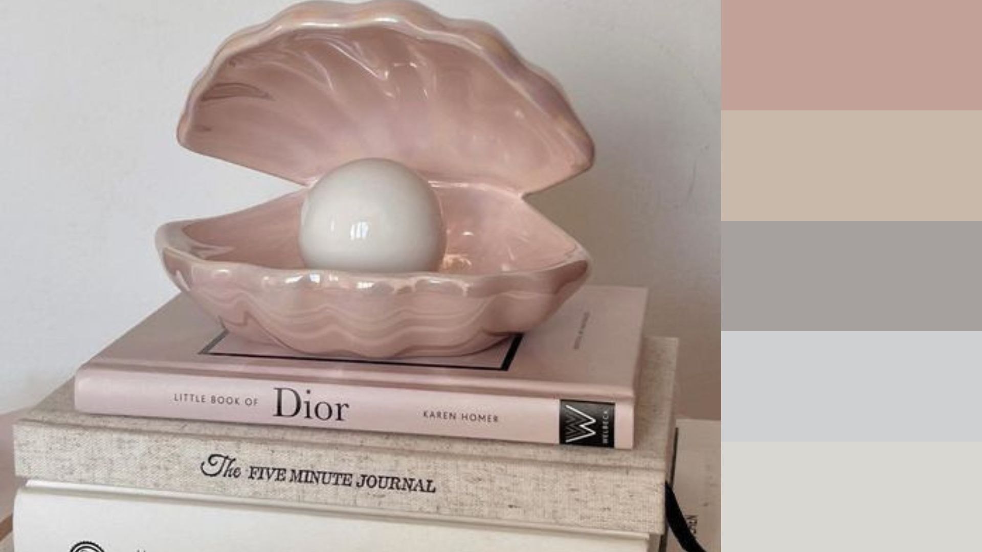
Pink Aesthetic Color Palette
This cute color palette is a symbol of love and femininity. It's often associated with romance, sweetness, and tenderness. Pink is perfect for adding a touch of playfulness to designs or creating a dreamy atmosphere in interiors. Whether it's used as an accent color or the main focus, pink always manages to bring a sense of warmth and charm.
Hex codes: #C2A198, #C9B9AA, #A6A09E, #CFD0D2, #D8D7D2
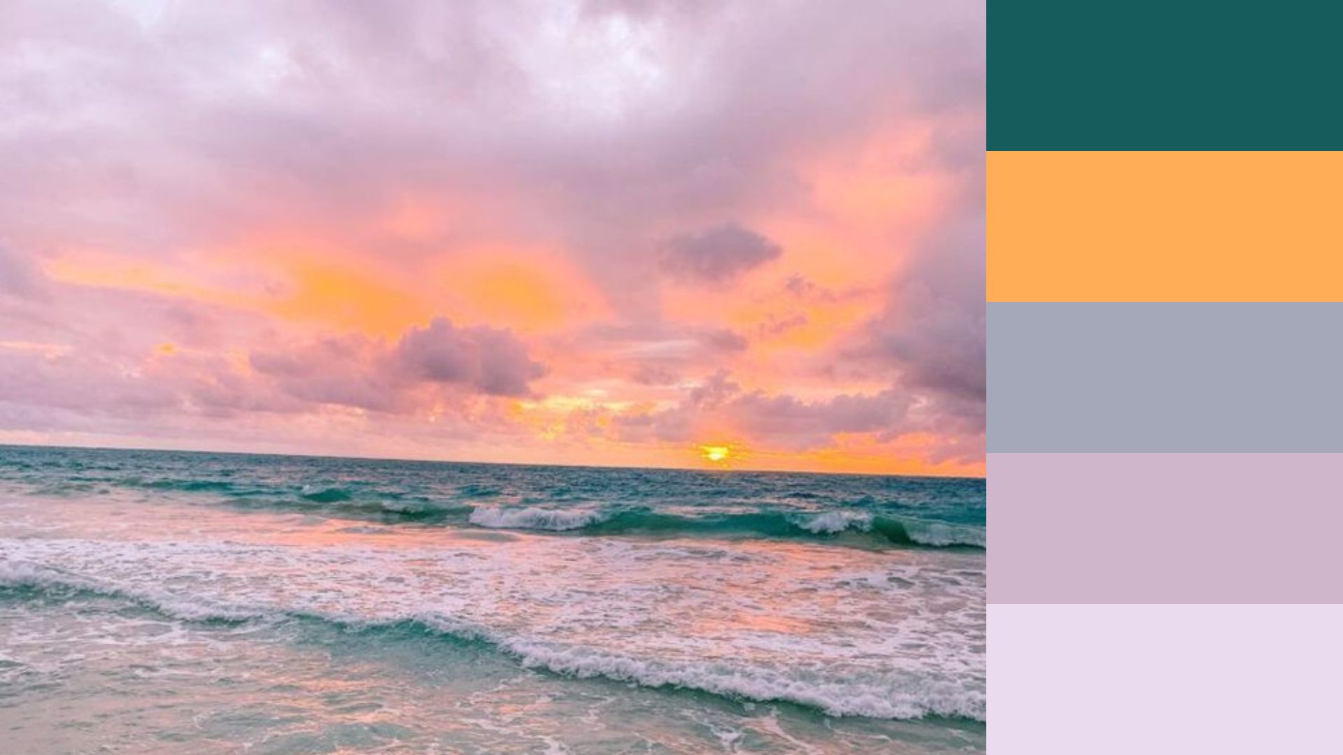
Purple Aesthetic Color Palette
Purple is a magical color. It represents royalty, luxury and spirituality. In design, it can add a touch of elegance or mystery. It's also a great color palette for stimulating creativity and imagination. Use different shades of purple to create depth and complexity in your designs.
Hex codes: #165C5C, #FFAD57, #A5A8B9, #CFB6CB, #EADBEE
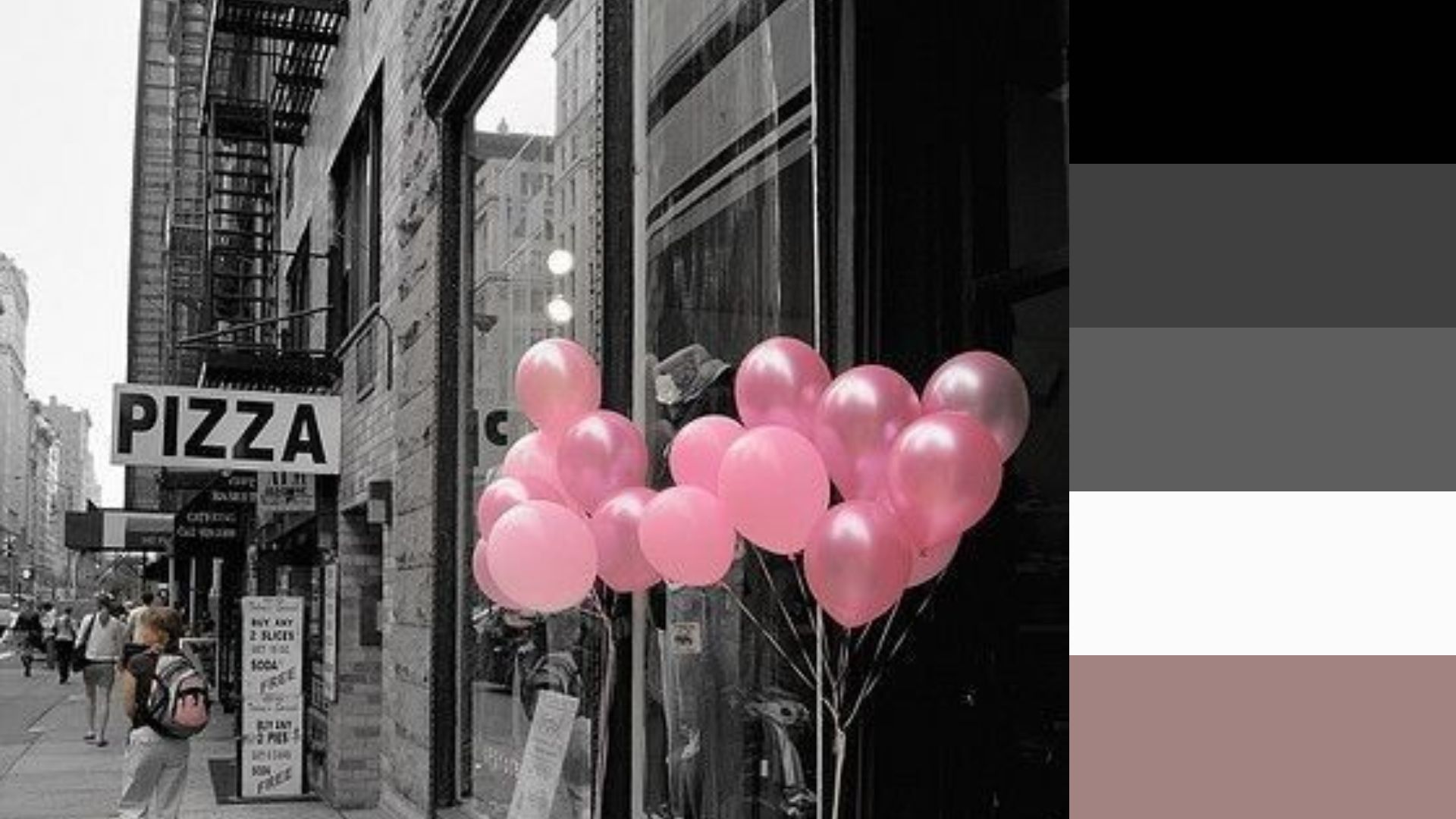
Black Aesthetic Color Palette
The black color palette is sleek, sophisticated, classic, and timeless, widely favored for Instagram feeds. It exudes power, confidence, and authority, making it a top choice in design for elegance and luxury. Black enhances other colors, creating bold, impactful statements in branding or fashion.
Hex codes: #010101, #404040, #5E5E5E, #FBFBFB, #A28381
Creating Your Own Color Palettes
You may be wondering how to create your own unique color palettes. The good news is that you don't need to be an artist or a designer to do it.
There are now many tools available online that can help you generate beautiful color schemes for your projects.
With Pixcap useful online tool, you can easily explore different color combinations and find the perfect color palette for your needs or create your own custom palettes.
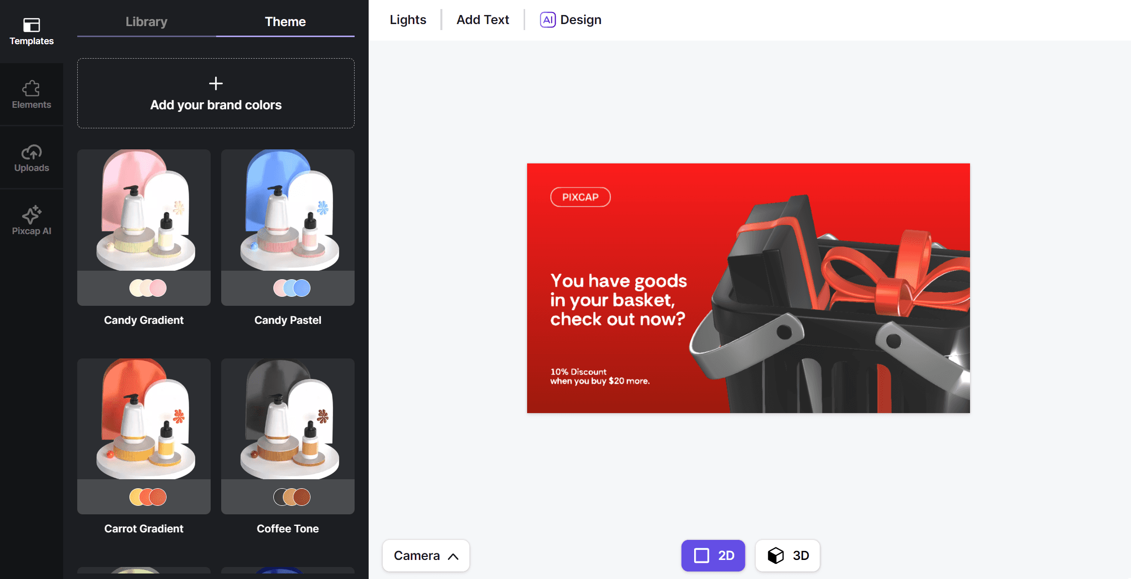
When creating a color palette, it's important to consider the mood and emotions you want to convey. Think about the purpose of your design and the message you want to send. Play around with different hues, shades, and tones until you find the perfect balance and harmony. You can always take inspiration from nature, art, or even fashion trends to create and improve your color palette.
Conclusion
A well-designed color palette can make all the difference in your design projects. It can evoke emotions, convey messages, and create a sense of harmony and cohesion in design project. By understanding the meaning and psychology behind colors, you can use them strategically to enhance your designs and leave a lasting impression on your audience.
