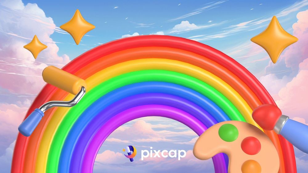
In the vibrant world of digital design and technology, the rainbow serves as a magnificent inspiration. With its captivating colors and mesmerizing arc, the rainbow effect has long fascinated people of all ages. But have you ever wondered how many colors are actually present in this dazzling natural phenomenon?
In this article, we dive deep into the spectrum of the rainbow, exploring its rich palette of colors and unraveling the secrets behind its vivid hues. Whether you're a professional 3D designer seeking inspiration for your next project, a business looking to incorporate eye-catching visuals into your marketing design, or an educator eager to enhance your students' learning experiences, join us as we unveil the spectrum and uncover the true beauty of the rainbow.
Understanding the Rainbow Spectrum
The Science Behind the Rainbow
The rainbow's creation is a scientific marvel, a result of light refraction, reflection, and dispersion.
When sunlight enters a water droplet, it refracts or bends, splitting into different wavelengths that correspond to various colors. These colors then reflect off the inside surface of the droplet and disperse as they exit, separating into a spectrum of colors that appears as an arc in the sky.
The precise conditions required for this optical phenomenon include the presence of moisture in the air and a certain angle of sunlight, which is why rainbows often appear after a rain shower with the sun positioned low in the sky.
Understanding the science behind how rainbows form gives us insight into how many colours of the rainbow we can observe, with variations depending on the light and atmospheric conditions.
The Seven Recognized Colors
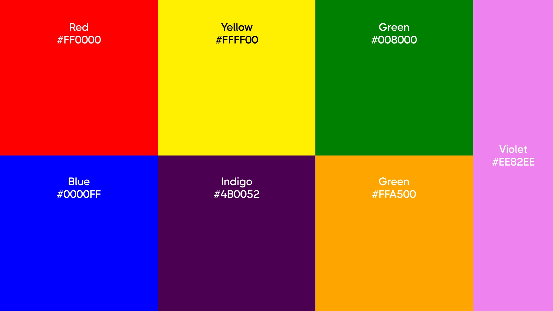
There are seven distinct hues in a rainbow. These are red, orange, yellow, green, blue, indigo, and violet, often remembered by the acronym ROYGBIV. These colors represent the spectrum of light that is visible to the human eye when sunlight is dispersed through moisture in the atmosphere.
Red, with the longest wavelength, appears on the outer edge of the rainbow, while violet, with the shortest wavelength, is seen on the inner edge. The colors in between cover a range of wavelengths that our eyes perceive as different colors. While the number of colors can sometimes seem infinite due to the continuous nature of the spectrum, these first seven colours are the most commonly recognized and serve as a foundation for understanding the rainbow's composition.
Decoding the Significance of Rainbow Colors
Red: Warmth and Energy
Red, the first color of the rainbow, is associated with warmth and energy. It's the color of fire and blood, often linked to vitality, passion, and action. In marketing and design, red can be a powerful tool. It grabs attention and evokes strong emotions, making it a frequent choice for 'Call to Action' buttons or sale announcements. However, it's important to use red judiciously as it can also signal danger or induce anxiety if overused.
In different cultures, red can represent anything from prosperity and good fortune to a sign of warning. When red is used in 3D designs or animations, it can bring objects to the forefront, making them stand out against cooler, more subdued colors. Overall, red's universality and boldness make it an essential color in any designer's palette.
Orange: Creativity and Change
Orange is the blend of red's intensity and yellow's joy, often associated with creativity, enthusiasm, and change. In the context of design, it's a color that can introduce a sense of playfulness or invite casualness. It tends to be used less frequently than red or yellow, giving it a unique edge in attracting attention.
For businesses, incorporating orange into marketing materials can suggest affordability and value, making it a popular choice for call-to-action graphics and sale banners. In different cultures, orange can symbolize change and adaptability, traits that are highly valued in the fast-moving digital world. It's a color that can make designs pop, particularly when set against a contrasting cool background, and it is effective in drawing the viewer’s eye to focal points.
Yellow: Light and Optimism
Yellow, the color most associated with sunshine, exudes light and optimism. It's the color of happiness, hope, and spontaneity. In the realm of design, yellow is used to catch the eye, stimulate mental activity, and evoke cheerful feelings. It can be a powerful color for brands that want to communicate a positive, welcoming image. When applied thoughtfully in marketing materials, yellow can give a sense of confidence and energy to promotions and advertisements.
However, it is important to consider its brightness and saturation, as overly intense yellow can be overwhelming. In various cultures, yellow holds different meanings—from sacred and imperial to a color of caution.
Green: Balance and Harmony
Green sits at the center of the spectrum and is emblematic of balance, harmony, and growth. In design, green often represents nature and is used to evoke a sense of tranquility and rejuvenation. It's a versatile color, able to inspire innovation when used in brighter shades or convey stability in its darker forms.
For businesses, green is a strategic choice when they wish to emphasize environmental values or health-related services. It's also a common color in the branding of financial services, where it symbolizes prosperity and security. With its calming effect, green is an ideal choice for spaces where focus and calm are desired.
In graphic design, green can serve as a restful backdrop or as a vibrant focal point, depending on the hue. It is effective in creating an atmosphere within a model or an animation, whether it's a lush landscape or a subtle hint of spring in an urban setting.
Blue: Calm and Stability
Blue is the color of the sky and sea, often associated with depth, calm, and stability. In design, it is used to create a sense of serenity and professionalism. Many corporate businesses favor blue in their branding to convey trust, reliability, and responsibility. It's a universally liked color, which makes it a safe and appealing choice for a wide audience.
In terms of psychology, blue is known to have a calming effect and can even slow down the perception of time. It's a color that encourages contemplation and can often be found in spaces designed for relaxation or focused work.
Blue is a powerful tool for setting the tone of a scene. It can create a cool, spacious feeling, suggesting infinity or openness. When used in animations, blue backgrounds can make brighter colors stand out, providing a visually striking contrast that can make a design memorable.
Indigo: Depth and Intuition
Indigo, a deep blue-violet hue, is often associated with depth, intuition, and wisdom. In design, indigo can be seen as a color that conveys integrity and sincerity. It's less commonly used than other colors in the spectrum, which can give designs that feature it a unique and sophisticated edge.
This purple color is thought to stimulate the right side of the brain, encouraging creativity and perception. It's also linked to spirituality and contemplation, often used in spaces that are designed for meditation or reflection.
For businesses, using indigo can convey a message of quality and authenticity, making it a good choice for premium brands.
Violet: Spirituality and Luxury
Violet, the final color of the rainbow, is a blend of blue's stability and red's energy. It is frequently associated with luxury, wisdom, and spirituality. Historically, violet dyes were expensive to produce, which led to its association with power and wealth. In modern times, this color is still connected with quality and exclusivity.
In design, violet can be used to add a touch of elegance and sophistication. It's often found in the branding of luxury goods and services due to its historical connotations of opulence. Violet can also evoke a sense of mystery and magic, making it popular in areas related to creativity and imagination.
Rainbow Colors in 3D Design
Creating Vibrant 3D Models
In the realm of 3D design, color choice is pivotal in conveying the right message and evoking the intended emotional response. Utilizing the vibrant colors of the rainbow can breathe life into 3D models, making them more realistic and engaging. The key is to use colors purposefully to highlight textures, differentiate elements, and guide the viewer's eye through the design.
For instance, warm colors like red and orange can be used to suggest areas of interaction within a model, while cooler colors like white light blue and green can create a sense of depth and space. Understanding color theory and the emotional impact of each hue allows 3D designers to craft vibrant models that are not only visually stunning but also communicate effectively.
Moreover, the incorporation of the rainbow's spectrum can add dynamism to models that represent real-life scenarios, making them more relatable and immersive for the viewer.
Colour Grading for Impactful Animation
Colour grading is an essential step in the production of impactful 3D animation. It involves adjusting the color properties of an image to achieve a specific aesthetic or emotional response. By carefully selecting the color palette and manipulating hues, saturation, and value, animators can control the mood of each scene and guide the audience's attention to important elements.
For example, a scene can be made to feel warm and inviting by pushing the colors towards the red and mixing blue and yellow end of the spectrum or cold and isolating with a shift towards blue. Strategic use of color contrast can also highlight key characters or objects, making them stand out against the background.
Effective colour grading in animation not only enhances visual appeal but also strengthens storytelling. It's a powerful tool that can transform a good animation into a great one, leaving a lasting impression on the audience.
Incorporating Rainbow Spectrum in Various Fields
SMEs: Enhancing Marketing Strategies
For small to medium-sized enterprises (SMEs), incorporating the rainbow spectrum into marketing strategies can have a pronounced impact. Colors influence perceptions that are not obvious, such as the taste of food, the comfort of a room, or the trustworthiness of a brand. By understanding the associations and emotional reactions that different colors can evoke, SMEs can use this knowledge to their advantage.
When creating visual content, SMEs can select colors from primary colours of the rainbow that align with their brand message. For example, green can be used to promote eco-friendliness, while blue can foster trust. The vibrant colors of the rainbow can also be used in product packaging, website design, and promotional materials to stand out in a crowded marketplace and appeal to customers' emotions.
Thoughtful use of color can enhance brand recognition and customer recall, making it a crucial element in the marketing toolkit for SMEs looking to grow their brand and connect with their audience.
3D Designers: Boosting Creativity
3D designers can draw upon the full spectrum of the rainbow to boost their creativity and bring a new dimension to their work. The use of vibrant and varied colors can transform a 3D model from a simple representation to a piece that tells a story and invokes emotion. A deep understanding of color theory and its effects on the human psyche can be a powerful asset in a designer's toolkit.
Experimenting with color can lead to innovative design solutions and visually stunning portfolios that capture the attention of clients and audiences alike. For example, using unexpected color combinations or gradients can create a sense of movement and fluidity within static images. By harnessing the rainbow's palette, designers can challenge themselves to think outside the box and produce work that stands out in the competitive field of digital design.
Colors are not just aesthetic choices; they're tools for communication, and when used skillfully, they can elevate a designer's work to new heights of creativity.
Marketing Firms: Creating Engaging Campaigns
Marketing firms can leverage the rainbow spectrum to create campaigns that are not only visually engaging but also strategically targeted to evoke specific consumer responses. The right color choices can make advertisements more memorable and influence the audience's decision-making process. For instance, red can generate a sense of urgency, while a blue light can build trust and security.
By incorporating colors that align with the brand's identity and campaign goals, marketing professionals can craft messages that resonate more deeply with their target audience. The use of color can also help campaigns to stand out on various media platforms, from print to digital.
Furthermore, understanding cultural color associations is crucial for firms operating in global markets, as basic colors themselves can have different meanings in different cultures. Mastering the use of color can thus be a key factor in the success of international marketing efforts, making campaigns more effective and culturally sensitive.
The strategic use of the rainbow colors enables marketing firms to create campaigns that are not only aesthetically pleasing but also psychologically compelling.
Educational Settings: Promoting Interactive Learning
In educational settings, the use of the rainbow spectrum can significantly enhance learning experiences by promoting interaction and engagement. Colors can be used to organize information, highlight key concepts, and stimulate cognitive processes. For example, warm colors can be used to draw attention to important points, while cool colors can provide a calming backdrop for complex information.
Interactive 3D models colored with the rainbow spectrum can turn abstract concepts into tangible experiences for students. This visual and interactive approach caters to various learning styles and can aid in memory retention. By incorporating vibrant colors into educational tools and environments, educators can create a more dynamic and inclusive classroom that encourages curiosity and exploration.
Additionally, the use of color can help in differentiating learning materials, making it easier for students to navigate through educational content. When employed thoughtfully, the rainbow visual spectrum becomes a powerful educational aid that promotes a more engaging and effective learning environment.
Beyond the Conventional Spectrum
Other Colors Hidden in the Rainbow
While the conventional rainbow is often described as having seven primary colors, the actual spectrum of light contains a vast array of colors, many of which are not typically distinguished with the human eye. Between the primary bands of red, orange, yellow, green, blue, indigo, and violet, there are countless intermediate hues.
Technological advances in imaging and optics have allowed us to detect subtle gradations and colors that were previously invisible. For instance, infrared and ultraviolet light sit just outside the visible light spectrum and are not traditionally seen in a rainbow with the naked eye. However, they are part of the broader electromagnetic spectrum.
These hidden colors can be revealed through specialized equipment, opening up new possibilities for design and art. By exploring the full potential of the color spectrum, artists and designers can push the boundaries of what's visually possible, creating works that challenge our perception of color and light.
The Impact of Light Conditions on Rainbow Colors
The colors we see in a rainbow can vary dramatically depending on the light conditions at the time of its formation. Factors such as the size of the raindrops, the angle of the sun, and the presence of pollutants in the air all have an impact on the color intensity and range of the rainbow.
Large raindrops tend to produce rainbows with more vivid colors, while smaller water droplets can create rainbows that appear faint or have pastel hues. Similarly, the time of day influences the appearance of a rainbow; those occurring in the early morning or late afternoon, when the sun is lower in the sky, usually display the most intense colors due to the angle of the light entering the raindrops.
Furthermore, atmospheric conditions like fog, dust, or pollution can filter the sunlight before it interacts with moisture, resulting in muted or altered colors. Understanding these light conditions is essential for photographers, artists, and designers who wish to accurately replicate the beauty of the natural rainbow of colors in their work.