Understanding and mastering how to us a tetradic color scheme can significantly elevate the visual impact of designs. By utilizing a tetradic palette effectively, designers can create vibrant, harmonious compositions that captivate viewers.
This guide is tailored for professional 3D designers seeking to enhance their projects with advanced color techniques. From blending hues to creating dynamic contrasts, delve into the intricacies of incorporating a tetradic color scheme into your designs to unlock its full potential and elevate your creations.
Introduction to Tetradic Color Schemes
Tetradic Color Scheme Definition
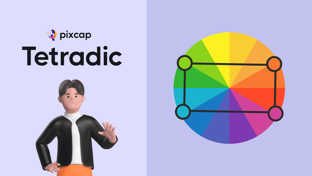
The tetradic color scheme, also known as the double-complementary scheme, is a robust method for choosing colors in design. A tetradic color scheme, by definition, is a harmonious palette composed of four colors evenly spaced around the color wheel.
These colors form two complementary pairs, creating a balanced and vibrant combination. To effectively use a tetradic color scheme, select two main colors and their respective complementary hues to ensure visual interest and harmony in your design.
By adhering to the principles of the tetradic color scheme, you can create dynamic compositions that captivate the viewer's eye.

The Power of Four
In the realm of color theory, the tetradic color scheme's power lies in its versatility and vibrancy. By incorporating four colors, designers have the ability to create a more complex and nuanced visual experience. This complexity can be harnessed to draw attention, guide the viewer's eye, and evoke specific emotions.
The use of four colors also provides ample opportunity for creating hierarchy within the design, enabling certain elements to stand out more than others. For instance, a 3D designer might use one color for the primary object of interest and the remaining colors to support the scene's overall mood and tone.
The tetradic scheme allows for a balanced use of color that can enhance the visual storytelling of any 3D design or animation.
Tetradic Color Scheme vs. Split Complementary Color Scheme
Understanding the distinctions between the tetradic color scheme vs split complementary color scheme is essential for effective color coordination in design.
The tetradic scheme utilizes two pairs of complementary colors evenly spaced around the color wheel, resulting in a more balanced and vibrant palette. On the other hand, the split complementary scheme incorporates a base color and two colors adjacent to its complementary hue, offering a harmonious yet dynamic contrast.
The tetradic scheme tends to be more versatile and provides ample opportunities for creativity, whereas the split complementary scheme offers a subtle twist on traditional complementary colors, adding complexity to the design.
Ultimately, choosing between the two depends on the desired mood, style, and visual impact of the project.

Tetradic Color Schemes in 3D Design
Application in Professional 3D Design
In professional 3D design, tetradic color schemes are applied to create visually compelling and cohesive scenes. The four-color palette can define the mood of an environment, highlight architectural features, or underscore the realism in a character's attire.
It is especially beneficial in rendering complex scenes where multiple elements must stand out without competing for attention. When applied with precision, a tetradic scheme can guide the viewer's focus to the most important aspects of the design.
The scheme also aids in establishing visual balance, as the colors can be strategically placed to lead the eye through the composition. Effective use of the tetradic color scheme enhances not just the aesthetics but also the functionality of 3D models, making it a critical skill for designers aiming to produce top-tier work.
Experiment & apply the tetradic color scheme in your 3D designs with Pixcap. Choose from our +10,000 pre-made elements, templates, and mock ups and customize the colors accordingly!
Advantages for Animators
Animators can greatly benefit from the strategic use of tetradic color schemes. The rich variety of hues available within this scheme can help to distinguish motion and define the flow of a 3D animation.
For example, contrasting colors can emphasize the speed and direction of a moving object, making the animation more dynamic and engaging.
Additionally, the breadth of the tetradic palette can assist in differentiating characters or elements within a scene, allowing for a clearer narrative. The use of a tetradic scheme can also add depth to animations, making environments more immersive and lifelike.
By carefully selecting colors that complement each other, animators can create a sense of harmony that resonates with viewers, enhancing the overall impact of their animations.
Utilizing Tetradic Color Schemes for Business
SMEs and Color Theory
For small to medium-sized enterprises (SMEs) and brands, understanding and applying color theory can be a game-changer in branding and product design. A tetradic color scheme, with its rich palette, can help an SME stand out in a crowded marketplace.
It allows brands to create a distinctive look and feel that can be consistently applied across various marketing materials. When used thoughtfully, these brand color schemes can convey a company's values and ethos without the need for words.
In product design, the tetradic scheme can highlight features, enhance aesthetic appeal, and even influence consumer behavior. Moreover, by leveraging the emotional associations of colors, SMEs can forge a deeper connection with their audience, potentially increasing engagement and loyalty.
The strategic use of color is an effective tool for businesses to differentiate themselves and appeal to their target markets.
Boost Marketing with 3D Models
3D models are becoming a staple in innovative marketing strategies, and when paired with tetradic color schemes, their impact is magnified. The use of four harmoniously balanced colors can make 3D models more attractive and engaging, drawing the consumer's eye and making the product more memorable.
For businesses, this means that marketing campaigns can achieve higher levels of interaction and consumer interest. When viewers encounter 3D models colored with a well-executed tetradic scheme, it can lead to increased dwell time on advertisements and promotional material.
This engagement can translate into better brand recognition and, ultimately, a higher conversion rate. Additionally, the vast range of colors in a tetradic palette allows for flexibility and creativity in marketing campaigns, helping a business's products to stand out in a competitive digital landscape.
Tetradic Color Schemes for Advertising and Marketing
Impact On Visual Appeal
The impact of tetradic color schemes on visual appeal in advertising and marketing is substantial. These schemes can transform an advertisement from being just noticeable to becoming truly captivating.
The careful selection of four colors allows for a rich visual hierarchy, making it easier to direct the viewer's attention to key elements. This visual strategy and marketing design can be particularly effective in online environments, where users are inundated with content and have short attention spans.
Ads that utilise tetradic color schemes can stand out and capture interest quickly. Furthermore, the emotional resonance of color combinations can be leveraged to reinforce brand messaging and create a lasting impression.
An appealing tetradic palette can evoke feelings of excitement, trust, or sophistication, depending on the chosen hues, thereby supporting the overall marketing goals.
Transformation of Campaigns
The use of tetradic color schemes can completely transform the effectiveness of advertising and marketing campaigns. By introducing a broader range of colors, campaigns can become more visually complex and appealing, which helps in retaining audience attention.
A well-thought-out tetradic scheme can create a sense of unity and cohesiveness across different marketing assets, from digital adverts to print materials. This consistency aids in building a strong, recognizable brand identity.
Moreover, the strategic use of these color schemes can highlight calls to action or special offers, subtly guiding the audience towards the desired interaction.
For seasonal campaigns or product launches, the adaptability of tetradic schemes allows for fresh and exciting visual themes that resonate with the target audience, keeping the brand relevant and engaging.
Mastering Tetradic Color Schemes
Your Roadmap to Get Started
Embarking on the journey to master tetradic color schemes begins with a solid foundation in color theory. Start by familiarizing yourself with the color wheel and the relationships between colors.
Practice by creating tetradic combinations and observe how they interact. Experiment with different saturations and values to see how they affect balance and harmony. Next, apply these combinations to simple 3D designs to get a feel for how they influence perception in a three-dimensional space. Pay attention to the emotional responses they evoke. It's also important to study the work of other designers and see how they use tetradic color schemes effectively.
As you progress, gather feedback on your color choices and refine your approach. Remember, the goal is to create visually appealing designs that also serve their functional purpose effectively.
Advanced Techniques for the Pros
For seasoned designers, mastering advanced techniques in tetradic color schemes can lead to groundbreaking work. One such technique is the intentional use of color to manipulate spatial perception.
For instance, using cooler colors to push elements into the background and warmer colors to bring other elements forward can create a profound sense of depth in 3D designs. Pros also know the importance of considering lighting and how it interacts with color.
Light can alter the appearance of colors, and understanding this interaction can prevent a scheme from losing its intended effect. Additionally, incorporating texture alongside color can bring a new dimension to a tetradic scheme, making the design more realistic and engaging.
Lastly, always consider the context in which your design will be viewed, as this can greatly influence the effectiveness of your color choices.
Conclusion
Key Takeaways
The key takeaways from this guide on how to use a tetradic color scheme in professional 3D design are manifold.
Firstly, understanding the basics of the tetradic colour scheme is crucial; it involves the use of four colors to create a balanced and vibrant design.
Secondly, the scheme offers versatility, allowing for dynamic contrasts and harmonious visuals. In the realm of 3D design, tetradic color schemes enhance the depth and realism of models, providing a more engaging viewer experience.
For businesses, particularly SMEs, these color schemes can elevate branding and marketing efforts, making products more appealing and memorable. Mastering tetradic color schemes is a journey of continuous learning, from grasping the basics to experimenting with advanced techniques that push the boundaries of design and color theory.
Next Steps on Your Color Journey
As you conclude this guide, the next steps on your color journey are clear. Continue to immerse yourself in color theory, seeking out new knowledge and refining your understanding of how colors interact.
Experiment with different tetradic color schemes in your 3D designs, and don't shy away from seeking feedback and iterating on your work. Stay abreast of trends and innovations in design technology, as these can offer new tools and methods for applying color.
Consider the psychological impact of color choices and how they resonate with your intended audience. And most importantly, keep a creative and open mind.
Color is a powerful tool in design, and mastering its use is an ongoing process that rewards patience, practice, and passion. Embrace the journey, and let the colors you choose be a reflection of your skills and creativity.


