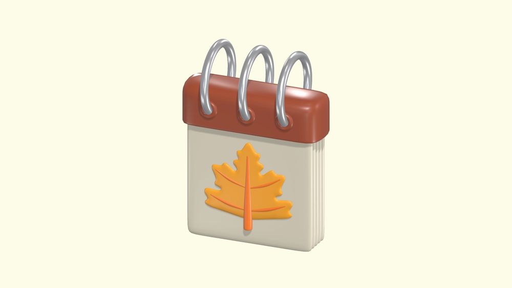
Autumn is an inspiring season, with warm tones, cozy ambiances, and a shift toward more muted hues. For designers looking to evoke fall's charm in web or app interfaces, the right color palette can make all the difference.
Whether you’re working on a seasonal marketing design or a warm, cozy UI, these palettes can bring depth and vibrancy to your designs. Here’s a curated selection of 15 autumn color palettes, categorized into soft, dark, deep, and muted styles to help you set the right mood.
Soft Autumn Color Palettes
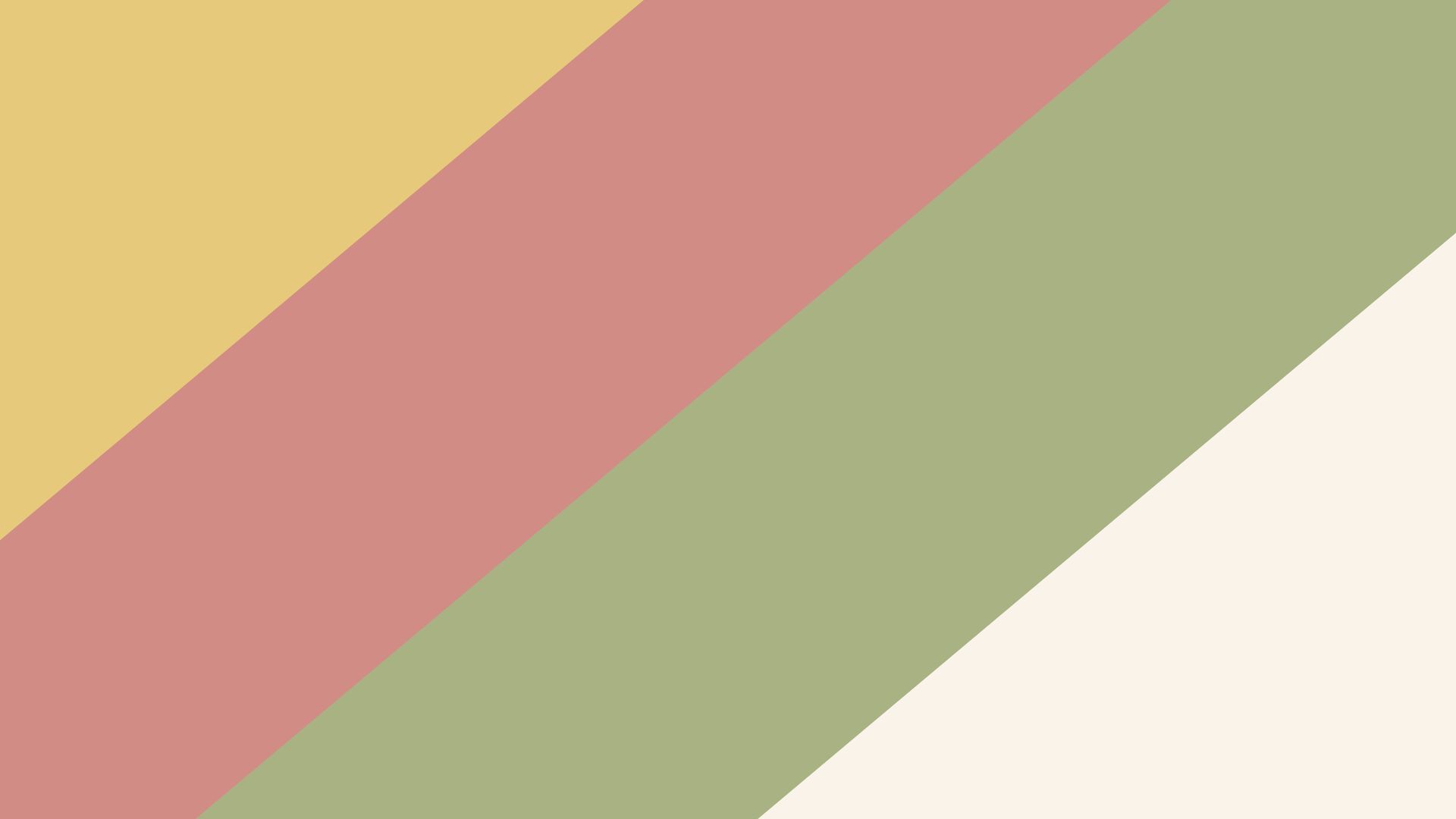
1. Warm Harvest
This palette captures the mellow side of autumn. With tones of soft mustard (#E7C97B), coral pink (#D18C85), olive green (#A9B283), and beige cream (#FAF3E9), Warm Harvest brings warmth without overwhelming brightness. It's ideal for projects looking to convey coziness, like a website or app for a coffee shop or a fall-themed lifestyle blog. The gentle hues make this palette perfect for background designs, enhancing text readability while adding warmth.
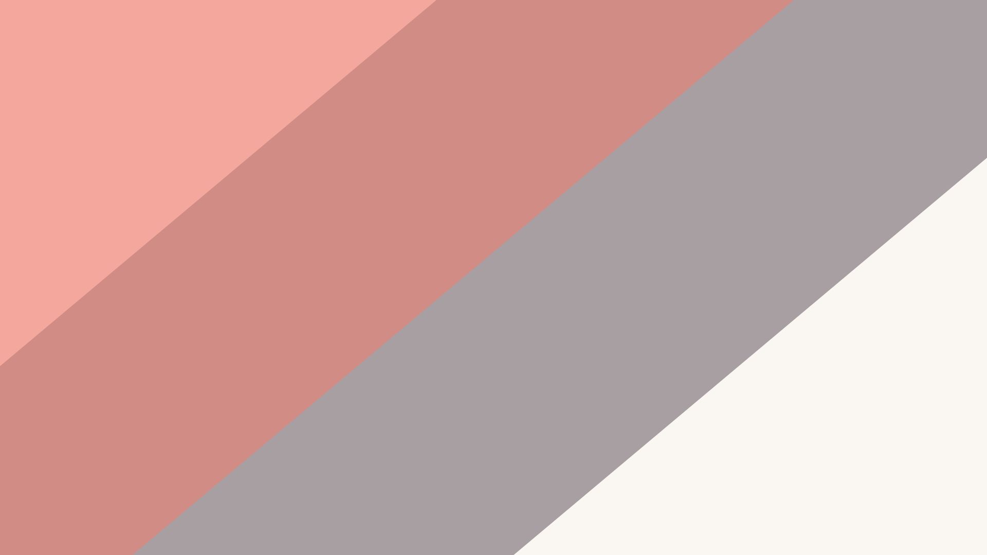
2. Rustic Sunset
Rustic Sunset mimics the colors of an autumn sunset with gentle hues like salmon pink (#F4A89D), dusty mauve (#C58D89), lavender gray (#A89FA3), and a creamy white (#FAF6F2). This palette works well for websites or apps that need a soft, inviting touch—like personal blogs or wellness platforms. Rustic Sunset provides a comforting feel without overwhelming the eye, creating a balanced design suitable for extended viewing.
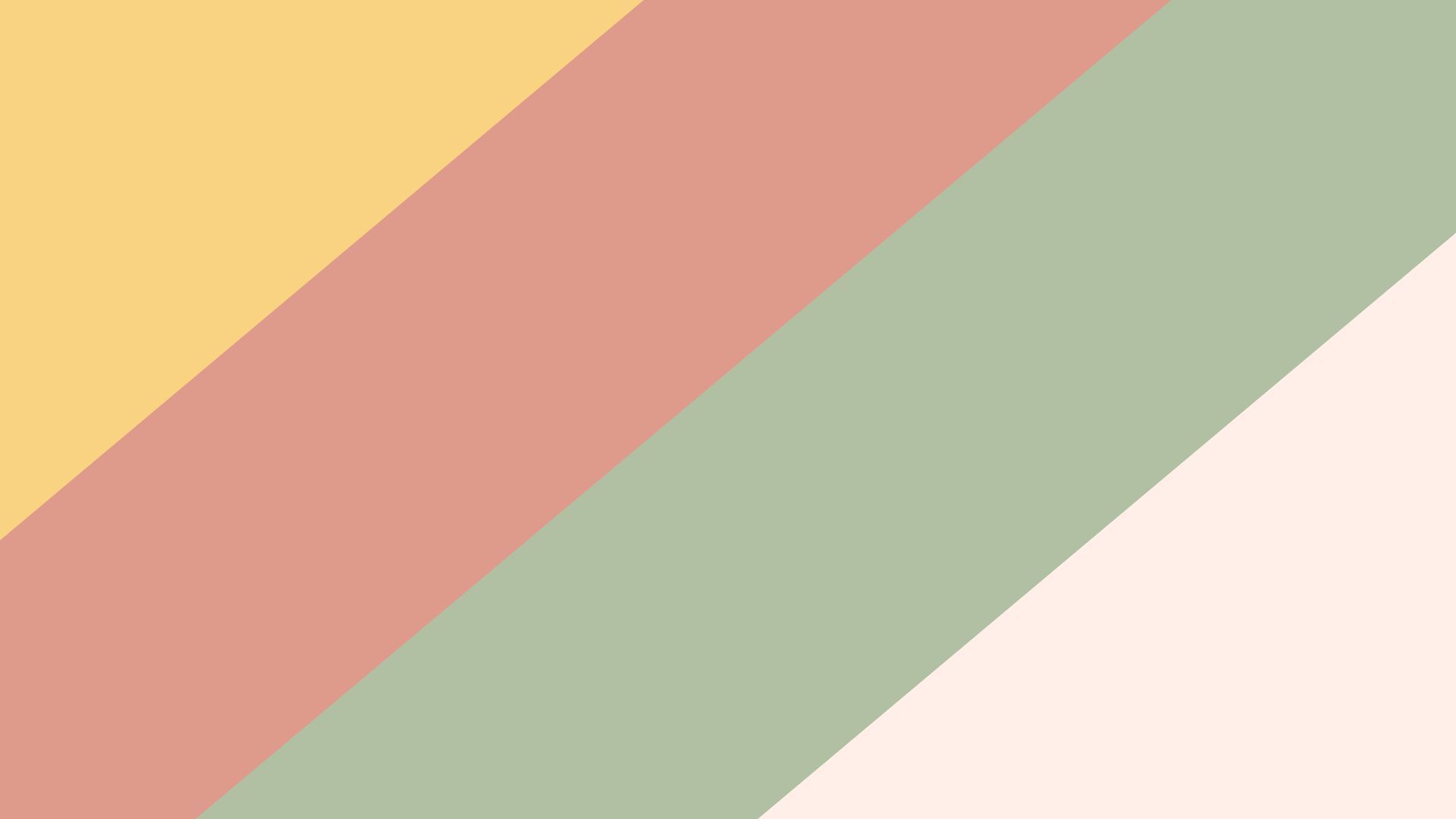
3. Cozy Amber
With hues of amber yellow (#F9D282), soft terracotta (#DE9A8A), light forest green (#B1C0A3), and pale peach (#FFEFE8), Cozy Amber embodies the softness of autumn foliage. This palette is ideal for creating a sense of warmth and approachability, making it a great choice for home decor websites or creative portfolio designs. The colors are perfect for backgrounds, headers, and sections where warmth is key.
Discover 15,000+ customizable 3D icons, illustrations, and characters for designing beautiful autumn-themed websites or marketing materials on Pixcap. Easily adjust colors, rotation, and materials to perfectly match your brand's style!
Dark Autumn Color Palettes
4. Midnight Maple
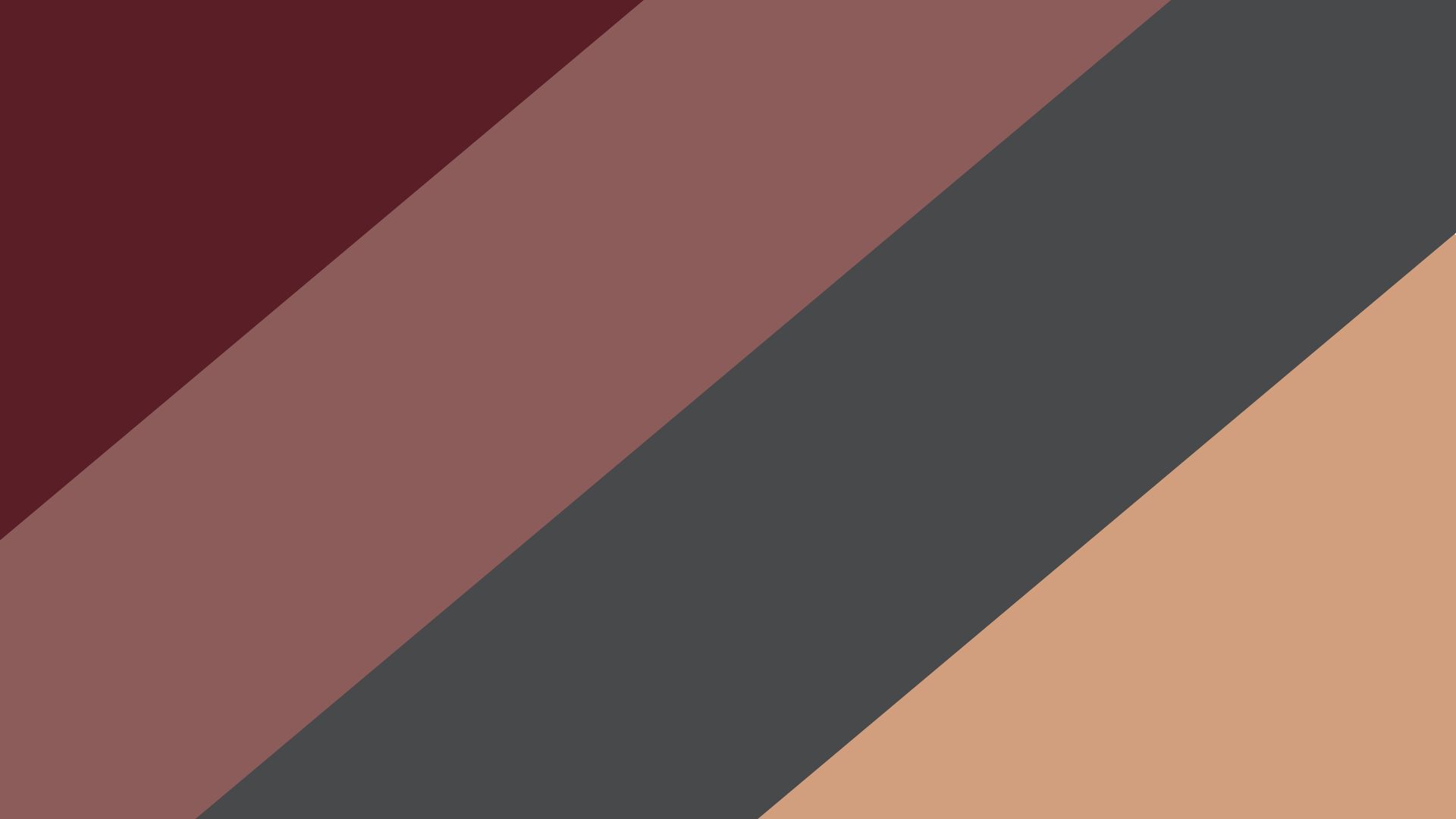
Midnight Maple is a dramatic palette featuring deep burgundy (#5A1F26), maple brown (#8B5C5A), charcoal gray (#48494B), and muted amber (#D19F7D). This palette suits apps or websites with a moody and sophisticated vibe, such as those in the luxury or fashion industries. Midnight Maple's high contrast adds depth and elegance to UI elements, making it especially effective for accenting buttons or icons on dark backgrounds.
5. Forest Shadows
Inspired by the quiet woods, Forest Shadows combines dark pine green (#2B4B40), earthy brown (#5F4E45), foggy gray (#A3A5A4), and muted beige (#DBD3CB). Ideal for outdoor or eco-focused websites, this palette brings a natural feel to the interface. Its grounded colors work well in backgrounds or as borders, offering a calm, introspective touch that resonates with eco-conscious audiences.

6. Deep Roast
Deep Roast brings together espresso brown (#3C1E1A), rich maroon (#732D2A), olive green (#646E55), and dark ochre (#B68056). Perfect for drink or food-related designs, especially coffee shops or restaurants, Deep Roast offers an earthy richness. This palette's strong, dark colors are best used sparingly for impact, such as in header sections, buttons, or logo elements to add warmth and sophistication.

Deep Autumn Color Palettes
7. October Woods
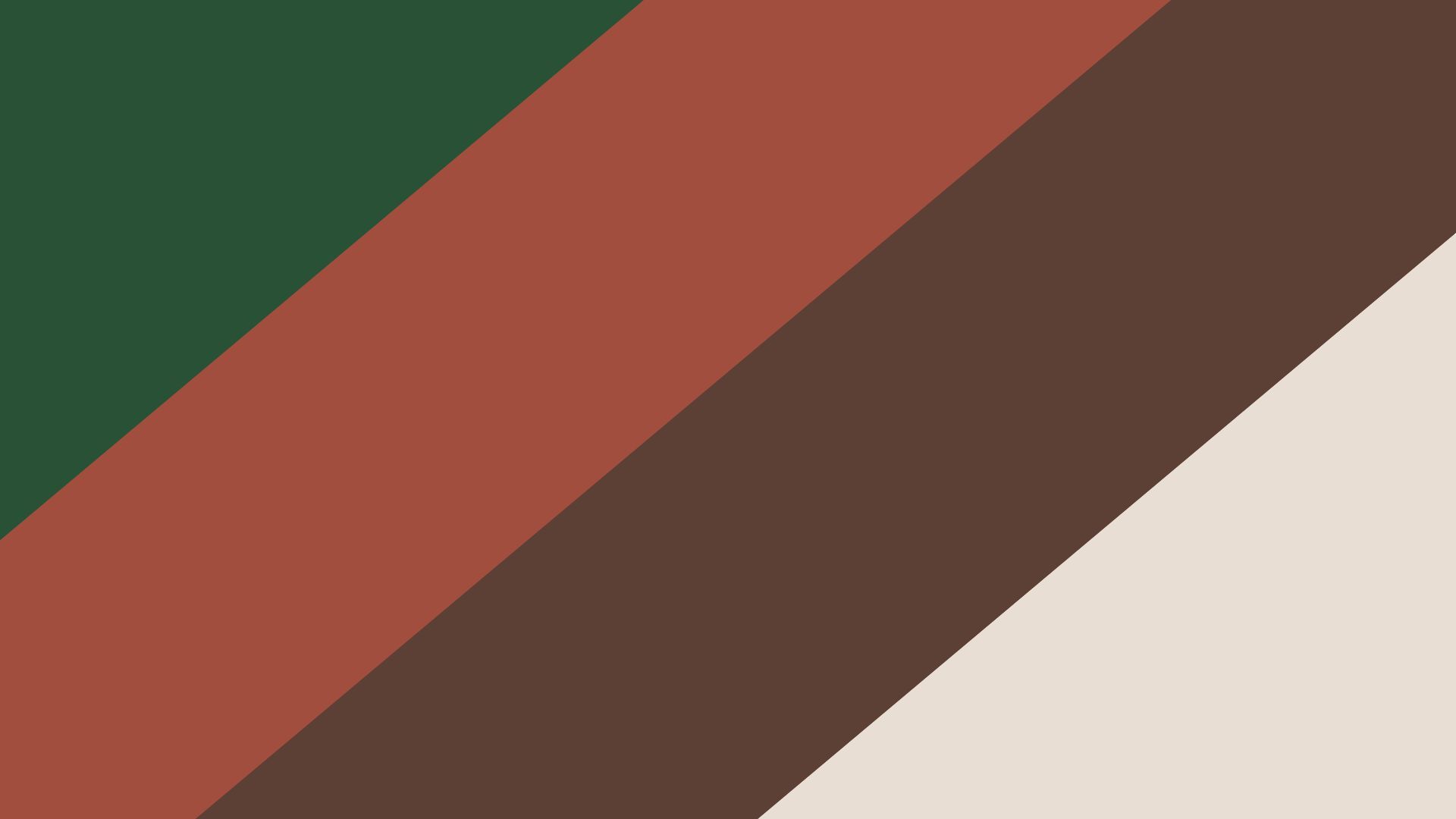
October Woods blends rich earthy tones like forest green (#295135), burnt orange (#A14E3E), bark brown (#5D4035), and muted cream (#E9DED3). This palette is ideal for nature-inspired designs, outdoor activity apps, or eco-tourism websites. The deep, grounded colors invoke autumnal forests and work well as primary background shades or for framing photography, enhancing the natural beauty of the visuals.
8. Maple Glow
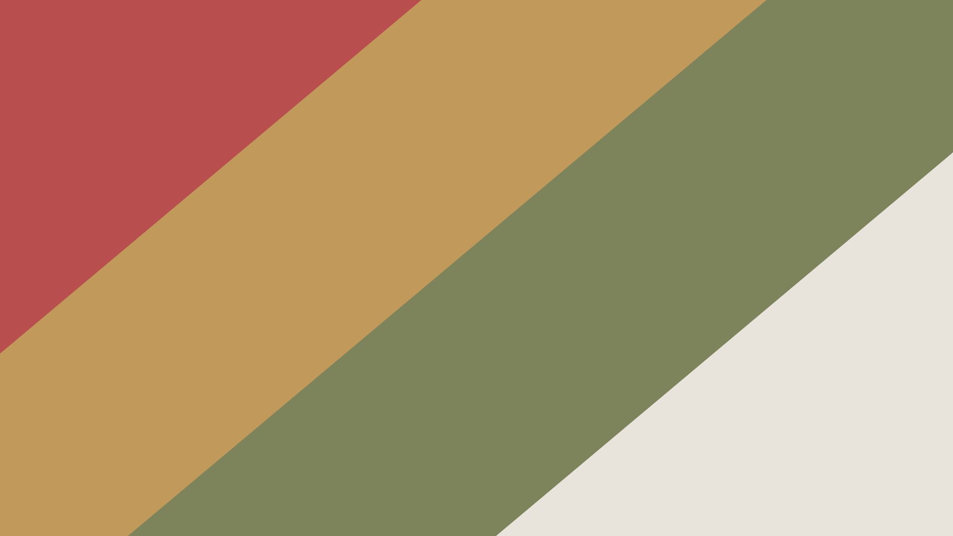
Maple Glow brings the essence of vibrant autumn foliage with rusty red (#B84E4D), warm gold (#C19A5B), muted olive (#7D835A), and cream (#E9E4DB). This palette is perfect for personal branding or portfolio sites that need a touch of seasonal flair. The contrast between the rich red and the muted olive brings out the beauty of each color, making it ideal for hero sections, logos, and accent icons.
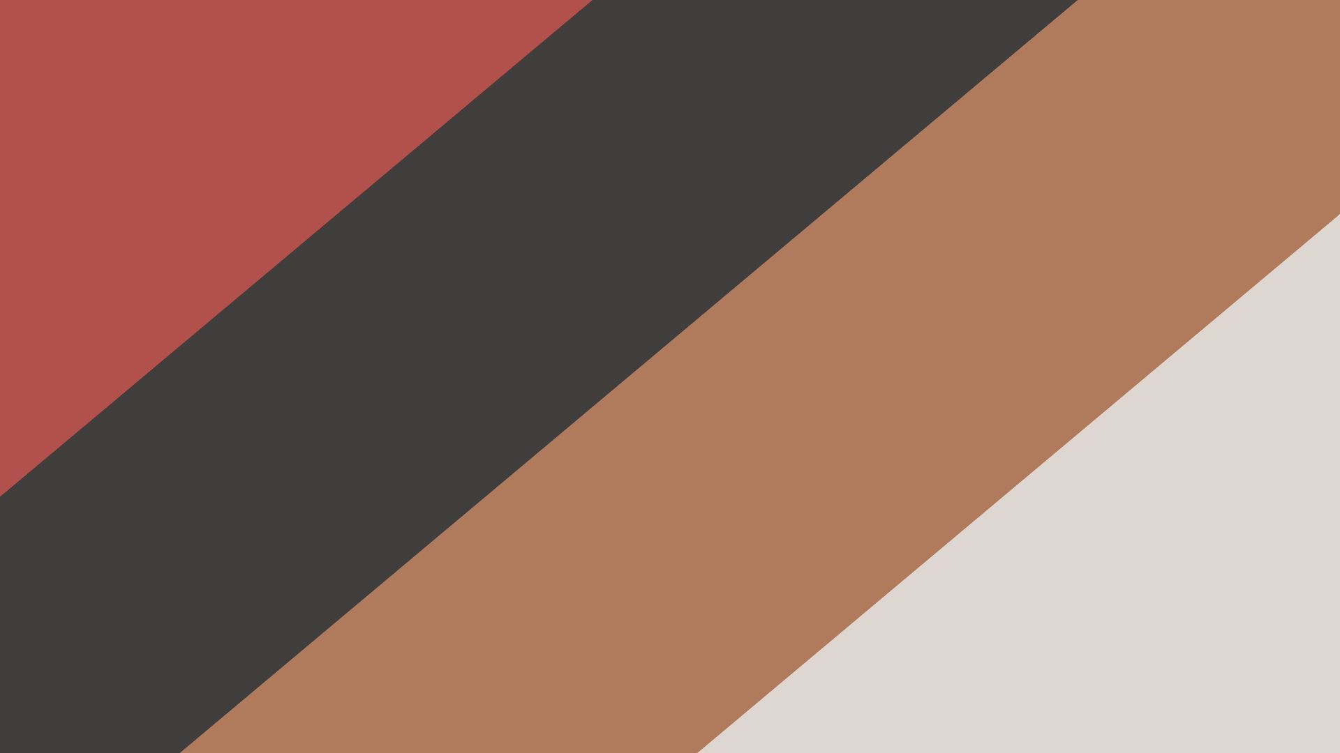
9. Fireside Embers
With ember red (#B2504C), charcoal gray (#3F3E3C), burnt sienna (#B07A5C), and light gray (#DED6D0), Fireside Embers creates a warm, comforting aesthetic. This palette is well-suited for autumn promotions or e-commerce designs, especially in the fashion and lifestyle sectors. Its colors bring a cozy atmosphere, best used in overlays, backgrounds, or text highlights for added depth.
Muted Autumn Color Palettes
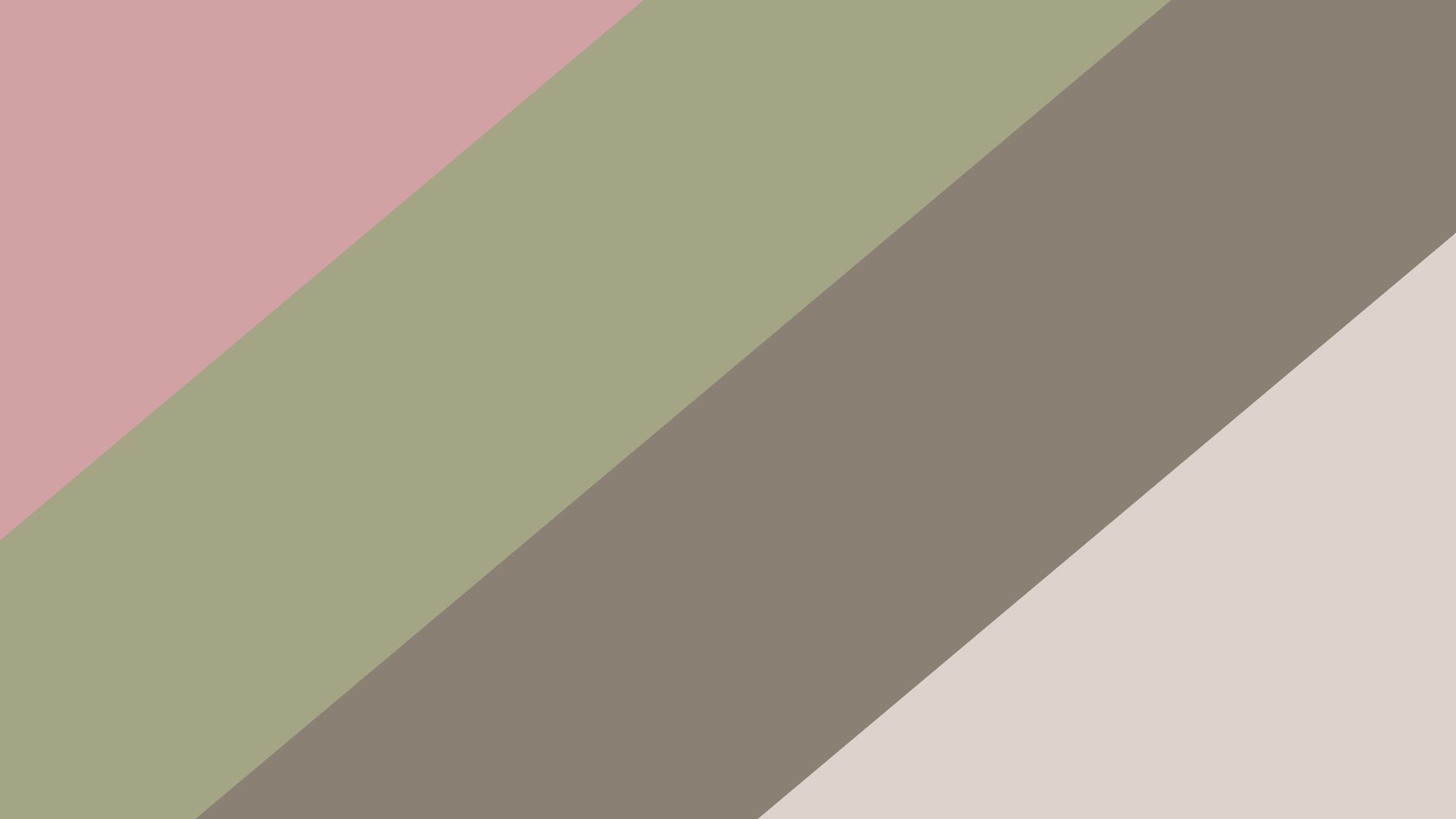
10. Smoky Maple
Smoky Maple consists of dusty rose (#D1A1A4), soft olive green (#A4A584), cool taupe (#8A8073), and sandy beige (#DED3CC). The muted hues are gentle and unassuming, making this palette ideal for calming UIs such as mindfulness or wellness apps. Smoky Maple’s understated tones create a serene backdrop, and it’s especially useful for creating harmony in minimalistic designs.
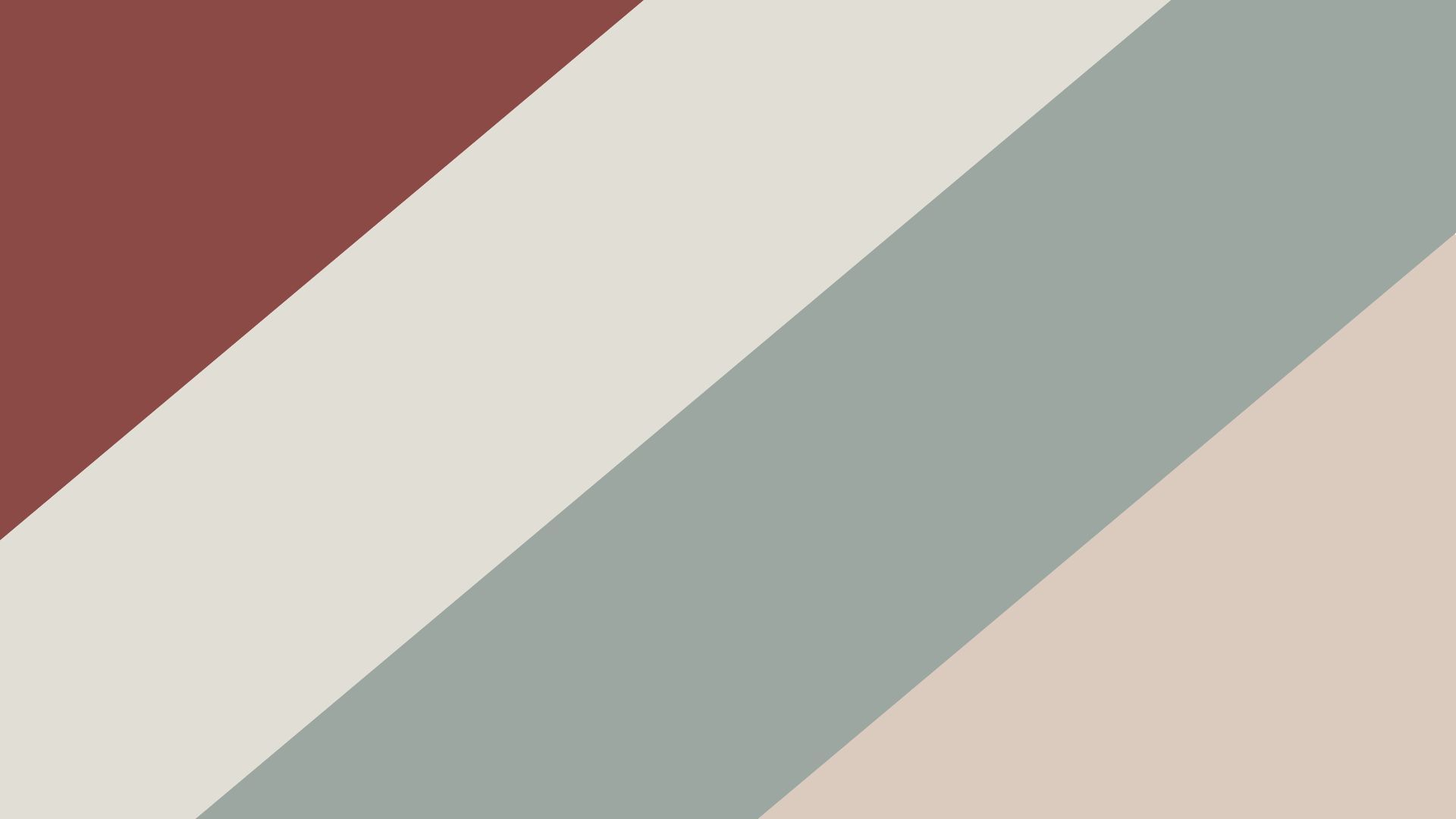
11. Autumn Breeze
This palette combines a subtle burgundy (#8C4A47), pale gray (#E0DED5), soft teal (#9DA7A1), and warm sand (#DBCBBE). Autumn Breeze is perfect for health and lifestyle apps, as the muted colors promote tranquility and ease. The colors are best used for secondary UI elements, backgrounds, and overlays, as they don’t distract but enhance the overall look with a gentle autumn feel.
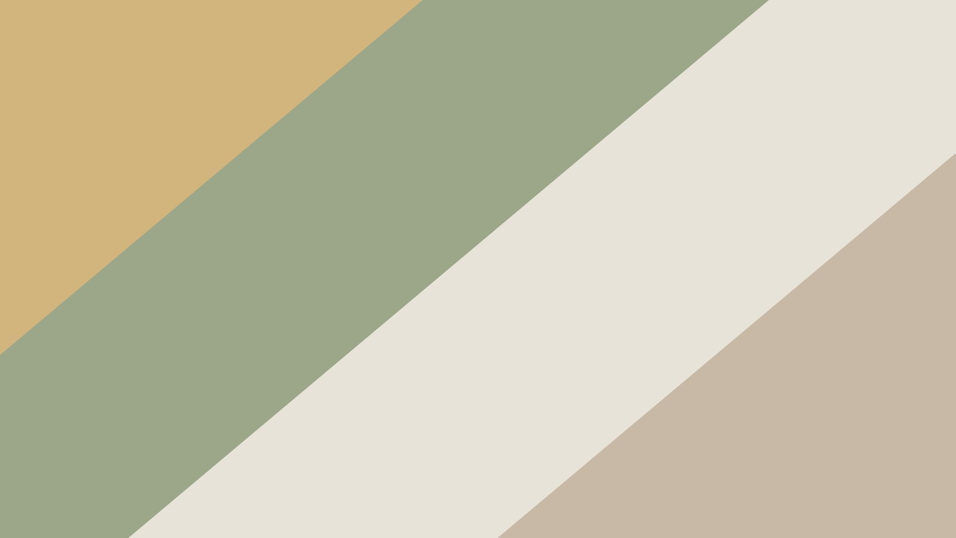
12. Golden Sage
Golden Sage is a mix of muted mustard (#D2B47D), sage green (#9CA789), dusty cream (#E7E3D8), and light clay (#C8B8A6). This palette is ideal for organic or nature-themed websites, providing a cozy, earthy aesthetic. The colors work well in interface backgrounds, navigation bars, or as accent colors to bring in a natural, grounded feel that doesn’t overpower.
Experimental Autumn Color Palettes
13. Vibrant Leaves
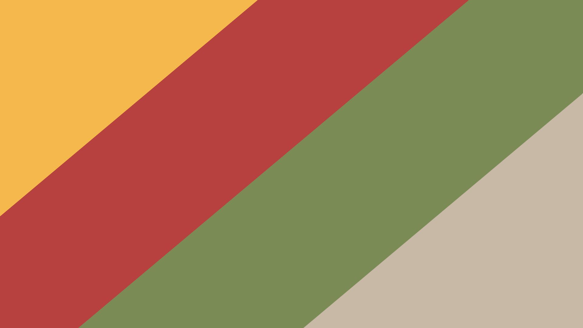
Vibrant Leaves is a bolder take on autumn, with lively colors like golden yellow (#F5B84C), warm red (#B7413E), olive green (#7A8B55), and sky blue (#92A4C0). Ideal for festival or event websites, this palette creates a more energetic autumn look. These colors pop against neutral backgrounds and are ideal for call-to-action buttons or highlights in festive, upbeat designs.
14. Smoky Amber
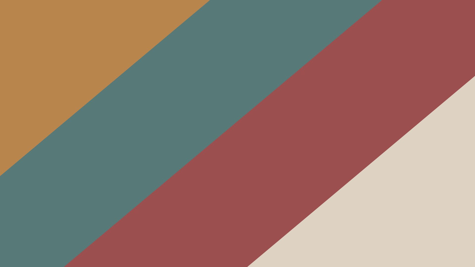
With smoky amber (#B8854C), dusky teal (#577A79), rosewood (#9C4F4F), and sandy gray (#DED2C3), Smoky Amber brings a nostalgic feel to autumn. This palette is well-suited for classic or vintage-themed websites, lending a timeless vibe. Its muted colors work beautifully for overlays, filters, and headers, adding a cozy vintage touch.
15. Urban Fall
Urban Fall combines charcoal black (#2F2E2E), ochre yellow (#C2953D), dusty teal (#667B7A), and creamy beige (#E4E0D6). Ideal for modern, urban-themed designs, this palette offers a contemporary twist on autumn colors. Best used for fashion, lifestyle, or urban-inspired websites, the colors make UI elements like buttons, icons, and navigation bars stand out, adding a sophisticated, sleek appeal.

How to Use Autumn Color Palettes in Web Design
Here’s a guide to integrating autumn colors in a way that enhances your site’s aesthetic and usability.
Prioritize Contrast and Readability
When using autumn colors, it’s essential to maintain readability and contrast across your design. One approach is to pair darker autumn tones, such as forest green or maroon, with light-colored text. This contrast makes text easier to read and adds sophistication to your design.
To draw attention to specific elements, like calls-to-action or headings, use vibrant shades like orange or golden yellow sparingly. This subtle use of warm colors guides the viewer’s eye naturally, enhancing the user experience without overwhelming them.
Consider subtle gradients to add depth and avoid flatness, which brings dimension to the design and enriches the color palette.
Incorporate Textures and Overlays
Textures and overlays can add a layer of authenticity to your autumn design. Think about integrating natural textures like wood grains, leaf patterns, or fabric-inspired backgrounds. These textures create an organic feel that’s particularly fitting for fall, adding warmth and depth.
Using semi-transparent overlays in autumn colors on your images or backgrounds is another great technique. It ties the color scheme together, creating a cohesive visual experience where elements feel interconnected and part of a single narrative. These overlays soften images and backgrounds, allowing them to complement rather than compete with the foreground content.
Leverage Imagery to Reinforce the Theme
Seasonal imagery is a powerful way to deepen the autumn feel of your site. High-quality photos of fall landscapes, cozy indoor scenes, or harvest elements can evoke the essence of the season without relying solely on color.
You can also use themed illustrations or icons, such as pumpkins, leaves, or cups of tea, which add personality and charm to your design. 3D illustrations, especially those in coordinating autumn hues, can enhance engagement and add a dynamic element to your visuals, making the overall experience more immersive.
Adapt Color Usage by Section
To create a balanced and visually appealing layout, consider how you apply autumn colors across different sections of the website. Darker, earthy tones are well-suited for background sections like headers and footers, providing a grounded, solid look. Content areas often benefit from lighter warm colors, like soft oranges and yellows, which help text and images stand out while maintaining an inviting aesthetic
For buttons and interactive elements, using bold, contrasting autumn hues, such as deep red or vibrant orange, helps draw attention naturally and encourages clicks without feeling too overpowering.
Ensure Accessibility
Finally, accessibility is a vital consideration when using rich color schemes. Make sure that there’s adequate color contrast between text and background to maintain legibility.
Using a contrast checker can ensure that your colors meet accessibility standards, which is especially important for visually impaired users. Testing your design with color-blindness simulations can help confirm that the website’s readability and usability remain intact for all visitors, regardless of their visual abilities.
Bringing Autumn to Your Designs
Choosing the right autumn color palette can set the tone for an entire project, evoking warmth, sophistication, or nostalgia. Soft palettes work well for inviting, cozy designs, while dark or deep tones can bring drama and richness. Muted hues keep the design subtle and sophisticated, and experimental tones bring energy and creativity to seasonal projects. Whatever your project, these palettes offer a range of choices to make your designs truly reflect the beauty of fall.
