Typography is the art and technique of arranging type to make written words and language legible, readable, and appealing when displayed.
Within this domain, 'leading' is a crucial aspect often overlooked. Leading exists to establish the right distance and kind of 'breathing room' between lines, affecting not just the visual hierarchy but the readability and user experience of any design.
For graphic designers, mastering leading is not an option—it's a necessity. This comprehensive guide will walk you through all you need to know about leading in typography, from the basics to techniques, and will equip you with the tools to take your typographic designs to the next level.
What Is Leading in Typography?
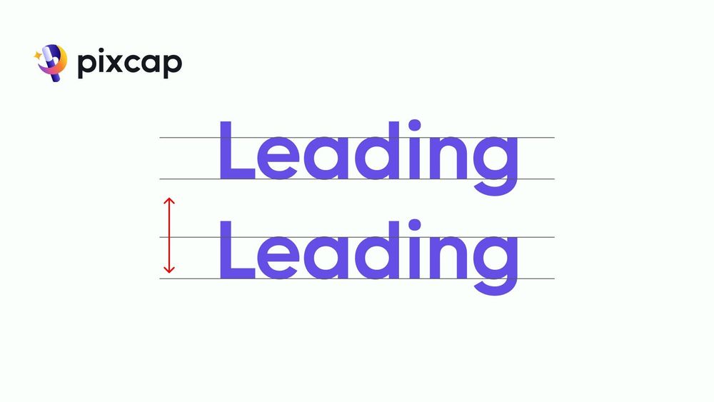
Leading, also known as line height or spacing, is the vertical space between lines of text. It is measured from baseline to baseline and plays a crucial role in typography by determining how much white space exists between lines. Proper leading creates a comfortable reading experience for the viewer while also creating visual balance within a design.
Why Leading Is 'Leading' in Typography
Leading, or line-spacing, has a significant role in the legibility and aesthetics of typographic content. In early typesetting days, strips of lead were inserted between the lines of type, to add space, hence the name 'leading.' Here are three key reasons why leading is so essential in typography.
Readability: The appropriate line spacing enhances the readability of the text, particularly when it comes to prolonged reading. Too little space can lead to the lines and letters blending together, making it harder for the reader to follow the text.
Aesthetics: Good leading contributes to the overall aesthetic of your design. Appropriate spacing can create a sense of openness and lightness, making the text more inviting to the reader.
Hierarchy: Leading can be used to establish a clear distinction between different elements in a design—be it a headline or a body of text. This helps the reader understand the flow and emphasis of the content.
Understanding these three principles is crucial as we advance into exploring the finer details of leading.
How Is Leading Measured in Typography?
Most programs use points as the unit of measure for leading, just like for type size. When specifying a typeface's measurements and leading, you'll use a format like Helvetica 10/12 - the first number is the point size, and the second number is the leading size. In programs like InDesign or Illustrator, when you input body copy, the default leading typically starts around 2 points higher than the point size, known as default leading. Remember the terminology:
Normal leading: Matches the typeface's point size, written as Helvetica 10/10.
Negative leading: Smaller than the typeface's point size, written as Helvetica 10/8.
Positive leading: Larger than the typeface's point size, written as Helvetica 10/14.
You will mostly use normal or positive leading in graphic design, though negative leading can produce interesting effects when used intentionally.
Best Leading Techniques to Follow
A mastery of leading requires attention to detail and a refined sense of design. Here are some key techniques to help you master leading in text.
Consistency is Key
Maintain a consistent leading throughout a document or project to create a sense of unity and structure. This typeface consistency aids in establishing a rhythm for the reader as they make their way through the text.
Readability and Comfort
Adjust leading based on the font size of choice and the intended audience. Physically comfortable leading plays a vital role in preventing eye strain and fatigue during the reading process.
Establishing Hierarchy
Use leading to establish a clear hierarchy within your design. Ensure that headings have less leading than body text to create a visual distinction and make the content more scannable.
By focusing on these techniques, you can ensure that leading becomes an ally in your typographic layout rather than an obstacle.
Best Practices for Using Leading
To truly master leading, it's essential to understand and implement best practices. Here are the three most significant practices for ensuring your leading is on point.
Balancing Text and White Space
The key to successful leading is finding the balance between the text and the white space. Neither too tight leading overcrowding nor excessively wide leading should disrupt the rhythm of your design or the flow of your content.
Enhancing Visual Appeal
Leading can make or break the visual appeal of multiple lines in your typographic design. Experiment with leading to see how adding just a little extra space can considerably enhance the overall look and feel.
Impact on User Experience
The user experience of your design is not limited to digital interfaces. For products that involve prolonged reading, such as books and magazines, the right leading is crucial for a positive user experience.
Keeping these best practices in mind will elevate your typographic design, making your work more engaging and effective.
Tools and Resources for Leading in Typography
To implement leading in your designs, several tools and resources are at your disposal.
Online Graphic Design Games
What helps better understand leading than a fun, interactive graphic design game? Games such as Kern Type provide an entertaining way to learn about leading while testing your skills.
Software Recommendations
Graphics software like Adobe InDesign, Illustrator, and Photoshop offers thorough control over leading settings, offering the ability to adjust different leading settings according to your needs.
Online Courses and Tutorials
There are numerous online courses and tutorials specifically dedicated to typography, offering in-depth guidance on how to manage leading and other important typographic elements.
By making use of these tools and resources, you'll gain practical experience and deepen your understanding of leading in typography.
Conclusion
Mastering the correct leading used in typography is a skill that requires practice, patience, and an eye for detail. It plays a vital role in creating designs that are not only visually stunning but also highly functional and readable.
By understanding the significance of leading, familiarizing yourself with the various types, and implementing best practices, you can ensure that leading takes its rightful place in your toolbox as a powerful instrument for typographic excellence. Remember, in the world of typography, the space between the lines is just as important as the space occupied by the letters themselves.


