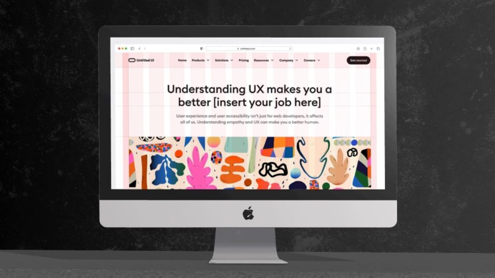
In the digital landscape, small details can significantly enhance user experience. A dynamic loading page, for instance, can inform users that the application is in the process of loading while providing engaging content and visually tracking progress, encouraging users to remain on the page. Micro interactions—subtle animations or feedback mechanisms—play a crucial role in guiding users and adding enjoyment to their interactions. From a loading animation to a successful form submission icon, micro interactions can make a more delightful user experience.
In this guide, we’ll explore the importance of micro interactions and how to effectively implement them to improve user engagement and satisfaction. Let’s dive into the essentials of enhancing user experience through these powerful design elements.
What are Micro-Interactions?
Micro-interactions are small animations or feedback tools used in digital interfaces. They have a single purpose: to make the user experience better. Imagine them like a friendly smile from a store clerk or the satisfying ‘click’ when you close a good quality box. These little interactions can greatly impact how a user feels about their experience with a product or service.
When used well, micro-interactions create a warm, happy feeling for the user. They offer immediate feedback, which helps users know that their actions have been acknowledged. This instant response makes digital interfaces feel more responsive and easier to use. By making technology more intuitive, micro-interactions help users feel more connected and satisfied with their digital experiences. Additionally, micro-interactions can encourage users to continue through tasks and interact more deeply with the product, ultimately driving adoption and boosting conversion rates.
The Psychology Behind Micro-Interactions
Micro-interactions are more than just design flourishes; they tap into fundamental psychological principles that enhance user experience. Understanding the psychology behind these subtle elements can help designers create more engaging and intuitive interfaces. Here are a few key aspects to consider:
1. Feedback and Confirmation
One of the primary purposes of micro-interactions is to provide feedback through user action. When users perform an action—like clicking a button or submitting a form—immediate visual or auditory feedback reassures them that their action has been recognized. Micro-interactions capture user actions to improve the overall digital experience by providing feedback and visual cues, such as loading animations or button effects. This aligns with the psychological principle of operant conditioning, where positive reinforcement encourages repeat behavior.
2. Affordance and Usability
Micro-interactions can signal how to interact with an element, making interfaces more intuitive. For example, a button that gently pulses or changes color implies it’s clickable. This leverages the concept of affordance, where the design itself suggests its function, reducing cognitive load and enhancing usability.
3. Emotion and User Engagement
Micro-interactions evoke emotions, making experiences more enjoyable. Delightful animations or playful sounds can create a sense of joy and satisfaction, fostering a positive connection with the product. This taps into the emotional design framework, which emphasizes the importance of creating meaningful user experiences that resonate on an emotional level. Recognizing user preferences and incorporating tailored micro-interactions can further enhance user experience by acknowledging individual behavior and history, making interactions more engaging and rewarding.
4. Surprise and Delight
When users encounter unexpected, charming interactions—like a quirky loading animation—they experience moments of surprise that can lead to increased engagement. This aligns with the psychological principle of novelty, which captures attention and enhances user satisfaction.
5. Cognitive Load Reduction
Micro-interactions simplify tasks and reduce cognitive load. Clear visual cues guide users through complex processes, making them feel more in control and less overwhelmed. This is rooted in cognitive psychology, which emphasizes the importance of reducing mental effort to improve user experience.
Key Components of Micro-Interactions
Micro-interactions consist of several essential components that work together to create effective and engaging user experiences. Understanding these elements can help designers implement micro-interactions that enhance usability and delight users. Here are the key components:
1. Triggers
Triggers are the initiators of micro-interactions. They can be user-initiated (e.g., clicking a button, swiping a screen) or system-generated (e.g., notifications, alerts). Effective triggers draw users’ attention and prompt them to engage with the interface.
2. Rules
Rules define how a micro-interaction responds to triggers. They specify what happens when a trigger is activated, outlining the conditions for the interaction. For example, if a user hovers over a button, the rule may state that the button changes color. Clear and logical rules help users understand the expected outcomes of their actions.
3. Visual Feedback
Feedback provides users with information about the result of their actions. This can be visual (e.g., animations, color changes), auditory (e.g., sounds, alerts), or haptic (e.g., vibrations). Effective feedback reassures users that their actions have been recognized and helps them gauge the success of their interactions.
4. Loops and Modes
Loops are the repeating cycles of micro-interactions, while modes are the various states that a micro-interaction can exist in. For instance, a loading animation might loop until the content is fully loaded, while a button can have different modes (normal, hover, active) that represent its current state. Managing loops and modes ensures a coherent flow and enhances the overall experience.
5. Duration
Duration refers to the timing of micro-interactions, including how long animations or transitions last. A well-timed interaction can create a sense of smoothness and fluidity, while overly long or abrupt transitions can disrupt user experience. Designers should aim for durations that feel natural and responsive, typically between 200-500 milliseconds for animations.
Micro-Interactions 2024 Examples
Micro-interactions are powerful tools that can elevate user experience across various digital platforms. Here are some real-world examples of micro-interactions that enhance usability and engagement:
1. Button States
Buttons often employ micro-interactions to indicate their state. For instance, when a user hovers over a button, it may change color or animate slightly. This visual feedback confirms that the button is interactive and ready to be clicked, making the interface more intuitive.
2. Loading Indicators
When users are waiting for content to load, a well-designed loading animation can keep them engaged. For example, a circular spinner or a progress bar not only informs users that the action is in progress but can also reduce frustration by providing a sense of control over waiting times.
Discover Pixcap's animated loading icon pack! Customize it by adjusting colors, rotation, and more to perfectly match your brand.
3. Form Validation
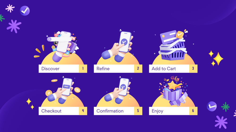
Micro-interactions in forms can improve the user experience significantly. For example, when a user complete their profile in app, a small checkmark or a red error message can appear in real time, providing immediate feedback on whether the input is valid. The "Complete Your Profile" interaction in an app's UI helps users correct mistakes and enhances the overall efficiency of form completion.
Download animated icons for "Complete Your Profile" UI design on Pixcap! Customize it by adjusting colors, rotation, and more to perfectly match your brand.
4. Notification Alerts
Notifications that slide in or gently pulse can draw users’ attention without being disruptive. For example, a new message alert that smoothly animates into view keeps users informed and engaged without overwhelming them, enhancing the user experience. Notification alerts are commonly used in messaging apps to maintain conversation flow and user interest.
5. Toggle Switches
Toggle switches often use micro-interactions to indicate changes in state. When a user flips a switch from off to on, a smooth animation and a color change can visually reinforce the change, making the interaction clear and satisfying.
6. Social Media Interactions
On social media platforms, actions like liking a post or following a user often include micro-interactions, such as heart animations or checkmarks. These small animations provide instant feedback and emotional satisfaction, encouraging users to engage more frequently.
7. Onboarding Tutorials
Micro-interactions can be used in onboarding processes to guide new users through an application. For instance, animated tooltips that highlight features or subtly direct users to click specific elements can help reduce confusion and improve user adoption.
Designing Effective Micro-Interactions
Designing effective micro-interactions requires a deep understanding of user needs and goals. Micro-interactions should be designed to serve a clear purpose and align with the overall UX strategy and brand personality.
Understand User Needs and Goals
To design effective micro-interactions, it’s essential to understand user needs and goals. This involves identifying the user’s motivations, pain points, and behaviors. By understanding what users want to achieve, designers can create micro-interactions that provide the right feedback at the right time, making the user experience more intuitive and engaging. For instance, a well-timed animation can reassure users that their action has been acknowledged, reducing user frustration and enhancing satisfaction.
Focus on Simplicity and Clarity in Design
Micro-interactions should be simple and easy to understand. Avoid cluttering the interface with too many micro-interactions, as this can lead to user frustration. Instead, focus on creating a few, well-designed micro-interactions that provide clear feedback to users. Use visual feedback, such as animations or color changes, to draw attention to important elements and guide users through the interface. By keeping micro-interactions simple and purposeful, designers can enhance user experience, encourage user engagement, and provide immediate feedback to users.
Best Practices for Creating Micro-Interactions
While micro-interactions can greatly enhance the user experience, it's important to follow some best practices in their design and implementation. Here are a few key tips for creating effective micro-interactions:
- Keep them subtle: Micro-interactions should be noticeable but not overwhelming. Avoid using too many animations or sounds that may distract users from their main task.
- Make them purposeful: Every micro-interaction should serve a specific purpose, whether it's providing feedback or guiding users through an action.
- Consider accessibility: Ensure that your micro-interactions are accessible to all users, including those with disabilities. This may include providing alternative text for animations or options to turn off certain effects.
- Test and iterate: As with any design element, it's essential to test your micro-interactions with real users and gather feedback. Continuously iterating and improving them will lead to the most effective results.
- Keep them consistent: To maintain a seamless experience, use similar micro-interactions throughout your application or website. This will help users understand how to interact with different elements.
- Use them sparingly: While micro-interactions can greatly enhance the user experience, using too many of them can be overwhelming and diminish their impact. Use them sparingly and strategically for maximum effect.
Future Trends in Micro-Interactions
As technology continues to evolve, there are several emerging trends of micro-interactions in 2025 beyond. Here are a few that we can expect to see more of in the coming years:
- Voice interactions: With the rise of virtual assistants and voice-controlled devices, we can expect to see more micro-interactions being triggered by voice commands.
- Gesture-based interactions: As touchscreens become more prevalent, we can also expect to see an increase in gesture-based micro-interactions, such as swiping and pinching.
- Personalization: With advancements in data collection and AI, micro-interactions will become more personalized for individual users based on their preferences and behavior.
- Integration with augmented reality: As augmented reality becomes more integrated into our daily lives, we can expect to see micro-interactions that enhance this experience and make it more seamless.
- Incorporating haptic feedback: Haptic feedback, which uses vibrations or other physical sensations to simulate touch, will become more prevalent in micro-interactions, adding a new level of engagement for users.
As the way we interact with technology continues to evolve, so too will the role of micro-interactions. By understanding their importance and staying up-to-date on emerging trends, designers can continue to create engaging and user-friendly experiences for their audiences.
Create Animated Icons for Web, App Design with Pixcap
Using Pixcap, you can easily create animated icons for web and app design in 4 simple steps! Let's take a look at how it works:
- Start by selecting the icon you want to animate from Pixcap's extensive library
- Adjust colors, rotation, and other settings to customize the icon to your liking
- Export your animated icon as a PNG, GLB, GIF or MP4 file for use in web or app design
- Add your animated icons to your design projects and watch them come to life!
Sign up for free today and elevate your web and app design with engaging animated icons. Try out Pixcap and take your designs to the next level!