A well-designed navigation bar is like a friendly guide, helping users effortlessly explore your website or app. Whether you’re building a sleek e-commerce platform or a vibrant blog, understanding the principles of effective navigation design is key to creating a smooth user experience.
In this article, we’ll dive into the fundamental design principles that make navigation bars not just functional, but also intuitive and engaging. We’ll also showcase some inspiring examples that highlight how these principles come to life in real-world applications.
What Is a Navigation Bar?
A navigation bar, often referred to as a navbar, is a crucial component of a website or application that allows users to navigate through its various sections and features. Typically positioned at the top or side of a page, it serves as a roadmap, guiding visitors to important areas like home, about, services, blog, or contact pages.
A well-designed navigation bar not only helps users find what they need quickly, but it also enhances their overall experience by providing a sense of structure and organization. It can take various forms—horizontal or vertical layouts, dropdown menus, icons, or even mobile-friendly hamburger menus.
Types of Navigation Bars
There are five main types of navigation bars, each with its unique characteristics and use cases:
- Horizontal navigation bars - Horizontal navigation bars are the most common type and are typically found at the top of a page. They provide a straightforward way for users to move through the main sections of a website, offering a clean and organized user experience.
- Vertical navigation bars - Vertical navigation bars are often used as sidebars or menus on the sides of a page. They are particularly useful for websites with a lot of content, as they can accommodate more links and categories without overwhelming the user.
- Dropdown navigation bars - Dropdown navigation bars offer additional options or submenus, allowing users to access more detailed pages without cluttering the main navigation area. This type of navigation is ideal for websites with a hierarchical structure, where content is divided into different categories and subcategories.
- Tabbed navigation bars - Tabbed navigation bars are used to organize content into separate sections, often seen in applications or websites that require switching between different views or topics. They provide an intuitive way for users to explore related content without leaving the page.
- Responsive navigation bars - Responsive navigation bars adjust their layout and design based on screen size, ensuring a seamless user experience across devices. This type of navigation is crucial for modern web design, as it enhances accessibility and usability on mobile devices and varying screen resolutions.
Key Components of a Navigation Bar
Along with the different types of navigation bars, there are also key components that make up a well-designed navigation bar. These components work together to create a user-friendly and efficient way for users to navigate through a website.
- Logo - The brand's logo should be prominently placed at the top left corner, serving as a visual anchor and a quick way for users to return to the homepage.
- Primary Navigation - This is the main menu, typically located horizontally across the top of the page. It contains links to the most important sections of the website.
- Secondary Navigation - This is a supplementary menu that may appear below the primary navigation or in a dropdown. It provides additional links to less frequently accessed pages or subcategories.
- Search Bar - A search bar allows users to quickly find specific content within the website.
- Account/Cart - If applicable, links to user accounts, shopping carts, or wishlists should be placed in the top right corner.
- Hamburger Menu - On smaller screens, a hamburger menu (three horizontal lines) can be used to collapse the navigation into a dropdown.
Principles of Effective Navigation Bar Design
Simplicity
Designing an effective navigation bar is crucial for enhancing the user experience on a website or app. One of the fundamental principles is simplicity. A navigation bar should limit the number of menu items to around five to seven options. This manageable number helps users quickly locate what they need without feeling overwhelmed by excessive choices. Clear and descriptive labels are equally important; they should accurately convey the content within each section. Avoiding jargon ensures that all users, regardless of their background, can easily understand the navigation.
Hierarchy
Another essential principle is hierarchy. Organizing the structure of the navigation helps indicate the relationships between items, making it easier for users to navigate. Primary navigation should be prominent, while secondary options can be nested or less emphasized to create a visual flow. Consistency plays a critical role as well; maintaining a uniform design, layout, and terminology throughout the navigation bar reinforces familiarity and enhances usability.
Responsive Design
In today's digital landscape, responsive design is vital. A navigation bar should function seamlessly across various devices and screen sizes. For mobile users, incorporating a hamburger menu can save space while still providing access to necessary options.
Accessibility
Accessibility is another key consideration. Ensuring that the navigation is usable for all individuals, including those with disabilities, involves using appropriate contrast, alt text, and ensuring keyboard navigability. This inclusivity broadens your audience and enhances overall usability.
Visual Feedback
Visual feedback is essential for creating an interactive experience. Providing cues, such as highlighting or changing colors when users hover over or click menu items, indicates that these elements are interactive. This feedback helps guide users and makes the navigation feel more responsive.
Search Functionality
Furthermore, integrating a search functionality can significantly enhance usability, especially on larger sites. A search bar allows users to find specific content quickly, which can save time and improve the overall experience.
Sticky Navigation
If you're wondering whether a navigation bar should be sticky, the answer is yes: implementing a sticky navigation bar can be beneficial. This design keeps the navigation visible as users scroll down the page, thereby improving accessibility and the overall user experience. It ensures that users can easily access navigation options without having to scroll back up.
Testing and Iteration
Lastly, regular testing and iteration based on user feedback are crucial for ongoing improvement. Gathering insights from real users can help identify pain points and areas for enhancement. This continuous feedback loop ensures that the navigation remains intuitive and user-friendly. By adhering to these principles, you can create a navigation bar that significantly enhances usability and overall user satisfaction.
Best Practices for Navigation Bars
Navigation bars should be easy to use and intuitive
The primary purpose of a navigation bar is to help users find and access the content they are looking for on a website. Therefore, it is essential to keep the design simple and easy to use. The menu items should be clearly labeled and organized in a logical manner.
Avoid using overly complex or unique designs that may confuse users. Stick to standard navigation patterns that users are familiar with, such as placing the menu bar at the top or side of the page.
Keep navigation options minimal
Having too many menu items can overwhelm users and make it challenging to find what they are looking for. It's best to limit the number of options in the navigation bar to a manageable amount. Consider using drop-down menus or sub-menus to organize content and avoid clutter.
Make sure the navigation is responsive
With more and more users accessing websites through their mobile devices, it's crucial to ensure that the navigation bar is responsive. This means that it should adapt and display correctly on different screen sizes, including desktops, tablets, and smartphones.
Use visual cues for user guidance
Visual cues such as icons or colors can help guide users to important sections of a website. These can also aid in differentiating between different types of content or actions within the navigation bar. However, make sure not to overdo it with too many visual elements that may distract from the menu items' clear labeling.
Mobile Navigation Considerations
When designing a navigation bar for mobile devices, it's important to consider the limited screen space and touch-based interaction. Here are a few tips to keep in mind:
Use a hamburger menu
A popular and effective way to display the navigation on mobile devices is by using a hamburger menu - three horizontal lines stacked on top of each other. This saves valuable screen space and allows users to access the menu with just one tap.
Keep labels short and clear
On smaller screens, there isn't much room for lengthy labels. Keep them concise and easy to understand.
Include search functionality
Adding a search bar in the navigation can be helpful for users who know exactly what they're looking for. It can also save them the time and effort of scrolling through the menu to find what they need.
Consider using drop-down or collapsible menus
If your website has a lot of pages or sub-menus, consider using drop-down or collapsible menus to avoid overwhelming users with too many options at once. This also helps keep the navigation bar compact and tidy on smaller screens.
Examples of Effective Navigation Bars
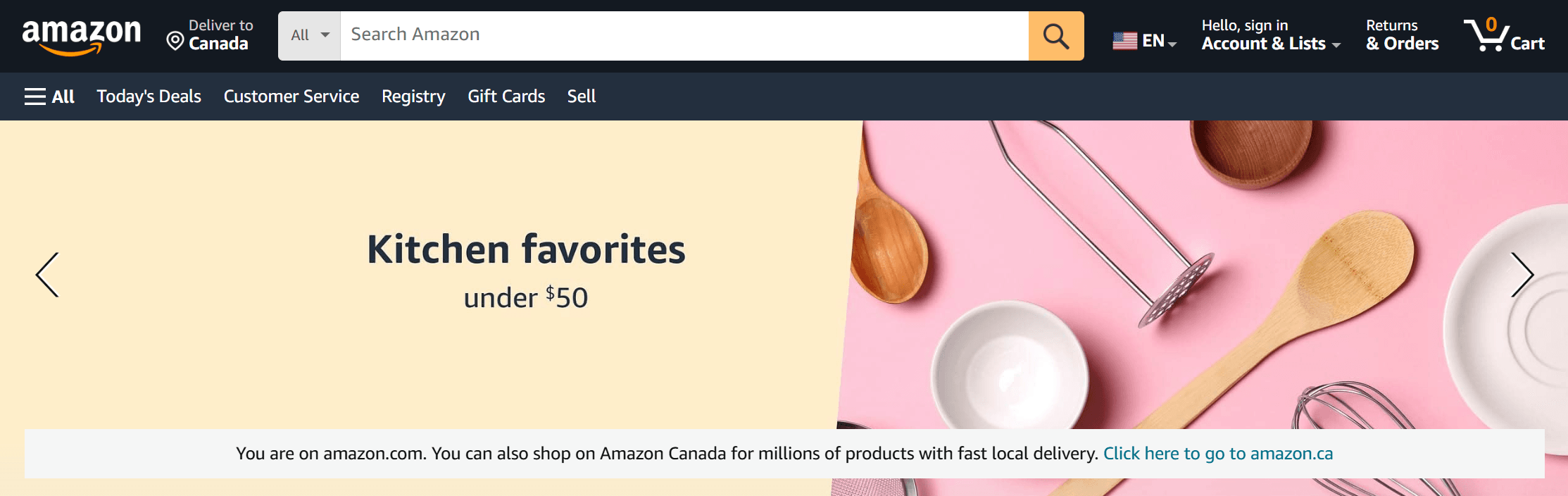
Amazon's Navigation Bar
Amazon's navigation bar is a prime example of a well-designed menu. Its horizontal layout, combined with clear and concise labels, makes it easy for users to navigate through the vast product catalog. The prominent search bar allows users to quickly find specific items, while the dropdown menus provide additional options and categories. The "Hello, [Name]" greeting adds a personalized touch, making the user feel welcomed and valued.
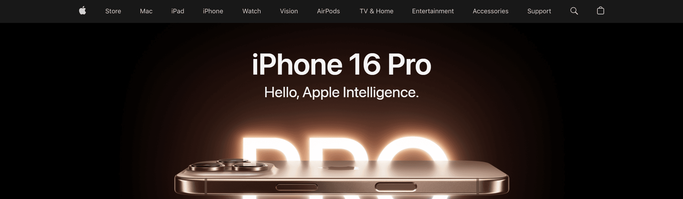
Apple's Navigation Bar
Apple’s navigation bar is simple yet powerful. It prominently features essential product categories like "Mac," "iPad," "iPhone," "Watch," and "TV," making it easy for users to find what they need. The use of a dropdown menu offers quick access to subcategories without cluttering the interface. The consistent branding and intuitive design ensure a seamless user experience.
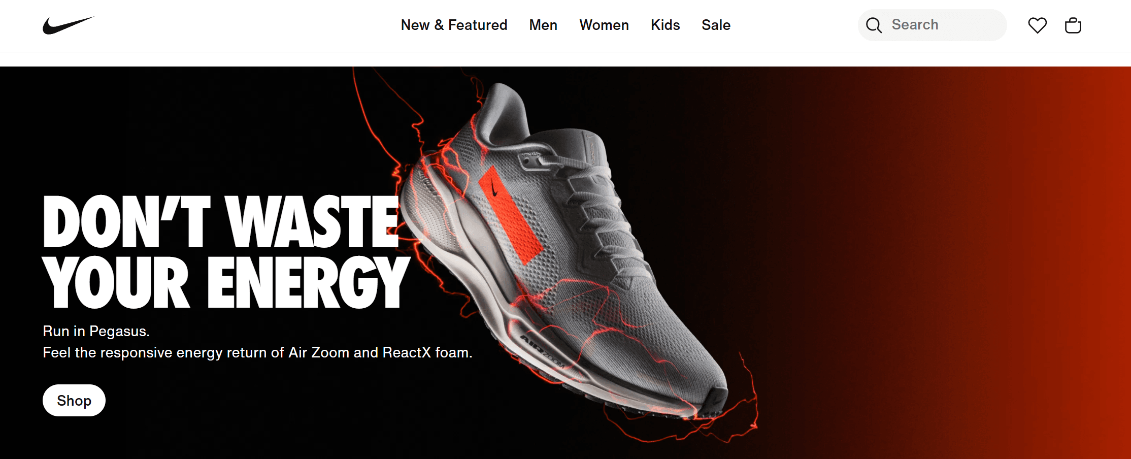
Nike's Navigation Bar
Nike's website navigation bar is a great example of effective design, featuring a clean layout with clear categories like “Men,” “Women,” “Kids,” and “Sale.” This organization makes it easy for users to find what they need quickly. The dropdown menus provide quick access to subcategories, especially for websites that have large number of subcategories like Nike.
Airbnb's Navigation Bar
Airbnb’s navigation bar encourages exploration with categories like “Icons”, “Amazing views”, “Amazing pools”, and more. The search function is highlighted, making it convenient for users to use the function when they need. The navigation also features type-based suggestions, which enhances user engagement and helps users discover new stays.

Common Mistakes to Avoid When Designing a Navigation Bar
Here are some common mistakes to avoid in navbar design to ensure a user-friendly experience:
1. Overcomplicating Navigation
Including too many links or categories on a website can confuse visitors. When there’s too much information, it can be hard for people to find what they’re looking for.
To make things easier, it's better to keep the number of categories small and straightforward. For more specific topics, using dropdown menus can help organize subcategories without overwhelming users. This way, people can navigate the website more easily and find the information they need without any hassle.
2. Inconsistent Labeling
One common mistake is using different words for the same idea, like saying "Products" in one place and "Goods" in another. This inconsistency can confuse people.
To solve this, it's important to use the same terms throughout the navigation bar. This helps people understand and find what they are looking for more easily. Keeping the language consistent makes the whole experience smoother and less confusing.
3. Neglecting Mobile Responsiveness
One common mistake when designing a website is creating a navigation bar that doesn't work well on smaller screens. This can make it hard for users on mobile devices to navigate the site.
To fix this, it's important to use a responsive design. This means designing the navigation bar to be user-friendly on all devices, especially mobile phones. A good way to do this is by using collapsible menus, which make the navigation bar clean and easy to use on small screens.
4. Poor Hierarchy and Organization
One common mistake is not having a clear hierarchy in design, which makes it difficult for users to find their way around. When everything looks the same, people can get confused about where to go or what to focus on.
To solve this, it's important to use simple visual cues like different font sizes or colors. These can help show which parts are more important than others, guiding users easily through the content.
5. Ignoring Search Functionality
One common mistake on websites, especially those with a lot of content, is not including a search bar. Without it, users can find it difficult to locate specific information they want. This can result in frustration and may cause them to leave the site.
To avoid this, it's important to include a search bar in the navigation bar. This makes it easier for users to find what they need without having to navigate through multiple pages.
6. Static Navigation on Scroll
One common mistake on websites is having a navigation bar that disappears when you scroll down the page. This can make it difficult for users to find their way around the site.
To solve this issue, you can use a sticky or fixed navigation bar. This type of navbar stays in place as users scroll, making it easy for them to access the menu at any time.
Conclusion
Navigation bar design can sound simple, but it plays a crucial role in the overall user experience. A well-made navigation bar can guide users through your website and make it easy for them to find what they're looking for. By avoiding common mistakes, you can create a seamless and enjoyable browsing experience for your audience.