When it comes to fonts, you have many options like Helvetica, Times New Roman, Georgia Bold, Bebas Neue and more. Before choosing a font that suits you, your brand, and your designs, it's important to know about different font categories. The main ones to understand are Serif and Sans Serif.
So, what's the difference between serif vs sans serif fonts? How does each category reflect your brand? And which designs work best with different fonts in each category? Let's explore serif and sans serif fonts to help you decide which one suits you and your designs best.
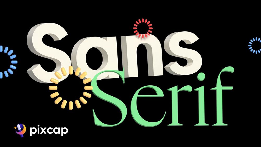
Serif vs. Sans Serif: What’s the Difference?
Serif fonts are characterized by the small lines or strokes attached to the end of their larger strokes in each letter or symbol. These decorative lines, or serifs, give the typeface font a classic and traditional feel, making it a popular choice for printed materials like books, newspapers, and magazines. Some well-known serif fonts include Times New Roman, Georgia, and Garamond.
On the other hand, sans serif fonts, as the name suggests ('sans' meaning without in French), lack these decorative lines. Sans serif fonts offer a cleaner, more modern look and are easier to read on digital screens. This makes them ideal for web design, digital advertisements, and any online content. Helvetica, Arial, and Calibri are examples of widely used sans serif fonts.
The choice between serif vs sans serif ultimately depends on the message you want to convey through your design. A serif font might be your go-to for conveying tradition and authority, while a sans serif font could be more appropriate for a fresh, modern vibe in your branding design.
Let's take a closer look at each font, and how they can complement your brand.
The Origin of Serifs
Serifs are those little decorative strokes you see on letters. They first appeared in the Latin Alphabet when people carved words into stone in Ancient Rome. The stone carvers followed brush marks, creating these serifs at the ends and corners of the strokes.
Serif fonts are often used in long texts in printed media like books, newspapers, and magazines because they are considered easy to read fonts. Times New Roman, Georgia, Palatino, and Garamond are some common Serif fonts. The main goal of using these fonts is to make your message clear and readable when you're trying to create something beautiful and eye-catching.
How to Use Serif Fonts Effectively
Serif fonts are often the go-to choice for printed material such as books, newspapers, and magazines, where their distinct serifs aid in the readability of long passages of text.
However, their use is more nuanced. Serif fonts are excellent for headlines or titles on websites or business cards where their formal and authoritative qualities can be leveraged. They're also effective in body text of e-books and online articles, where screen resolutions are high enough to render the details clearly.
In branding, serif typefaces can be used to convey a sense of tradition, reliability, and respectability, making them suitable for institutions such as banks, law firms, and educational establishments.
Serif fonts are also commonly used for luxury or natural products, as the serifs can give a sense of elegance.
Use elegant blue background with serif font for perfume product design.

Use green product display with serif font for natural products.

The Origin of San Serifs
Sans-serif font, known for not having decorative strokes, appeared much later than serif fonts. They started in the early 1800s when commercial printing and advertising needed simpler, eye-catching designs. The goal was to make typefaces that were clear and easy to read, even from far away. This led to fonts like Grotesque and Neo-grotesque, which paved the way for many modern sans-serif fonts.
In the 1900s, sans-serif font became popular for their modern, clean look that matched the graphic design trends of the time. They symbolized progress and were favored by businesses for their straightforward, no-nonsense style. As digital screens and graphic design software advanced, sans-serif fonts adapted to be very readable online, becoming essential for interfaces, digital ads, and web design.
How to Use Serif Fonts Effectively
Sans-serif fonts are ideal for modern and digital contexts, where their straightforward appearance enhances readability on screens. They are particularly effective for website content, mobile apps, and user interfaces, where a clean and uncluttered look is essential. Sans-serif fonts are also commonly used in logos and branding for companies aiming to project a modern, forward-thinking image.
In advertising and signage, the clear and bold nature of sans-serif typefaces makes them easily legible, even from a distance or at a glance, which is crucial for conveying messages quickly and effectively. For presentations and infographics, sans-serif fonts help maintain a clean and professional aesthetic, ensuring that information is communicated without unnecessary embellishments.
Educational materials that are designed with digital consumption in mind also benefit from sans-serif fonts, as they facilitate reading on devices such as tablets and laptops. Additionally, sans-serif fonts are often chosen for their neutral and inclusive feel in designs that aim to appeal to a broad audience.
Use this city bird park promotion marketing banner template.

Use buy 1 get 1 ads design template.

How to Make the Right Font Choice
Assessing Your Design Goals
Choosing the right font depends on what you want your design to say. Think about if you want to look serious and old-fashioned or modern and friendly. Also, where you'll use the design matters. For formal stuff like invitations, use a serif font, but for tech websites, go for sans-serif font.
Consider the type of design too. Serif fonts are good for printed material, while sans-serif works well on screens.
Remember who will see it. Young people like modern fonts, while older folks prefer old style, classic ones. Understanding these things will help you pick a font that matches your design goals.
Considering Your Audience Perception
Knowing what your audience likes and expects is crucial when picking a font. Different people may see serif typeface and sans-serif fonts differently based on their age and background. Older or academic folks might trust serif fonts more, while younger, tech-savvy people might prefer the simple look of sans-serif fonts.
It's also important to think about how easy it is to read the font for your audience. For example, if you're designing for seniors or people with vision problems, go for clear, easy-to-read fonts. In digital settings, like screens, sans-serif fonts are often better because they are easier to read with bright screens.
By using a font style that matches what your audience likes and needs, you can get more people interested and make sure your message is not just visible but also well-received and understood.
Determining the Message You Want to Convey
Serif fonts are formal, stable, and respected, great for serious or traditional messages. Sans-serif typefaces are modern and easy to read, perfect for clear and inclusive messages.
Think about how you want your audience to feel. Do you want them to trust you or feel modern and efficient? Also, where you use the font matters; like in ads, teaching, or business—it affects which font is best. The font should match your message and connect with your audience.
You may want to learn more about most popular graphic design fonts here.
How Big Brands Choose Between Sans Serif vs Serif
Major companies pay close attention to the style of writing they use in their logo designs and marketing plans. The type of font they choose can really impact how customers see them. For instance, The New York Times and Rolex go for traditional sans serif typefaces to show they're established, trustworthy, and top-notch. This matches their long histories and reputations for excellence.
On the other hand, companies that want to look modern, neat, and creative often go for sans-serif fonts. Big tech companies like Facebook and LinkedIn use sans-serif fonts in their logos to show they're all about staying connected, keeping things simple, and being part of the digital world.
Sometimes, brands change the fonts they use to keep up with the times and show they're moving in a new direction. Google and Spotify, for example, have switched to sans-serif fonts in their branding to show they're going for a more up-to-date and easy-to-understand look.
Deciding between serif vs sans serif typeface is a smart move that's based on what the brand stands for, the message they want to get across, and how they want people to see them in the competitive market.


