Looking to revamp your website with a fresh look? Split page designs can create a striking visual impact and enhance user engagement. But what makes a split page truly captivating? How do you balance creativity with functionality?
In this article, we’ll dive into 10 standout examples of split page designs that push the boundaries of conventional layouts. Discover how these designs effectively capture attention and inspire action, offering you innovative ideas to elevate your own site. Get ready to see how split page designs can transform your online presence!
What is a Split Page Webpage Design?
A split layout divides a webpage or screen into two or more distinct sections, each showcasing different content or functionality. This approach can highlight contrasting elements, streamline navigation, or create a visually dynamic experience.
The layout often features a prominent division, either vertical or horizontal, allowing users to engage with multiple pieces of information simultaneously. It’s a versatile design choice that can enhance user interaction by presenting varied content in a balanced and organized way.
Examples of Split Page Webpage Design
Here are ten websites that effectively utilize split page designs, each demonstrating different uses and advantages of this layout:
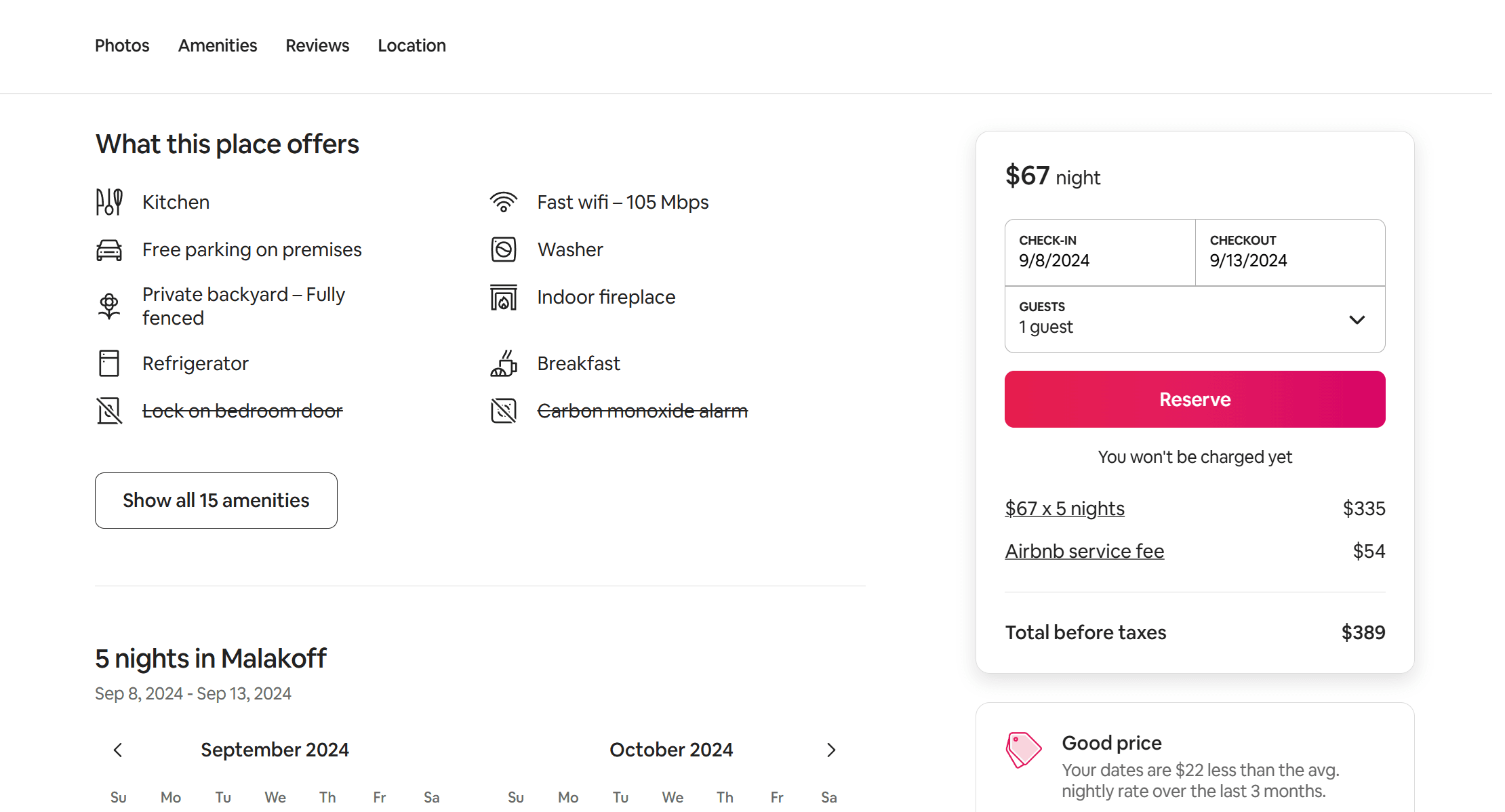
Airbnb
Airbnb effectively utilizes a split screen design on its property listing pages. When viewing a specific listing, the page is divided into two main sections. One side typically features detailed information about the property, including descriptions and amenities. The other side displays the reservation table, showing availability, pricing, and booking options. This layout allows users to easily browse the property details while simultaneously checking booking availability, making the reservation process seamless and intuitive. The split screen design facilitates user flows by guiding users through property details and booking options, enhancing the overall user experience.
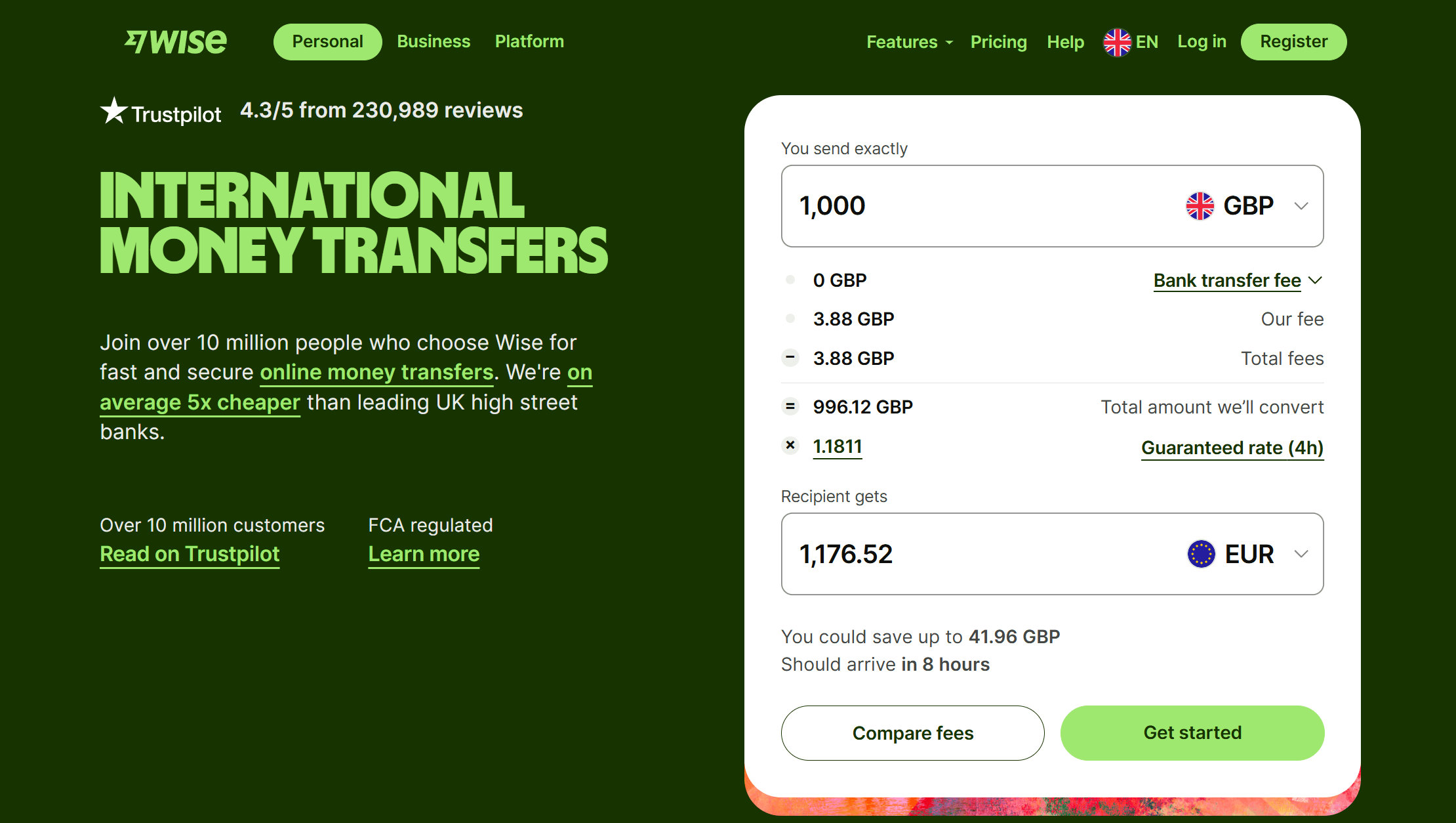
Wise
Wise effectively uses a split screen layout to balance content and a functional tool. The use of vertical columns in the split screen layout helps organize content effectively. On their converter tool page, one side highlights the advantages of using Wise for international money transfers, showcases positive customer testimonials, and encourages users to start their transactions. On the other side, the split screen features a practical currency converter, where users can input the amount they wish to send and view exchange rates and fees in real time.
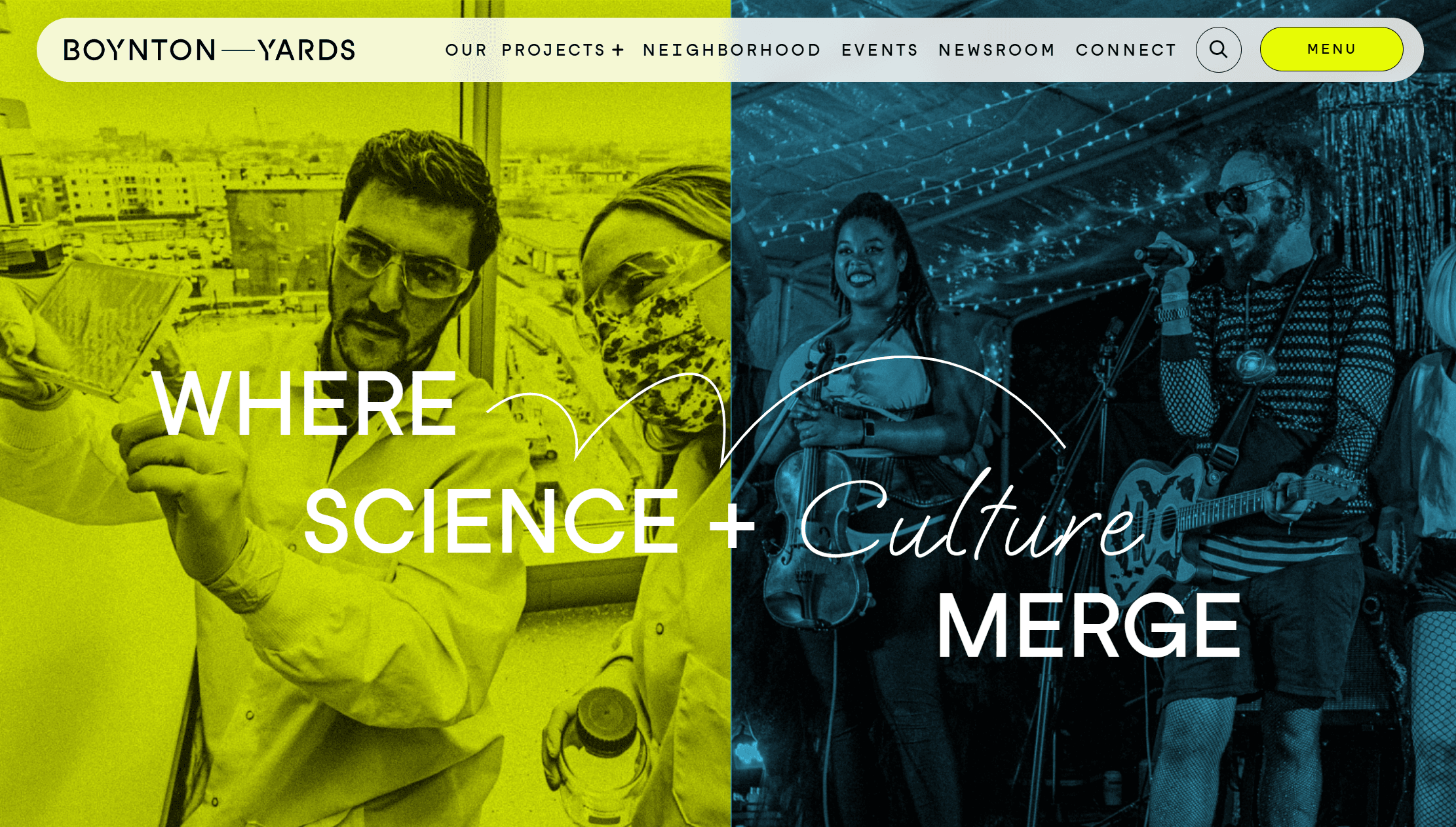
Boynton Yards
Boynton Yards uses a split screen hero section in their hero banner to effectively convey their unique theme. This visual split reinforces the headline “Where Science + Culture Merge,” emphasizing the integration of these two dynamic areas. The website’s design makes the most of the space by using two images that are visually distinct yet complementary, creating an engaging and memorable first impression.
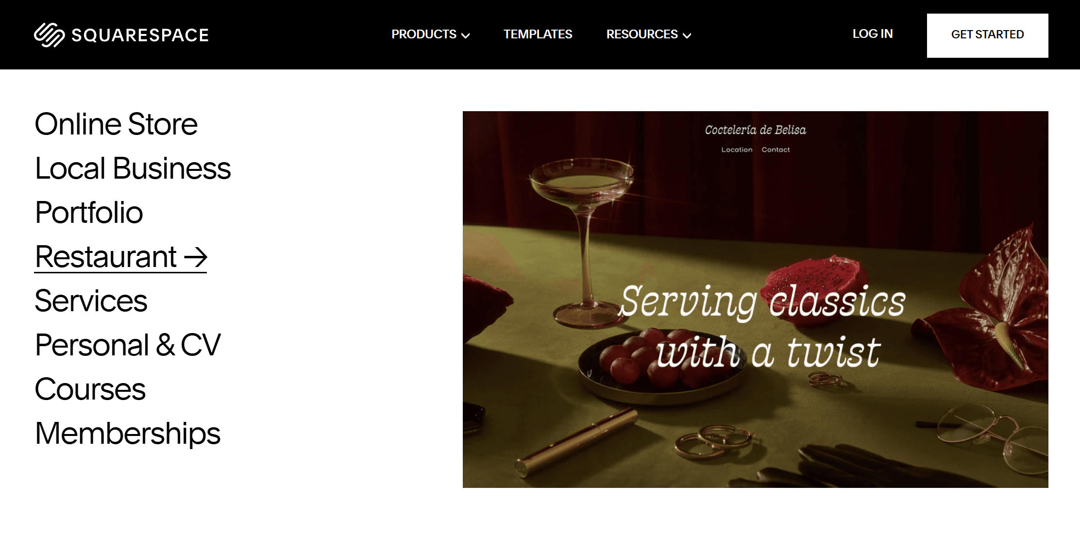
Squarespace
Squarespace uses a split screen design to effectively showcase its website templates and use cases. One side lists different use cases like portfolios, online stores, or services. When users click on a use case, the other side updates to display the corresponding website interface. This layout lets users see how the chosen template looks and functions in real time, helping them select the right design more easily. The split screen design enhances user experience by allowing different sections to respond independently as users scroll.
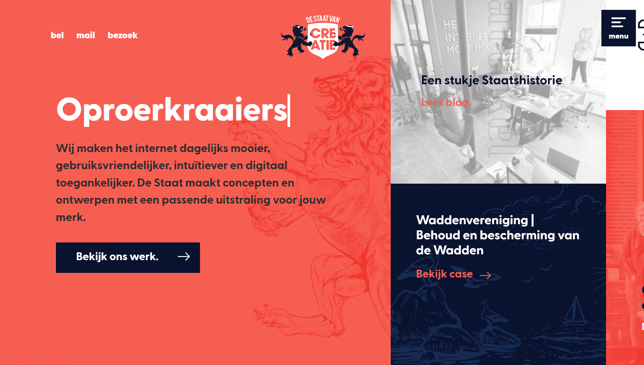
De Staat Van Creatie
This design studio website stands out by breaking the screen into more than just two sections. By using columns of varying sizes, it effectively highlights what’s most important first, providing more screen space for presenting important information. Plus, there are small animations and interactions that make the user experience feel special during their first visit. This strategy not only organizes information better but also creates a visually appealing and engaging experience!
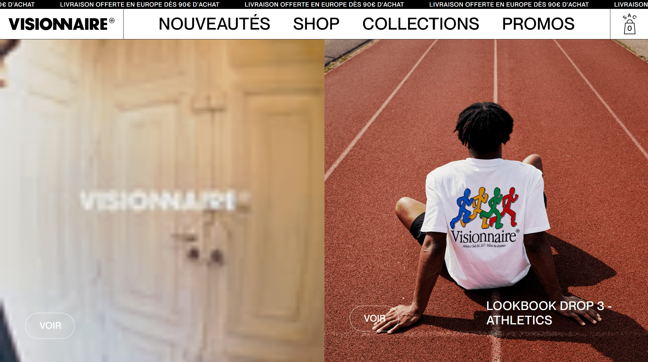
Visionnaire
Visionnaire is a laid-back clothing brand from Toulouse, known for its trendy and youthful style. Their online shop features a vibrant and modern look, starting with a split screen that showcases their latest collection. The website is well-organized: at the top, there’s a news ticker, followed by a clear menu for easy navigation. As you scroll down, you’ll find product categories displayed in neat, full-screen sections. This lively colour scheme and carefully arranged images create a fun yet orderly feel, making the shopping experience enjoyable and straightforward. The split screen design adapts seamlessly to mobile devices, ensuring a smooth shopping experience across different platforms.
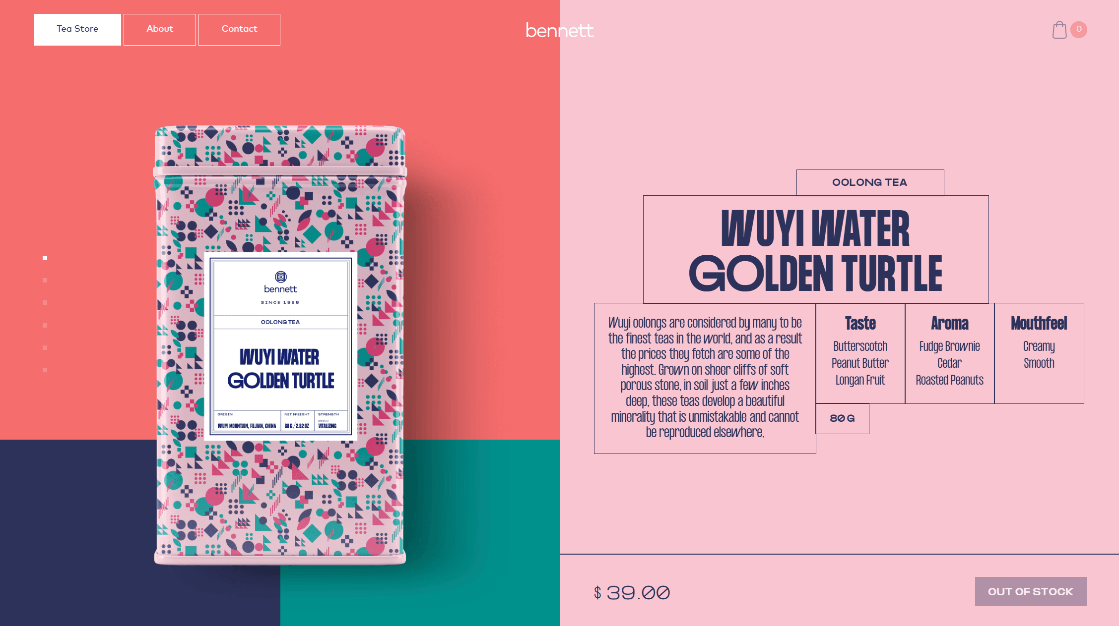
Bennett-tea
The Bennett Tea website is a great example of stylish web design, featuring a lovely mix of reds, pinks, and dark blues. The tea shop uses a split-screen slider layout: on the left, you can see a beautiful image of the tea tin, while the right side provides details about the tea’s origin, aroma, flavor, and texture. This layout maximizes screen space to present detailed information about the tea. As you scroll, the images slide seamlessly, one tea after the other, and the background of geometric shapes shifts in color and arrangement to match the tin’s design. This creates a vibrant and engaging experience for visitors!
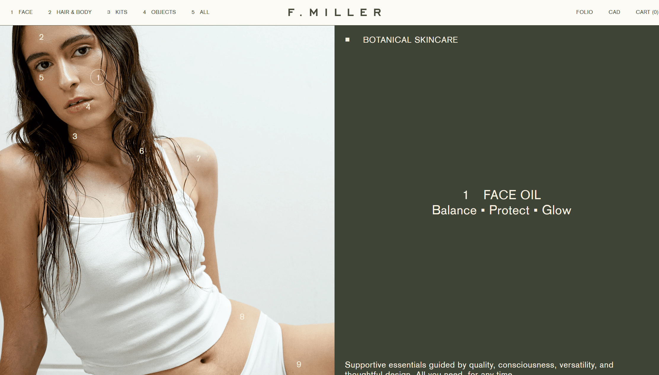
F. Miller
F. Miller website features a soft color palette of off-whites and light blues, creating a clean and airy feel. Thin lines neatly divide the content into sections, including a striking split screen that showcases a bold image alongside descriptive text. This sharp layout not only conveys seriousness but also enhances the site’s simplicity. Product images follow the same split-screen style, giving the site a magazine-like quality with well-organized, geometric sections influenced by the Swiss Style aesthetic. The split screen design contributes to the minimal website aesthetic by using a clean and organized layout.
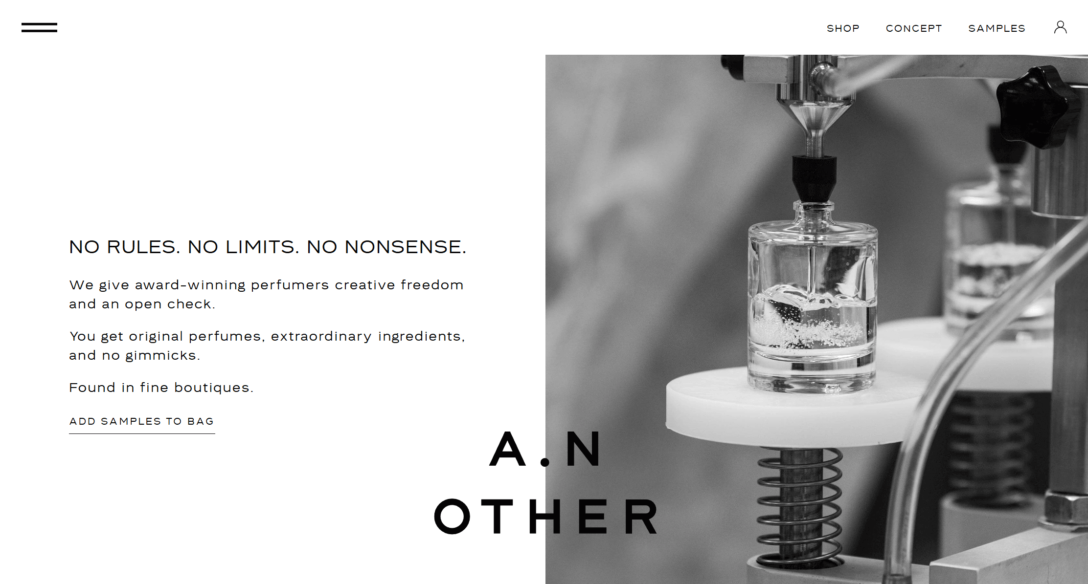
A.N. Other
This Miami-based perfume house embraces a unique motto: “No Rules. No Limits. No Nonsense.” Their website reflects this attitude beautifully. It’s clean and stylish, showcasing their fragrances alongside the stories of their creators. The homepage features a split-screen design where images and text alternate, giving it a fresh and airy feel without any clutter. The use of vertical split screen layouts creates a fresh and airy feel by alternating images and text. While the color scheme is minimalist, the layout keeps things exciting and aligns perfectly with the company’s bold philosophy.
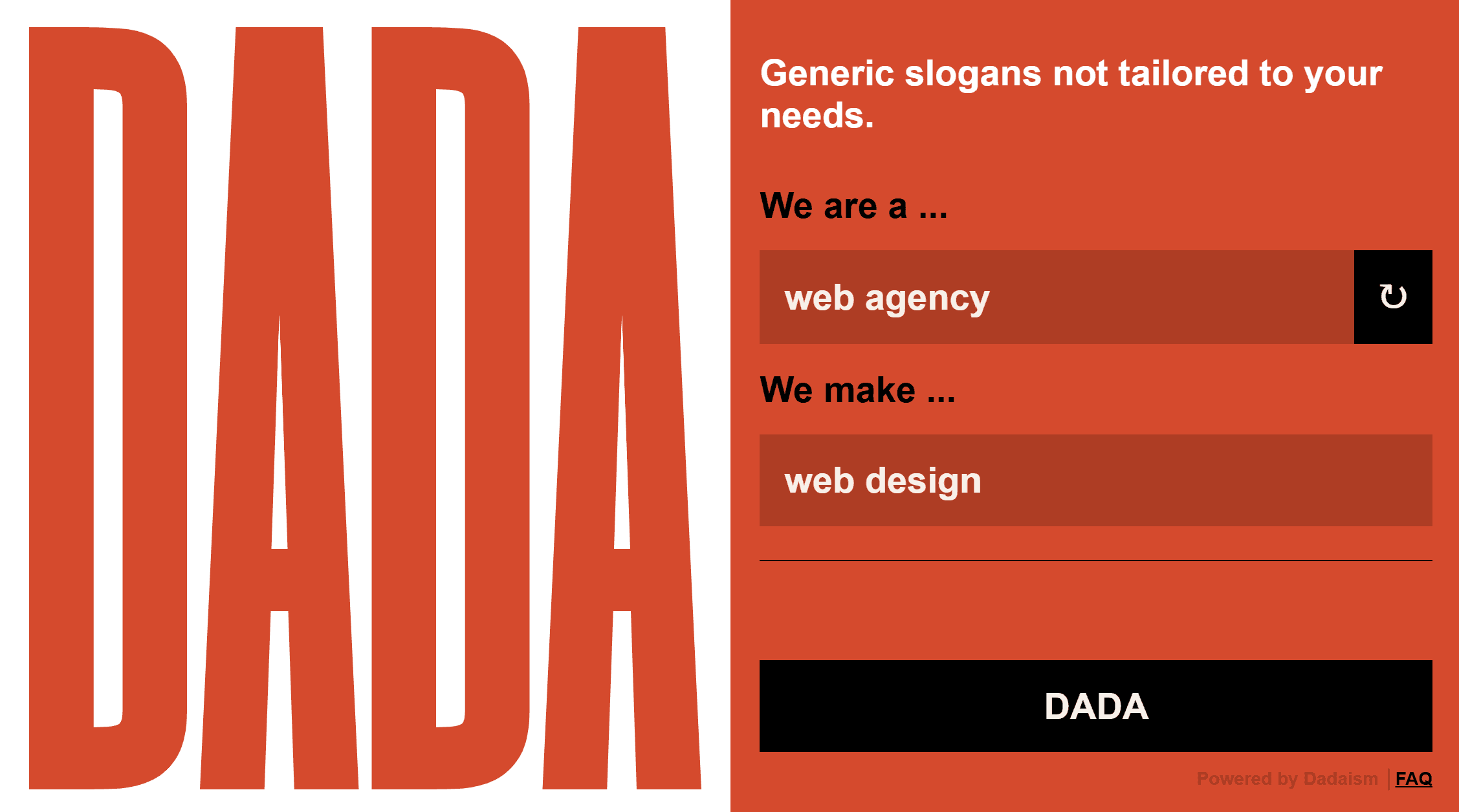
Corporate Dada
On this site, you’ll find a simple and efficient tool that generates headlines, even if they’re not specifically tailored to your unique needs. Surprisingly, these slogans can still pack a punch! The layout is user-friendly, with the logo prominently displayed on the left side, attracting attention and giving the site a polished look. Over on the right, visitors can easily generate and copy creative phrases that spark inspiration for their businesses. It’s a straightforward way to find just the right words to elevate your brand! Additionally, incorporating a video background can enhance the visual connection and create an immersive user experience.
Benefits of Using a Split Screen
Enhanced Visual Appeal
Split screens offer a modern and striking design by dividing the page into distinct sections, creating a clean look. This layout helps a website or app stand out, as the separation between areas adds unique aesthetics. A split screen hero section can enhance visual appeal by featuring contrasting content on either side.
For instance, a fashion retailer might use a split screen to feature summer and winter collections. One side could show bright summer styles, while the other highlights cozy winter wear. This approach makes each collection distinct and engages users with a dynamic, eye-catching presentation.
Improved User Focus
Split screens segment content, helping users focus on specific information without feeling overwhelmed. This layout allows easy comparison of different sections, enhancing decision-making. Split screens also facilitate user flows by guiding users through different sections of content.
For example, a tech comparison site could use a split screen to display two smartphones side-by-side, each section showing one model’s specs and features. This direct comparison helps users quickly understand differences and make informed choices without excessive scrolling or navigation.
Efficient Use of Space
Split screens maximize the use of available space by allowing multiple types of content to be displayed simultaneously. This design prevents the page from feeling cluttered and ensures that important elements are easily accessible. Additionally, split screens provide more screen space for displaying multiple types of content simultaneously.
You must have seen a travel website use one half of the screen for a search bar and the other half for a vibrant image of a destination. This layout effectively combines functionality with appealing visuals, making it easier for users to start planning their trips while being inspired by stunning imagery.
Increased Engagement
The interactive nature of split screens encourages users to engage with multiple elements. By presenting varied content in a balanced way, split screens help users explore different sections easily. Split screens enhance engagement by allowing different sections to respond independently as users scroll.
For instance, an online learning platform might use a split screen to showcase two courses. One side could offer a course preview with key details, while the other highlights student testimonials and success stories. This layout prompts users to explore both aspects, potentially increasing interest and enrollments.
Better Organization
Split screens effectively organize content, making navigation easier for users. By dividing the page into clear sections, this layout enhances user experience through structured information presentation. The use of vertical columns in split screens helps organize content and enhance user attention.
A news website might use a split screen to separate breaking news from featured stories. One side could show the latest headlines concisely, while the other presents in-depth articles and multimedia. This setup allows users to quickly access urgent updates and explore detailed stories.
Design Principles for Effective Split Screen Layouts
Clear Division
Ensure the division between the split sections is visually distinct to avoid confusion. Use contrasting colors, borders, or spacing to create a clear separation. For example, a vertical line or different background colors can help users easily differentiate between the two areas, making navigation straightforward.
Balanced Visuals
Maintain visual balance so that neither side overpowers the other. Both sections should be given equal prominence through consistent image sizes and text formatting. This balance ensures that users engage with both sides of the split screen equally, creating a harmonious design.
Complementary Content
Ensure that the content on each side of the split screen complements each other to provide a cohesive experience. This means that while the sections may feature different elements, they should support a unified message or purpose. For example, if one side highlights a product’s features, the other might show customer reviews or related benefits, enhancing the overall narrative.
Responsive Design
Design the split screen layout to be adaptable across different devices and screen sizes. The layout should adjust seamlessly to mobile, tablet, and desktop views, ensuring that it remains functional and visually appealing on all devices. This might involve stacking the sections vertically on smaller screens or adjusting their size.
Use mockups to see how your design will look in different devices. Browse all mockups here!
Effective Use of Imagery
Use high-quality, relevant images that enhance the content and support the layout’s purpose. Each image should be visually compelling and directly related to the content of its respective section. This helps users connect with the content and improves the overall visual impact of the split screen.
Readable Typography
Ensure that all text is legible and appropriately sized within each section. Use clear, readable fonts and ensure good contrast between text and background. Proper typography enhances readability and ensures that important information is easily accessible.
Strategic Use of White Space
Utilize white space effectively to prevent the design from feeling cluttered. Adequate spacing around text and images helps focus user attention on key elements and improves overall readability. White space creates a clean, organized look that enhances user experience.
Purposeful Layout
Design the split screen layout with a clear, intentional purpose that aligns with the overall goals of the page. Whether for comparison, showcasing different features, or presenting related content, the layout should support its intended function and provide a meaningful user experience.
Best Practices for Split Screen Web Design
Using Split Screens to Tell a Story
Split screen layouts can be utilized to tell a story or convey a message in an interactive and engaging way. By using images and text side by side, users are able to visually connect with the content and easily follow the narrative being presented.
Creating Interactive Experiences
A split screen layout allows for creativity in design and can be used to create interactive experiences for users. This could include hover effects, image sliders, or other interactive elements that enhance user engagement.
Enhancing User Decision Making
Split screens are commonly used in e-commerce websites to showcase different products or features side by side. This allows users to easily compare options and make informed decisions. The use of a split screen layout can also be effective in other industries such as real estate, where multiple properties or locations can be displayed simultaneously for easy comparison.
Conclusion
Split page designs enhance user experience by organizing content and creating engaging contrasts. They effectively showcase different aspects of a site or product, improving interaction and decision-making. However, avoid split screens when simplicity and focus are crucial, like on content-heavy pages or sites needing a unified message. Knowing when to use split designs ensures they add value without overwhelming users, making them a powerful tool in web design when used appropriately.