When it comes to design, the choice between symmetry vs asymmetry plays a crucial role in defining the aesthetic appeal and overall impact of a project. The balance between these two elements can significantly influence the visual harmony and dynamic energy of a design. Recalling basic design principles, such as understanding symmetry and asymmetry, is essential for making informed design decisions.
In this exploration of symmetry vs asymmetry in design, we will delve into the principles, benefits, and applications of both approaches, shedding light and examples on how each can be utilized to create engaging and captivating visual compositions. Let’s unravel the fascinating interplay between various types of symmetry and asymmetry in the world of design.
What Is Symmetry in Design?
The Core Definition
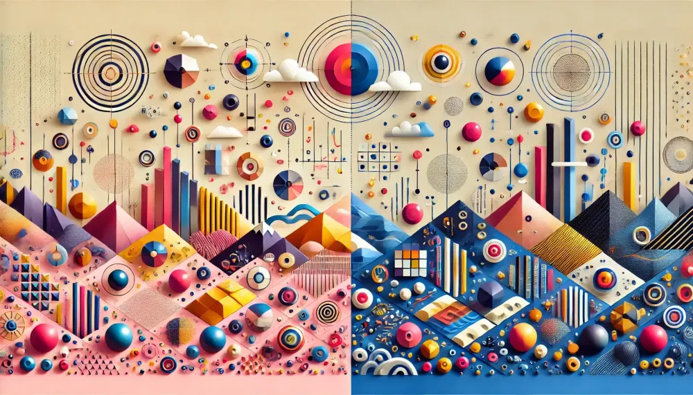
Symmetry in design refers to creating a balanced and proportionate composition by arranging elements in an equal or mirrored fashion. This approach often results in a sense of order, stability, balance and harmony. Symmetry can be achieved through various axes: the vertical axis, horizontal, rotational, or radial
Rotational symmetry involves visual elements rotating around a center at any angle, conveying a sense of motion, dynamic action, or speed, and is often seen in natural forms like the petals of a sunflower. Radial symmetry, where all visual elements rotate around a center at any angle, is used by designers to portray motion and visualize data in an interesting way, such as to infer progress or movement.
When elements on one side of mirror image of an axis are mirrored or duplicated on the other side, it creates visual balance. This technique is widely used in architecture, graphic design, and art because it is pleasing to the eye and easy to process.
Symmetrical designs are often perceived as formal and elegant, making them suitable for projects that require a sense of professionalism and reliability. However, over-reliance on symmetry can sometimes lead to predictability and lack of interest, which is why understanding its principles is crucial for effective application.
Advantages of Symmetrical Balance Layouts
Symmetrical layouts appeal to users who appreciate elegance and sophistication, as they communicate stability, harmony, and order, making them ideal for a professional portfolio or when seeking a more serious aesthetic. First and foremost, they provide a sense of balance and order, which can make a design feel more harmonious and cohesive.
This can be particularly beneficial in fields like architecture and web design, where a clear, structured layout enhances user experience. Symmetry also tends to be more visually appealing because it is naturally easy for the human eye to follow and understand.
Additionally, symmetrical designs can convey a sense of stability and reliability, making them ideal for corporate branding and professional settings. Another advantage is the ease of creating consistent and predictable patterns, which can save time and effort during the design process.
However, while symmetry has many benefits, it is essential to use it thoughtfully to avoid creating designs that feel monotonous or overly rigid.
When Symmetry Falls Short
While symmetry has its merits, it is not always the best choice for every design scenario. One significant drawback is that symmetrical layouts can sometimes appear too predictable or boring.
When every element is mirrored, the design may lack the dynamism and intrigue that asymmetry can offer. Additionally, strict adherence to symmetry can constrain creativity, limiting the designer's ability to experiment with unconventional layouts and ideas.
In some contexts, such as artistic compositions or modern advertisements, the rigidity of symmetry might not convey the desired emotional impact or uniqueness. Moreover, over-reliance on symmetrical designs can make circular logo of a brand appear outdated or unimaginative.
Therefore, understanding when to deviate from symmetry is crucial for creating designs that are not only visually balanced, but also engaging and innovative. It's essential to evaluate the project's goals and audience to determine whether a symmetrical approach is the most effective choice.
What Is Asymmetry in Design?
The Core Definition
Asymmetry in design introduces a sense of movement and unpredictability, making compositions more dynamic and engaging. Unlike symmetrical designs, which can sometimes feel static, asymmetrical layouts draw the viewer's eye across the design in a more fluid and natural manner.
This approach can create a focal point and generate visual interest, making the focal points of the design more memorable. Asymmetry allows designers to play with scale, contrast, and positioning to achieve a balanced yet unbalanced look.
This method is particularly effective in modern and contemporary designs, where uniqueness and originality are highly valued. By breaking away from traditional symmetry, designers can convey a sense of spontaneity and creativity.
This can be especially appealing in marketing materials, art, and editorial designs, where capturing attention is crucial. Embracing asymmetry can result in innovative and captivating visuals that stand out in a crowded marketplace.
Advantages of Asymmetrical Layouts
Asymmetry serves as a dynamic force in design by introducing elements of surprise and excitement. Unlike symmetrical designs, which often emphasize uniformity, symmetry and order, asymmetrical balance layouts leverage imbalance to create tension and interest.
This dynamic quality can make individual elements of a design feel more alive and engaging, capturing the viewer’s attention more effectively. Asymmetry allows designers to experiment with unconventional arrangements, leading to innovative and unique compositions. In contrast, translational symmetry involves repeating visual elements across a location in space, creating rhythm and conveying a message. It can be used to create background patterns in web design and is an active element that can convey motion, speed, and dynamic action.
This approach can highlight specific elements within a design, directing the viewer’s focus where it matters most. Additionally, asymmetry can convey a sense of modernity and edginess, making it a popular choice in contemporary art, fashion, and branding.
By using asymmetry thoughtfully, designers can achieve a visually compelling balance that feels natural and spontaneous. This approach not only enhances aesthetic appeal but also adds depth and complexity to the overall product design, making it more impactful and memorable.
Challenges of Asymmetric Design
While asymmetry can bring dynamism and uniqueness to a design, it also presents several challenges. One of the primary difficulties is achieving a sense of balance without the natural mirroring that symmetry provides.
Designers must carefully consider the placement, visual weight of, and proportion of each element to ensure the composition feels cohesive and not chaotic. This requires a keen eye and a deep understanding of visual hierarchy.
Additionally, asymmetrical designs can sometimes confuse or overwhelm viewers if not executed thoughtfully. The lack of predictable patterns may make it harder for the audience to navigate and interpret the design. Moreover, asymmetry might not be suitable for all types of projects, particularly those requiring a formal or professional tone.
Striking the right balance between creativity and clarity is key to overcoming these challenges. Therefore, while asymmetry offers exciting possibilities, it demands a high level of skill and deliberate planning to be effective.
Symmetry vs Asymmetry in Design: Choosing Your Styles
Context for Visual Weight and Balance
When deciding between symmetry and asymmetry in design, context plays a crucial role. The project's goals, target audience, and intended message should all influence the choice. For instance, in corporate branding or formal invitations, symmetrical designs often convey professionalism, reliability, and order, making them suitable for such contexts.
On the other hand, marketing campaigns for creative industries, fashion, or modern art might benefit more from the dynamic and engaging nature of asymmetrical layouts. Additionally, the context of use—such as print, digital, or environmental design—can dictate which approach will be more effective.
For example, website designs might employ asymmetry to create an interactive and visually stimulating user experience, while printed materials might favor symmetry for clarity and ease of reading. Understanding the specific needs and expectations of the audience is essential in making an informed decision between these two design principles, ensuring the final composition resonates effectively.
The Impact on User Experience
The choice between symmetry and asymmetry in design significantly impacts user experience. Symmetrical designs often provide a sense of predictability and ease, which can enhance usability and accessibility.
Users can quickly navigate symmetrical layouts, finding them intuitive and straightforward. This is particularly beneficial for websites, apps, and interfaces where user efficiency is paramount. Conversely, asymmetrical designs can create a more engaging and stimulating experience.
They can guide users’ attention to specific elements and encourage exploration, making the interaction more memorable. However, if not carefully executed, asymmetry can lead to confusion, causing users to struggle with navigation.
Therefore, the impact of these design choices on user experience depends on the context and execution. Striking the right balance is crucial; designers must consider how their choices will affect user satisfaction and behavior, ensuring that the design serves its intended purpose while providing a positive experience.
When to Use Symmetry and Asymmetry
In some cases, the most effective design approach involves blending symmetry and asymmetry. Combining both principles can create a balanced yet dynamic composition, capitalizing on the strengths of each.
For example, a website's overall structure might use symmetrical layouts to provide a sense of stability and ease the navigation, while incorporating asymmetrical elements in specific areas to draw attention and add visual interest.
This approach allows designers to maintain a clear and organized framework while introducing unique, engaging features. Mixing symmetry and asymmetry can also be effective in branding, where the logo might employ symmetrical design for consistency, while marketing materials use asymmetrical layouts mirror images to capture attention.
By thoughtfully integrating both techniques, designers can achieve a harmonious balance that meets functional requirements and captures the viewer's interest. This strategy requires careful planning and a nuanced understanding of both principles to ensure a cohesive and effective design.
Case Studies: Symmetry and Asymmetry in Action
Iconic Symmetrical Designs
Symmetrical designs have been used to create some of the most iconic and enduring visuals in various fields. Take the Taj Mahal, for instance, one of the most famous examples of symmetrical architecture. Its mirrored elements and symmetrically balanced, proportions create a sense of grandeur and harmony, making it a timeless masterpiece.
In graphic design, the Apple logo exemplifies the power of symmetry. Its clean, balanced form is instantly recognizable and conveys a sense of reliability and simplicity. The symmetry in these designs not only enhances their aesthetic appeal but also contributes to their memorability and effectiveness.
Similarly, the layout of traditional print newspapers often employs symmetry to facilitate easy navigation and readability.
These examples demonstrate how symmetrical design can be used to create impactful and enduring visuals, providing a sense of order and balance that resonates with audiences across different contexts.
Asymmetry in Award-Winning Layouts
Asymmetry has been a defining feature in many award-winning designs, bringing a sense of dynamism and originality to the table. For example, the magazine layouts of Wired and Vogue often use asymmetry to create visually striking and engaging compositions.
These layouts strategically place elements off-center, use varied sizes, and incorporate unexpected negative space to guide the reader’s eye through the content in a fluid, interesting way. In web design, sites like Apple and Airbnb have received accolades for their innovative use of asymmetry, blending text, images, and interactive elements in a way that feels both modern and user-friendly.
These examples show how asymmetry can break the mold of traditional design, offering fresh perspectives and capturing attention. By skillfully managing imbalance, designers can create layouts that are not only aesthetically pleasing but also memorable and impactful, setting their work apart in competitive fields.
Practical Tips for Mastering Design Symmetry and Asymmetry
Starting with Symmetry: A Safe Bet for Beginners
For beginners, starting with symmetry can be a practical and less daunting approach to mastering design. Symmetrical layouts offer a straightforward way to understand basic design principles like balance, proportion, and alignment.
By mirroring elements across an axis, designers can create cohesive and aesthetically pleasing compositions with less risk of error. This foundational knowledge provides a solid base from which to experiment and evolve.
Symmetrical designs also allow beginners to focus on other important aspects, such as color schemes and typography, without getting overwhelmed by complex arrangements. Tools like grid systems and templates can aid in achieving perfect symmetry throughout, making the learning process smoother. As novices become more comfortable with symmetrical designs, they can gradually introduce asymmetrical elements to add diversity and dynamism to their work.
Starting with symmetry thus serves as a stepping stone, helping beginners build confidence and technical skills before tackling more complex, asymmetrical compositions.
Tips in Experimenting with Asymmetry
For those ready to push the boundaries, experimenting with asymmetry can lead to innovative and eye-catching designs. One effective tip is to focus on balance rather than mirroring. Even in asymmetry, the visual weight of elements should be distributed in a way that feels cohesive.
Play with contrasting sizes, colors, and textures to create focal points and guide the viewer's eye. Negative space is another powerful tool; using it strategically can enhance the sense of movement and create rhythm and flow within the design.
Additionally, asymmetry allows for more creative freedom with layouts, so don't be afraid to break conventional rules and try unconventional placements. However, it's essential to maintain clarity and usability, especially in user interfaces.
Start with small, calculated asymmetrical elements and gradually introduce more complexity as you gain confidence. This approach ensures that your design remains engaging without becoming chaotic, striking a perfect balance between creativity and functionality.
Common Mistakes to Avoid in Design Balance
When aiming for balance in design, whether symmetrical or asymmetrical, several common pitfalls can derail your efforts. One major issue is overcomplicating the layout.
Adding too many elements can make the design feel cluttered and overwhelming, detracting from its overall effectiveness. Another pitfall is neglecting the importance of visual hierarchy. Without a clear focal or central point, the viewer's eye can struggle to navigate the design, leading to confusion and disengagement.
In symmetrical designs, an unbalanced composition with excessive reliance on mirroring can result in monotonous and predictable layouts. Conversely, in asymmetrical designs, a lack of balance can make the composition feel chaotic and disjointed.
Additionally, ignoring negative space can make the design appear cramped and uninviting. To avoid these pitfalls, always prioritize clarity, simplicity, and purposeful placement of elements. Regularly step back and assess the overall balance of your design, ensuring it remains visually appealing and functional.


