Colors are not just aesthetic choices—they carry meaning, emotion, and can significantly affect the perception of a product or brand. Basic understanding starts with primary colors (red, blue, and yellow), which are the building blocks of all other hues. Mixing these primary colors, we get secondary colors (green, orange, and purple), adding more variety and depth to our designs.
So what are tertiary colors? How to create them, and how to use them in design? In this guide, we will define tertiary colors and explore ways to incorporate them into your designs.
Understand Primary and Secondary Colors
First, let's review the basics of primary and secondary colors.
Primary colors are the fundamental hues that serve as the building blocks for all other colors. When working with paint or ink, artists identify the primary colors as red, yellow, and blue (RYB), while digital artists working with direct light recognize red, green, and blue (RGB) as their primary colors. Although there are reasons behind this distinction, we won't delve into them here.
What's crucial is that these three primary colors form the basis of every other hue and shade in the spectrum.
By blending equal amounts or mixture of two, primary colors, artists create secondary colors. For instance:
Yellow mixed with red yields orange.
Yellow mixed with blue creates green.
Blue mixed with red produces purple.
This principle results in the three secondary colors for artists using pigmented media: orange, green, and purple. Conversely, digital artists work with cyan, magenta, and yellow as their secondary colors.
What are Tertiary Colors?
Tertiary colors are made when you mix a primary color with a secondary color.
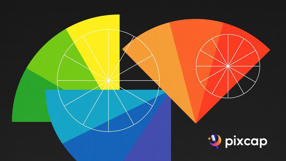
This mixing of colors creates a combination of new ones that are unique and different. Imagine you have a color wheel in front of you. On this wheel, there are three main colors you probably know well - red, blue, and yellow. These are called primary colors.
Then, there are secondary colors that we get by mixing these primary colors, like green (made from blue and yellow), orange (made from red and yellow), and purple (made from red and blue).

When we mix a primary color with one of these secondary colors, we get what's called tertiary colors or intermediate colors.
For example, mixing red (a primary color) with orange (a secondary color) gives you a color called 'red-orange'. This is a tertiary color. There are six of these tertiary colors in total - red-orange, yellow-orange, yellow-green, blue-green, blue-purple, and red-purple.
Or you may have heard about more creative names like: teal, chartreuse, vermilion, magenta, violet, and amber. Despite their names, a genuine tertiary color results from blending equal portions of a primary color with a secondary color. For those who work with RBG colors, the fancy names of tertiary colors are azure, violet, rose, orange, chartreuse and spring green.
Why Use Tertiary Colors?
When you use tertiary colors, it makes your colors blend well together. For example, if you paint with blue-purple, red-orange, and yellow-orange, they all have common starting colors. Red and yellow create orange, while red and blue make purple. Primary colors are close together on the color wheel, like red and yellow. Blue is opposite these on the wheel.
Using tertiary colors makes your art vibrant and eye-catching. By combining secondary and tertiary colors, you can create a balanced artwork that isn't too bold. Working with tertiary colors makes you carefully consider your color choices. Instead of using colors randomly, you can enhance your art by planning where to use each color. This approach can improve your composition, as colors and composition are closely linked.
Using tertiary colors helps you create a harmonious artwork with limited but well-matched colors. It can lead to vivid colors, so it's good to balance the color mixing them with more muted shades.
Color Harmony with Tertiary Colors
To achieve color harmony, understanding color theory and the relationship between colors on a wheel is crucial.
Tertiary colors are essential to creating interest and unity in your artwork. For example, you can use analogous tertiary colors for an exciting, yet harmonious effect. Analogous colors are next to each other on the color wheel, like red-orange, orange, and yellow-orange.
On the other hand, tertiary colors can also create contrast when paired with complementary colors. Complementary colors are opposite each other on the color wheel, such as blue and orange or green and purple. By using a tertiary color like chartreuse with its complementary color red-violet, you can create an eye-catching artwork with a strong visual impact.
Tips for Using Tertiary Colors
When you use tertiary colors (also called intermediate colors), remember:
Tertiary colors can make your images look very bright, especially if you use intense paints. To make them less bright, add white, burnt sienna, or black.
If your artwork still looks too bright, try mixing two secondary colors together to create a new tertiary color.
Instead of using all the tertiary colors, choose just two or three combinations. For example, yellow-orange, yellow-red, and blue-green.
Conclusion
Tertiary colors play a vital role in creating balance, harmony, and interest in your artwork. By understanding tertiary colors and their relationship with primary and secondary colors, you can use them to enhance your composition and make your art stand out. So next time you're working on a project, don't forget to consider tertiary colors!


