Creating a great user experience is essential for websites and applications. One way to enhance this experience is through effective UI notifications, which inform users about important actions, updates, or errors in a clear and friendly way. When executed well, they can guide users smoothly through tasks and keep them engaged.
In this article, we’ll explore various UI notification examples that enhance UX design. By understanding and applying these examples, you can make your site or app more user-friendly. Let's dive in and discover how to create impactful notifications!
What are Notifications and Their Purpose?
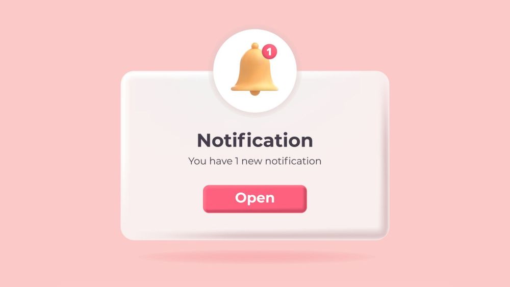
Notifications are messages or alerts that let users know about important events, updates, or actions they need to pay attention to. Their main job is to provide users with timely and relevant information, enabling users to accomplish tasks efficiently without needing to open the app, which helps improve their experience and keeps them engaged with an app.
Notifications can serve different purposes. They can remind users to take action, give feedback on something they’ve done, or provide updates about how the system is working.
Good notification design is very important for a positive user experience. If notifications are well-designed, they can enhance the user’s perception of the app; if they’re not, they can lead to frustration and confusion.
5 Types of Notifications & UI Notification Examples
In-Browser Notifications
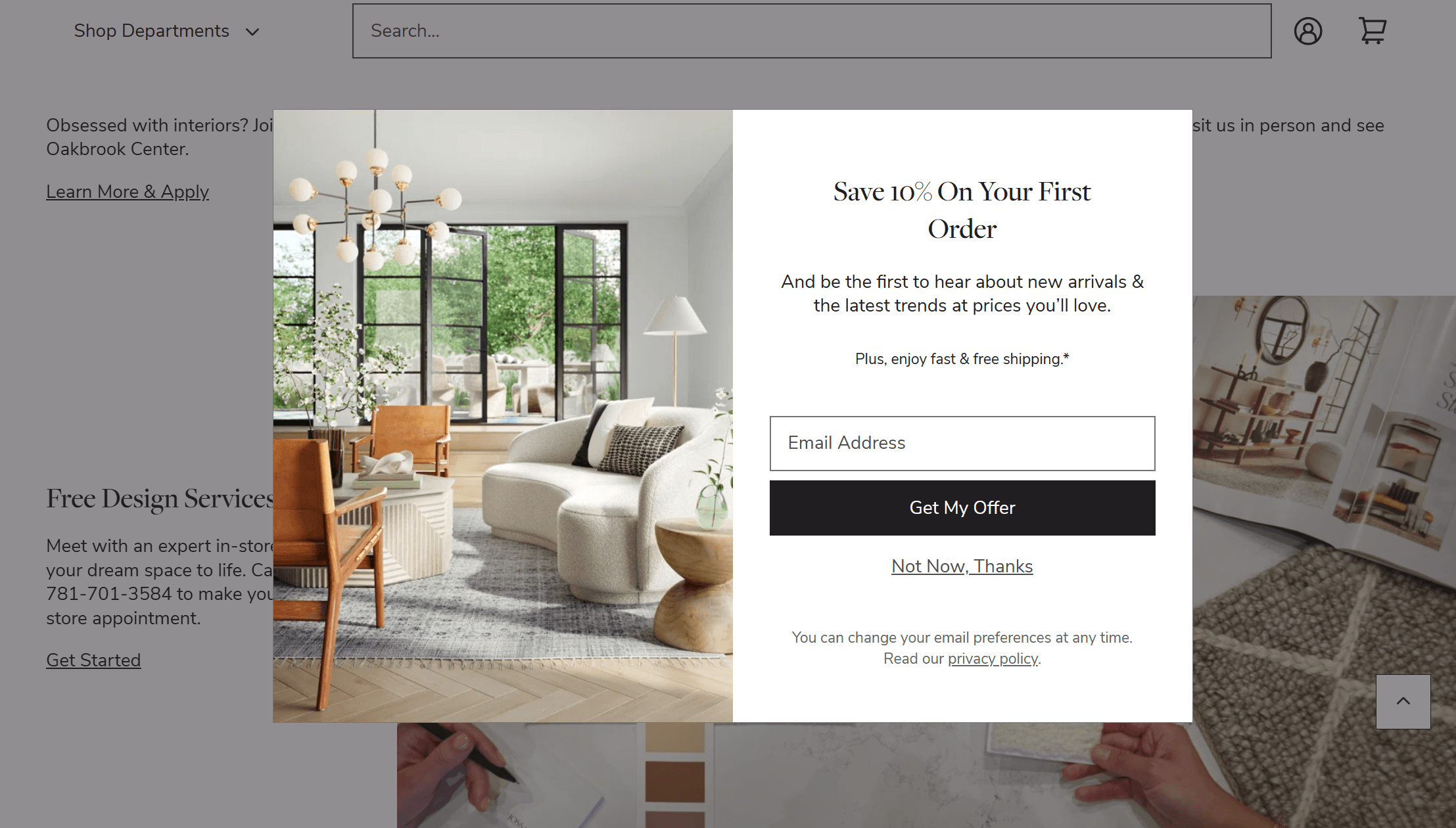
In-browser notifications appear as pop-up messages on a user’s browser window. They are similar to push notifications but only work when the user is actively using the app in their browser.
These notifications can be used for important updates, reminders, or calls-to-action that require immediate user attention. They are commonly used by e-commerce sites to inform users about discounts, sales, email marketing, or new products.
In-app Notifications
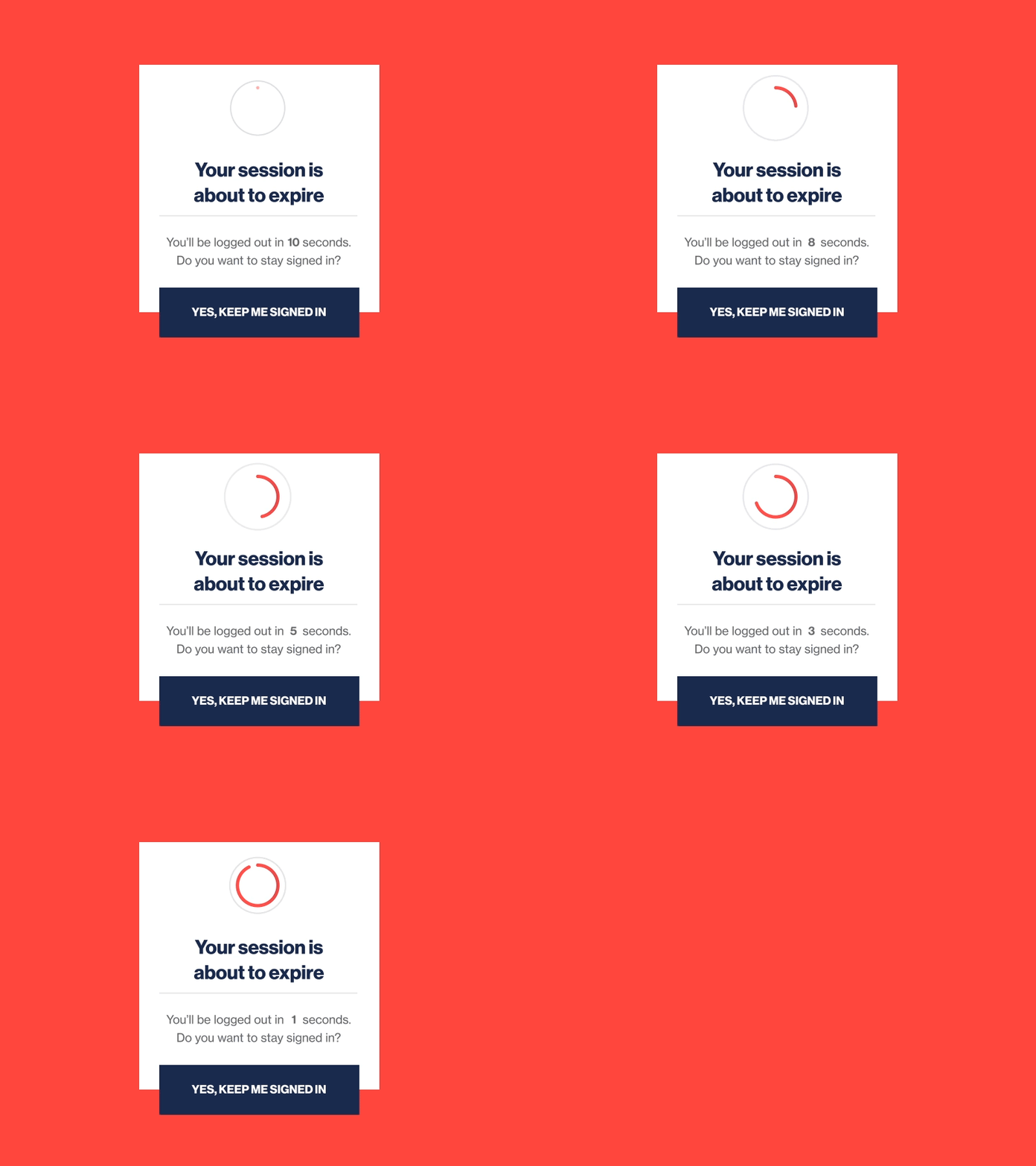
Toast notifications, snackbars, and dialog boxes are all types of pop-up notifications that appear on the screen while a user is using an app.
Toast notifications typically appear at the bottom of the screen and disappear after a few seconds. They are commonly used for non-critical updates or events, such as when a file has been successfully saved.
Snackbars also appear at the bottom of the screen but can be dismissed by the user. They are often used to provide feedback on an action taken by the user, such as when a form has been submitted.
Dialog boxes are larger pop-up windows that require interaction from the user before they can continue using the app. They prompt users for important alerts or warnings, such as when an error has occurred.
Source: https://dribbble.com/shots/2395357-DailyUI-016-Pop-Up-Overlay
Badge Notifications
Badge notifications are small numbers or symbols that appear on an app's icon in the browser tab. They are used to indicate new activity or updates within the app.
A messaging app might display a badge notification when a new message is received, or a social media app might show a badge notification for new friend requests.
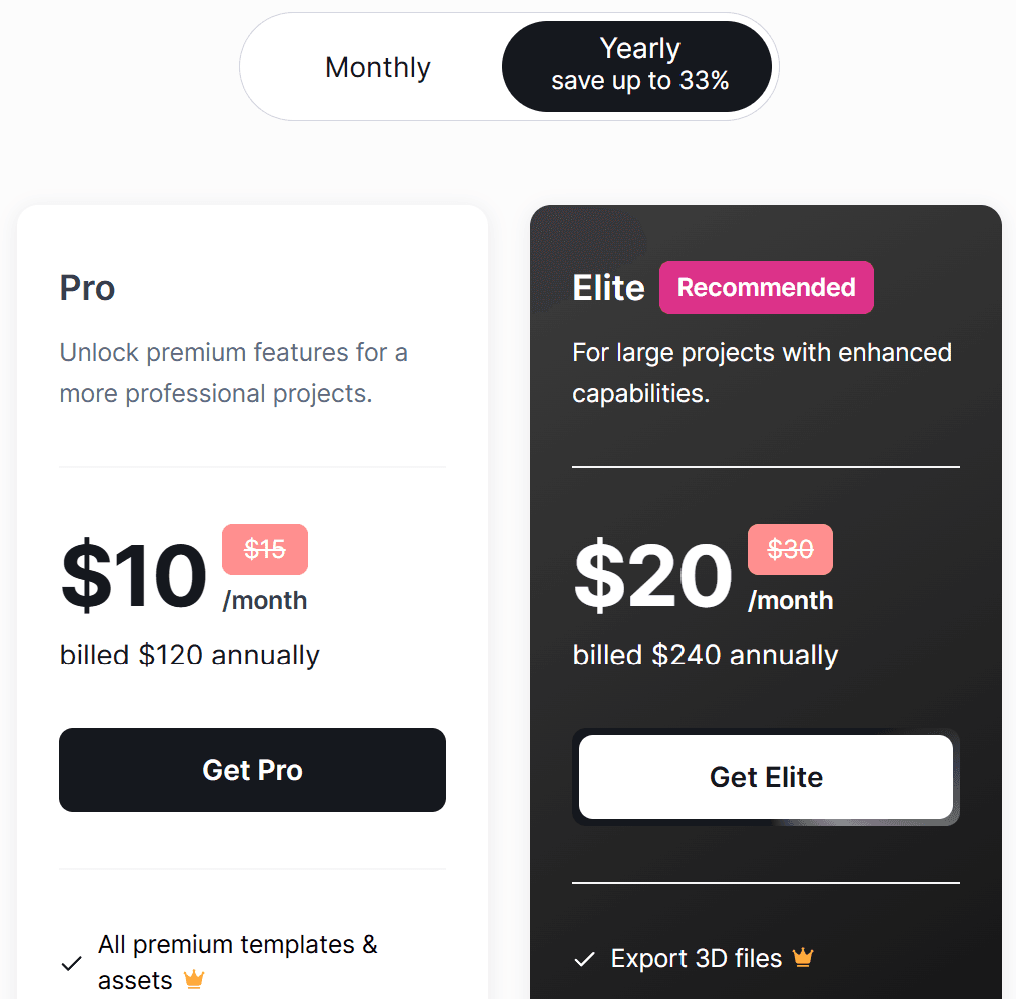
Badges can also motivate users to take action or make valuable choices. For example, here’s a badge placed over a payment option to emphasize the importance of choosing a yearly payment plan:
Local Notifications
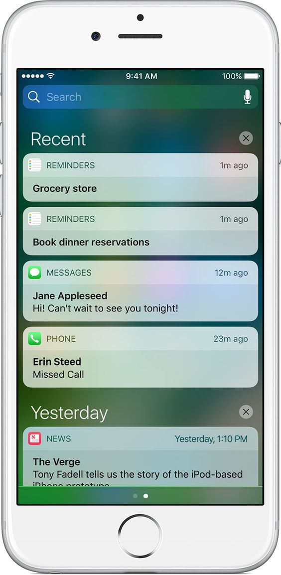
Local notifications are similar to push notifications, but they are triggered by events on the user's device instead of through a server. This allows apps to send notifications even when there is no internet connection.
Some common uses for location-based notifications include reminders, alarms, and calendar events. They can also be used for location-based alerts, such as reminding a user to pick up groceries when they are near a grocery store.
Push Notifications
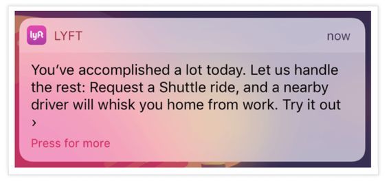
Push notification is a message sent directly to users’ mobile devices or desktops, even when they are not using the app. It is crucial to respect user privacy by providing clear opt-in and opt-out choices, ensuring users have control over the notifications they receive. This type of alert helps keep users engaged by providing them with timely and relevant information tailored to their interests.
They can inform users about new events, updates, or actions that need their attention. For example, you might receive a top notification bar from messaging apps, social media updates, or reminders from a task management app.
Key Elements of UI Notifications
When designing UI notifications, every detail is important, from how the layout looks to how messages are displayed. Here are the main components to consider:
- Buttons: These are crucial as they guide users on what actions to take. Effective buttons help users make decisions quickly, ensuring they stay informed and aware of updates.
- Icons: Small images or symbols that convey important information at a glance. They can signify urgency or an emergency alert and help clarify the context of the notification. Customize and download icons for your web, app projects here.
- Descriptions: Keep text simple and to the point. Descriptions should provide essential information without any unnecessary details, ensuring users understand the message clearly.
- Extras: Adding impactful elements can create a sense of urgency. This includes using secondary buttons for additional options, text fields for user feedback, or links to resources for more in-depth information.
- Smart Notifications: These notifications are uniquely tailored to each app's requirements. They utilize triggers based on user interaction levels and timing to improve user engagement, allowing for tracking and analysis to enhance their effectiveness in prompting user actions.
Notification Design Principles
When designing notifications, there are a few principles to keep in mind to ensure they are effective and user-friendly such as clarity, relevance, and timing.
Clear and Concise Language
Notifications need to use clear and simple language to effectively communicate with users. This helps ensure that the message is easily understood by everyone. It’s important that the tone remains respectful and professional, so users feel valued.
To achieve clarity, notifications should consist of straightforward sentences and avoid complex jargon. Additionally, including clear calls-to-action can guide users on what steps to take next, making the overall communication more effective. User interaction with these notifications or prompts is crucial, as it encourages users to make decisions or provide information before continuing with their tasks.
Meaningful Icons and Imagery
Notifications should feature meaningful icons and images that catch users’ attention and quickly convey important information. This helps users understand the message at a glance.
It's also important for these icons and images to stand out from other content on the page. They should have a consistent design and layout, making it easy for users to recognize them.
Some good examples of effective icons and images include color-coded symbols, relevant pictures, and engaging animations. These elements can enhance the overall user experience and ensure that key messages are communicated effectively.
Timing and Frequency
Notifications are important because they help users get the most critical information. To make sure users pay attention, notifications should be timely and frequent. This means delivering them at the right moments to keep users engaged and interacting with the content.
There are different ways to manage notifications effectively. For instance, real-time notifications can be sent as events happen, while scheduled notifications can be planned for specific times. Additionally, giving users control over how often they receive notifications can make their experience even better. By using these strategies, we can ensure that notifications are helpful and not overwhelming.
Managing Multiple Notifications
In some cases, users may receive multiple notifications at once. System notifications, which are low-priority alerts sent by the operating system, often use toasts and snackbars to inform users about key updates and actions outside of applications. This can be overwhelming and potentially lead to important information being missed. To avoid this, it’s important to consider how notifications are displayed and managed.
One approach is to group related notifications together so they don’t clutter the screen. This can be done by grouping notifications based on their topic or urgency levels. Additionally, giving users the option to customize which types of notifications they want to see can also help manage multiple notifications effectively.
Common Use Cases for Notifications
Onboarding and Welcome
Notifications are a great way to welcome new users to an app. They can help make the onboarding process smooth and enjoyable. For instance, notifications can provide a short tutorial that introduces users to the app’s main features and offers useful tips and resources.
Some effective ways to use notifications for onboarding include pop-up messages, interactive tutorials, and even rewards to motivate users. These approaches can help users feel more comfortable with the app and encourage them to explore all that it has to offer.
Progress and Completion
Notifications can be used to keep users informed about their progress and the completion of tasks or processes. By providing visibility into the system status, notifications offer crucial feedback on ongoing processes and potential actions needed, similar to a car's dashboard. By letting users know how far they’ve come and when they’ve finished, these alerts help create a sense of achievement.
Additionally, notifications can boost motivation by providing feedback and guidance. When users receive updates about their progress, it encourages them to keep going. Simple messages of success and recognition can make a big difference in how people feel about their work.
For instance, using progress bars shows users how much they have completed, while success messages celebrate their achievements. Offering rewards and incentives can also motivate users to stay engaged and reach their goals. Together, these elements help create a positive experience for users as they navigate their tasks.
Error and Exception Handling
Notifications are a valuable tool for error messages and exception handling. When something goes wrong, instead of displaying generic error messages, notifications can be used to provide more specific information about the issue. User-generated notifications, in particular, can engage users effectively by allowing them to contribute to the resolution process.
This approach helps users understand what went wrong and how to resolve it efficiently. Notifications can also offer solutions or direct users to additional resources that can help them solve the problem.
Moreover, using notifications for error handling can prevent users from becoming frustrated or confused. By providing clear and actionable information, these alerts make it easier for users to recover from errors without feeling overwhelmed.
Conclusion
Good UI notification design is essential for a positive UX design. It can greatly influence how users feel about an application. Notifications should add value rather than disrupt what users are doing. To create meaningful notifications, designers should follow a few best practices. By focusing on these aspects, designers can design notifications that enhance the overall user experience.
