Color plays a vital role in web design as it can evoke emotions and create an overall aesthetic impact on the viewer. And when it comes to warm colors, they are known for their ability to create a sense of energy, passion, and optimism. So if you want to give your website a welcoming and inviting vibe, incorporating warm colors into your design palette is a great idea.
But with so many options available, selecting the right combination of warm colors can be challenging. That's why we've curated 10 warm color palette ideas that you can use for your website design. Let's dive in!
What Are Warm Colors?
Warm colors are shades that remind us of warmth, like sunlight or a cozy fire. They usually include:
- Red: This color is bold and passionate. It grabs attention and can make you feel excited or energized. It's often used for things like sales or to create a sense of urgency.
- Orange: A mix of red and yellow, orange feels friendly and inviting. It’s associated with creativity and fun, making it great for brands that want to appear approachable.
- Yellow: Bright and cheerful, yellow represents happiness and optimism. It’s often used to grab attention and can make people feel more upbeat.
- Pink: Soft and gentle, pink often symbolizes love and care. It can evoke feelings of warmth and tenderness, making it popular in designs aimed at a younger audience or those focused on beauty and wellness.
- Gold: This rich hue suggests luxury and warmth. Gold can give a feeling of elegance and sophistication.
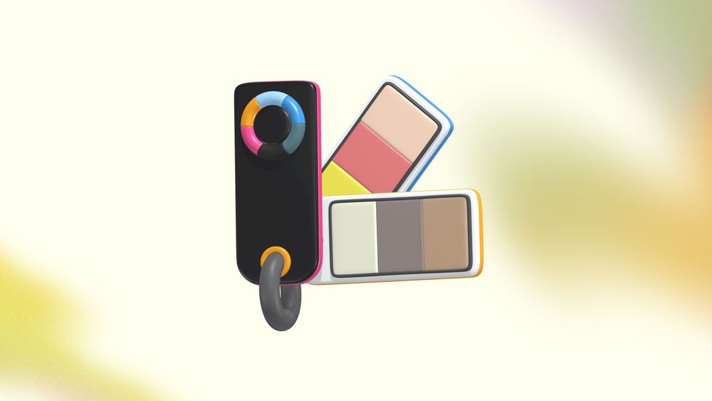
Create the perfect icon pack for your warm website design today with Pixcap. You can effortlessly customize 3D icons, illustrations, and characters in just a few clicks. Start enhancing your web design now!
10 Warm Color Palette Ideas for Web Design
1. Sunset Glow
Colors: Deep Orange, Soft Pink, Warm Yellow
This palette captures the serene beauty of a sunset. The deep orange brings a vibrant energy, evoking feelings of enthusiasm and warmth. Soft pink adds a gentle touch, creating a sense of comfort and relaxation. Warm yellow brightens the overall look, infusing a cheerful vibe that invites users to explore. Ideal for lifestyle blogs or creative portfolios, this combination creates an engaging atmosphere that encourages visitors to stay and interact with the content.

2. Autumn Leaves
Colors: Rich Red, Burnt Orange, Golden Yellow, Brown
Inspired by the changing colors of fall, this earthy palette evokes warmth and nostalgia. Rich red and burnt orange provide a sense of richness and excitement, while golden yellow adds brightness, reminiscent of golden autumn days. Brown grounds the palette, offering a natural and rustic feel. Perfect for food blogs, craft sites, or eco-friendly brands, this palette creates a cozy environment that resonates with the comforting themes of autumn.

3. Gentle Dawn
Colors: Soft Peach, Light Coral, Cream
This soft palette captures the essence of a gentle dawn. Soft peach brings a warm, inviting glow, while light coral adds a subtle vibrancy that feels fresh and uplifting. Cream acts as a calming neutral, providing balance and ensuring readability. This trio is perfect for websites and apps focused on wellness, beauty, or personal blogs, creating a serene and welcoming atmosphere that encourages exploration and engagement. The overall effect is soothing, making visitors feel at ease as they navigate through the content.

4. Fiery Sunset
Colors: Bright Red, Fiery Orange, Deep Gold
This bold palette is designed to make a strong impression. Bright red and fiery orange create a dynamic and energetic atmosphere, sparking excitement and action. Deep gold adds a touch of elegance and sophistication, making the palette feel luxurious. This combination is great for event websites, fashion brands, or any site looking to convey a sense of urgency and allure, capturing attention and driving engagement.

5. Earthy Tones
Colors: Terracotta, Olive Green, Soft Beige
Earthy tones create a calm, grounded feel, making them perfect for websites focused on wellness or sustainability. Terracotta brings warmth and richness, while olive green evokes nature, creating a harmonious blend that feels both inviting and organic. Soft beige balances the palette, providing a neutral backdrop that enhances readability. This palette is versatile and promotes tranquility, making it ideal for brands that prioritize a natural aesthetic.

6. Rose Gold
Colors: Soft Pink, Rose Gold, Cream
This elegant palette is all about luxury and sophistication. Soft pink provides a gentle, inviting touch, while rose gold adds a rich, glamorous element that captures attention. Cream lightens the overall appearance, ensuring the palette remains soft and approachable. Ideal for beauty, fashion, or lifestyle websites, this combination creates an upscale yet warm environment, appealing to a stylish audience and enhancing the user experience.

7. Tropical Paradise
Colors: Bright Yellow, Vibrant Orange, Turquoise
This fun and lively palette brings the energy of a tropical getaway to life. Bright yellow and vibrant orange work together to create a sunny, cheerful atmosphere, while turquoise adds a refreshing touch reminiscent of clear ocean waters. Perfect for travel, adventure, or leisure sites, this palette conveys excitement and joy, encouraging visitors to dive into the content and explore new experiences.

8. Warm Neutrals
Colors: Beige, Warm Gray, Soft Brown
This subtle and sophisticated palette uses warm neutrals to create a cozy and inviting look. Beige provides a soft background that is easy on the eyes, while warm gray adds depth and sophistication. Soft brown can be used for accents, grounding the palette and making it feel more substantial. This versatile combination is great for lifestyle, home decor, or wellness websites, promoting a sense of comfort and stability.

9. Burnt Sienna
Colors: Burnt Sienna, Mustard Yellow, Cream
This earthy palette draws inspiration from natural landscapes, using burnt sienna to provide warmth and richness. Mustard yellow adds a touch of brightness, injecting energy into the design, while cream keeps the overall look soft and inviting. This combination is perfect for artistic or handmade goods websites, evoking a sense of creativity and comfort that resonates with users seeking unique, artisanal products.

10. Candy Apple
Colors: Candy Red, Bright Orange, Lemon Yellow
Inspired by the playful colors of a carnival, this bright and energetic palette is sure to catch attention. Candy red and bright orange create a lively and fun atmosphere, sparking excitement and joy. Lemon yellow adds a cheerful pop that enhances the overall vibrancy. This palette is ideal for children’s products, entertainment sites, or brands focused on fun and playfulness, inviting users to explore and engage with the content in a delightful way.

Benefits of Using Warm Color Palettes in Web Design
Using warm color palettes in website design offers several benefits that can significantly enhance user experience and brand perception. Here are some key advantages:
Emotional Engagement
Warm colors like red, orange, and yellow have a powerful impact on emotions. They can evoke feelings of happiness, excitement, and warmth, which helps create a connection between the user and the content. For example, a vibrant orange can inspire energy and enthusiasm, making visitors feel more inclined to engage with the site. This emotional connection is particularly beneficial for brands looking to build loyalty, as users are more likely to remember and return to sites that make them feel good.
Increased Attention
Warm colors are naturally attention-grabbing. Their brightness and vibrancy stand out against cooler tones and neutrals, making them effective for highlighting important elements like call-to-action buttons, promotions, or critical information. For instance, a bright red button can compel users to click, driving conversions and increasing user interaction. By strategically using warm colors to guide the user's eye, designers can enhance navigation and ensure that essential actions are easily accessible.
Inviting Atmosphere
Creating a cozy and welcoming environment is crucial for many websites, especially those in hospitality, wellness, or personal services. Warm colors help achieve this by making the site feel more approachable and friendly. A soft peach background paired with light coral accents can evoke a sense of comfort, encouraging users to stay longer and explore more. This inviting atmosphere fosters trust, which is essential for converting visitors into customers or followers.
Brand Identity Enhancement
Warm colors can significantly influence how a brand is perceived. They convey specific traits—such as energy, friendliness, and creativity—that can enhance a brand's identity. For example, a brand using warm tones may appear more dynamic and approachable, while softer warm hues can evoke elegance and sophistication. This alignment between color and brand messaging helps create a cohesive visual identity that resonates with the target audience, reinforcing brand recognition and loyalty.
Choosing the Right Warm Colors
Choosing the right warm colors for your website involves several key considerations to ensure that the palette aligns with your brand identity and effectively engages your audience. Here are some important factors to keep in mind:
Understand Your Brand Personality
Identify Traits: Consider what qualities you want your brand to convey. Is it energetic, friendly, luxurious, or comforting? For example, vibrant oranges and reds might evoke energy, while soft peaches and corals can convey warmth and approachability.
Consistency: Ensure that the warm colors you choose reflect your overall brand identity and messaging. This consistency helps build recognition and trust with your audience.
Know Your Target Audience
Demographics: Different colors can resonate differently with various age groups, cultures, and genders. For instance, younger audiences might respond well to bright, playful colors, while older demographics might prefer more muted, sophisticated tones.
Preferences: Conduct research or surveys to understand your audience’s color preferences. This can guide your choices and enhance user engagement.
Consider Color Psychology
Emotional Impact: Each color evokes specific emotions. Red can signify passion and urgency, orange can inspire creativity and enthusiasm, while yellow often represents happiness and positivity. Think about how you want your audience to feel when they visit your site.
Combination Effects: How colors interact can also influence perception. Pairing a warm red with a softer peach can create a balanced look that maintains vibrancy while also being inviting.
Balance with Neutrals
Readability: Warm colors can be overwhelming if overused. Balancing them with neutral tones like white, gray, or beige can enhance readability and visual comfort. For instance, a soft peach background with dark orange text creates contrast without being harsh.
Visual Harmony: Using neutral colors allows warm tones to stand out without competing for attention. This balance helps create a cohesive and polished design.
Implementing Warm Colors in Web Design
Backgrounds
Opt for soft warm tones like light peach or pale coral for backgrounds to create a welcoming atmosphere. These colors provide a gentle backdrop that enhances content readability without overwhelming visitors.
Consider using gradient backgrounds that blend warm colors, such as transitioning from a soft pink to a warm yellow. This technique adds depth and visual interest while maintaining a warm, inviting feel.
Text and Typography
When using warm colors for text, ensure there is enough contrast with the background. Darker warm hues, like deep orange or burgundy, can be effective for headings, while lighter shades work well for body text.
Use warm colors strategically for important information, such as call-to-action buttons or quotes. For instance, a bright red button on a softer background can draw attention and prompt user interaction.
Buttons and Calls to Action
Bright warm colors, like vibrant orange or candy red, are great for buttons. They create a sense of urgency and encourage clicks. Ensure these buttons stand out against the surrounding colors for maximum visibility.
Implement hover effects that change the button color to a slightly darker shade when users mouse over. This not only provides visual feedback but also enhances the interactive experience.
Images and Graphics
Use images with warm tones to reinforce your color palette. For example, photos featuring sunsets, warm lighting, or cozy environments can complement your design and evoke the desired emotions.
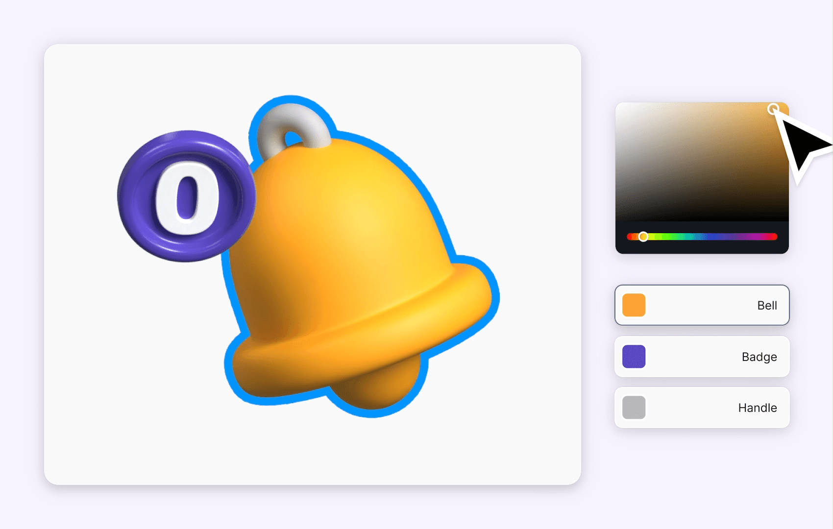
Incorporate warm colors into illustrations or icons. This adds a playful and cohesive feel to the site while ensuring that the visuals align with your overall color scheme.
White Space
Utilize white space effectively to avoid overwhelming users with too much color. Warm colors can be bold, so having sufficient white space allows your design to breathe and helps maintain a clean look.
White space also helps to emphasize warm-colored elements, guiding users’ attention to key areas without distraction.
Conclusion
As you can see, warm colors are a powerful tool for creating effective designs. When used strategically and in moderation, they can enhance the user experience and convey desired emotions. Remember to consider your target audience and the purpose of your design when choosing warm colors to ensure maximum impact. Happy designing!


