Choosing the right font is crucial for any design project. It can make or break the overall look and feel of your design.
Unfortunately, there are some fonts out there that are widely considered to be terrible choices. These fonts can ruin an otherwise well-designed project, making it difficult to read and visually unappealing. And if you're a graphic designer, using these fonts could seriously damage your reputation.
In this article, we'll take a closer look at the 10 worst fonts that you should avoid at all costs.
The 10 Worst Fonts You Should Never Use
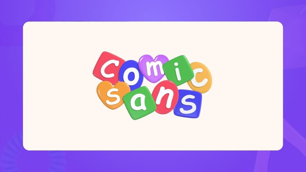
1. Comic Sans

First on our list is Comic Sans, the worst font on Google Docs, judged by many designers and typographers.
Despite its popularity during the 90s, Comic Sans has become synonymous with amateur design due to its overuse and simplistic style. It's often seen as immature and unprofessional, making it a poor choice for most design projects.
The font was originally created for comic book-style dialogue boxes in Microsoft software, which is a far cry from the professional design work you want to be associated with.
Pairing this font with corporate or serious content can lead to a disconnection between the message and its presentation, creating an impression of insincerity or even mockery.
2. Papyrus

Papyrus, a font that gained widespread notoriety after being used in the logo for the movie Avatar. While it may have worked well for the fictional world of Pandora, it doesn't translate well to real-world design.
Papyrus is often seen as cheap and overused, making it a poor choice for any professional project. Its handwritten style can also come across as unpolished and unrefined, making it a difficult font to use in a professional setting.
Despite its flaws, Papyrus continues to be used in various design projects, but always with negative connotations. Avoid this font if you want your design to be taken seriously and not associated with low-quality work.
3. Curlz

Curlz is a font that mimics handwritten cursive, but the exaggerated curls and loops can come across as juvenile and unsophisticated.
While it may be suitable for certain design projects aimed at children or parties, it falls short in conveying professionalism and credibility. It's best to avoid using this font in serious contexts, such as business presentations or legal documents.
Additionally, the excessive use of curls and loops can make it difficult to read, especially in smaller font sizes. This can lead to a lack of clarity and understanding of the message being conveyed.
4. Ecofont

The holes and dots within the letters of Ecofont may seem like an eco-friendly design choice, but in reality, it can be distracting and difficult to read.
The gaps within the letters can also make the font appear unprofessional and amateurish. It's best to avoid using Ecofont for any serious or formal projects.
Furthermore, the supposed environmental benefits of this font have been called into question, making it an unreliable choice for both design and sustainability purposes.
5. Souvenir

Souvenir was popular in the 1970s but has since fallen out of favor due to its outdated and kitschy look. Its thick and bold strokes can be overwhelming and make it difficult to read in large chunks of text.
While it may evoke nostalgia for some, it lacks the sophistication and modern appeal needed in today's design world.
However, if used sparingly and in the right context, such as in a retro-themed design project, Souvenir can still be a fun choice. Just make sure to use it intentionally and purposefully rather than relying on its outdated appeal.
6. Neuland-Inline

Neuland was created back in 1923 by the influential typographer Rudolf Koch, who also crafted Kabel, Marathon, and Neufraktur. When it first came out, it was quite different from other German typefaces (both blackletter and the emerging modernists), which caused it to receive a lot of criticism for being too clunky and rigid.
Don't use it in any social media graphics or marketing materials unless you want to be glanced over.
7. Arial

Arial is a widely used sans-serif font that comes pre-installed on many operating systems and software programs. While it may seem like a safe and reliable choice, its overuse has made it become mundane and unoriginal.
Additionally, Arial has been criticized for being too similar to the popular font Helvetica, leading to accusations of plagiarism.
Instead of relying on the default Arial, consider exploring other sans-serif options that offer a more unique and modern look. Experiment with fonts like Proxima Nova, Montserrat, or Open Sans for a refreshing change in your designs.
8. Trajan

The Trajan typeface has been featured on numerous movie posters, to the point of exhaustion. Like many fonts that gain immediate widespread use, Trajan runs the risk of becoming overused and losing its impact.
While it may seem like a suitable choice for a dramatic and epic design, using it too frequently can make your designs blend in with the rest.
9. Bleeding Cowboys

If you want to scare off your audience and make them cringe, then Bleeding Cowboys is the font for you. This gothic style font has been overused in horror and Halloween-themed designs, to the point where it has become a cliché.
10. Bradley Hand

This typeface is a casual font designed to replicate the handwriting of its creator, Richard Bradley. It may be appropriate for personal notes or informal invitations, but using it in professional designs can come off as unprofessional and amateurish. It lacks the legibility and versatility needed for more formal designs.
What Makes a Font Bad?
Several factors can contribute to a font being considered "bad." These include overuse, lack of uniqueness, poor legibility, and general aesthetics. Overused fonts lose their impact and become mundane. Uniqueness is important in standing out from the crowd and avoiding accusations of plagiarism. Legibility is crucial for effectively conveying a message or information. Aesthetics encompass all aspects of a font, such as spacing, weight, and style. A font that is poorly designed or executed can make a design look unprofessional and sloppy.
What Are the Best Fonts to Use in Graphic Design?
While there is no definitive answer to this question, as it largely depends on the specific design and its intended audience, there are some fonts that are consistently favored by designers for their versatility and aesthetic appeal. Some examples include:
Helvetica
Uni Sans
Futura
Garamond
Helvetica
Verdana
Lato
Open Sans
Montserrat
Proxima Nova
Conclusion
With numerous choices available, it can be tempting to use a font simply because it is popular or easily accessible.
However, it is important to carefully consider the purpose and target audience of a design before choosing a font. Using cliché or poorly designed fonts can detract from the overall effectiveness and professionalism of a design.
By understanding what makes a font bad and knowing some commonly favored alternatives, you can surely make your designs stand out in a positive manner.


