Colors have the power to transform spaces, and one of the most effective ways to achieve visual harmony is through analogous color schemes. By using colors that sit side by side on the color wheel, you create a seamless flow that feels natural and pleasing to the eye. Imagine the serene blend of ocean blues and greens or the warm embrace of autumnal oranges and reds.
In this article, we’ll showcase some of the most captivating analogous colors examples in design, revealing how these harmonious combinations can elevate your projects with effortless elegance.
What are Analogous Colors?
Analogous colors are hues that sit next to each other on the color wheel. This close relationship creates a harmonious and cohesive color scheme, making analogous colors particularly effective in designing spaces, graphics, and other visual media where a sense of unity and calm is desired. Understanding how these colors work together can be a powerful tool for creating aesthetically pleasing and balanced designs.
Understanding the Color Wheel
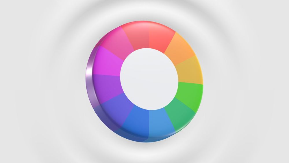
Before diving into the examples, let’s quickly review the basics of the color wheel. The color wheel is a visual representation of the primary, secondary, and tertiary colors in a circular format. It helps designers understand how different hues relate to each other and how they can be combined to create various effects.
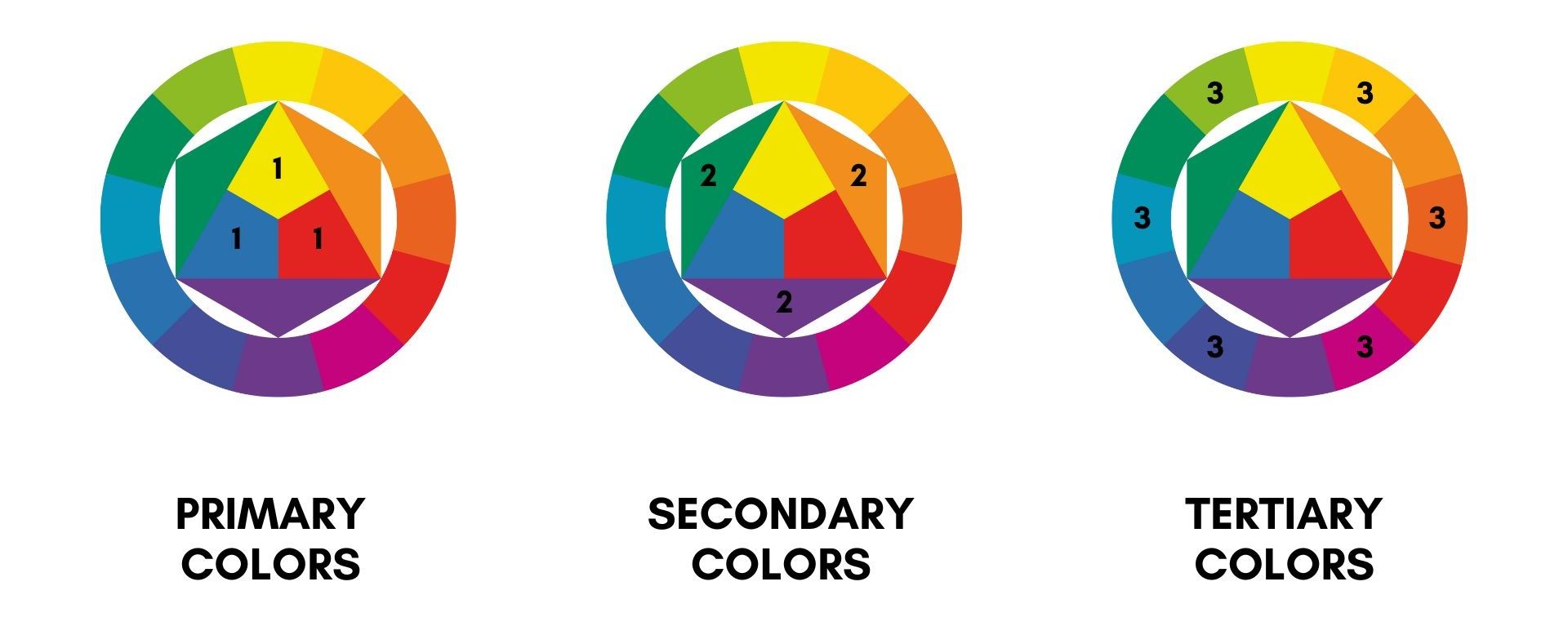
The traditional color wheel consists of 12 colors: three primary (red, yellow, blue), three secondary (orange, green, purple), and six tertiary (red-orange, yellow-orange, yellow-green, blue-green, blue-purple, red-purple). Analogous colors are found next to each other on this wheel.
Analogous colors are positioned adjacent to each other on this wheel, typically forming a group of three to five colors. For example, if you choose blue, blue-green, and green, these colors are next to each other and blend seamlessly due to their shared undertones.
Best Analogous Colors Examples
Next, we delve into some of the best examples of analogous color combinations, showcasing how they can be used to achieve stunning and effective design outcomes.
1. Oceanic Serenity: Teal, Turquoise, and Blue
This analogous color scheme evokes the calming and refreshing essence of the sea. It is perfect for spaces intended to promote relaxation and tranquility.
Color Characteristics:
- Teal: A blend of blue and green with a slightly muted tone, teal brings a sense of depth and sophistication.
- Turquoise: A brighter, more vibrant hue than teal, turquoise adds a lively, invigorating touch.
- Blue: A foundational color in the scheme, blue provides a sense of stability and calm.
Design Applications:
- Interior Design: Use teal on the walls, turquoise for accent pieces like cushions or rugs, and blue for larger furniture items to create a serene, beach-inspired living room or bedroom.
- Graphic Design: This palette works well for website backgrounds, branding materials, and promotional content where a calm, professional look is desired.
Visual Impact: The smooth transition from teal to turquoise and blue creates a serene and harmonious effect, reminiscent of ocean waves and coastal skies.
2. Autumn Warmth: Red, Orange, and Yellow
This warm and vibrant scheme captures the essence of fall foliage and is ideal for creating cozy, inviting spaces.
Color Characteristics:
- Red: A bold and energetic color that serves as the dominant hue in this scheme.
- Orange: A warm, enthusiastic color that complements red while adding a touch of brightness.
- Yellow: A cheerful and uplifting color that adds light and warmth to the combination.
Design Applications:
- Interior Design: Incorporate red on accent walls or feature pieces, orange for textiles and decor items, and yellow for smaller accessories to create a warm and inviting dining room or living space.
- Graphic Design: This palette is effective for marketing materials, seasonal promotions, and advertisements that aim to capture attention and evoke a sense of warmth and energy.
Visual Impact: The rich, warm tones blend seamlessly to create an atmosphere of comfort and vibrancy, perfect for spaces designed to feel welcoming and energetic.
3. Forest Retreat: Green, Olive, and Sage
This soothing and grounded color scheme mirrors the tranquility of a lush forest, making it ideal for creating relaxing and natural environments.
Color Characteristics:
- Green: The primary color in this scheme, green symbolizes nature and growth, offering a calming backdrop.
- Olive: A more subdued, earthy green that adds depth and sophistication to the palette.
- Sage: A soft, muted green that lightens the scheme while maintaining a natural, organic feel.
Design Applications:
- Interior Design: Use green for walls or large furniture pieces, olive for smaller accents or textiles, and sage for accessories or decorative elements to create a serene and nature-inspired living space or study.
- Graphic Design: Ideal for eco-friendly brands, nature-themed projects, and wellness content, this palette conveys a sense of calm and connection to nature.
Visual Impact: The gentle transitions between green, olive, and sage produce a serene and harmonious effect, reminiscent of a peaceful woodland setting.
4. Sunset Bliss: Pink, Coral, and Peach
This analogous pink color scheme captures the warm and inviting hues of a sunset, offering a soft yet vibrant aesthetic that can be both refreshing and romantic.
Color Characteristics:
- Pink: A soft and romantic color that serves as the base of this palette.
- Coral: A warm, energetic shade that adds a vibrant, lively touch.
- Peach: A light, subtle hue that complements both pink and coral, adding warmth and lightness.
Design Applications:
- Interior Design: Perfect for bedrooms or living areas where a warm and inviting atmosphere is desired. Use pink as the main wall color, coral for accent pieces, and peach for textiles and decor.
- Graphic Design: Effective for branding and promotional materials related to beauty, fashion, or lifestyle, where a fresh and inviting look is beneficial.
Visual Impact: The gradient from pink to coral to peach creates a warm and inviting atmosphere, perfect for creating spaces or designs with a cheerful and romantic vibe.
5. Urban Chic: Gray, Charcoal, and Silver
This sophisticated color scheme blends varying shades of gray to create a sleek, modern aesthetic suitable for contemporary and professional environments.
Color Characteristics:
- Gray: A versatile neutral that forms the base of the scheme, providing a balanced and calm backdrop.
- Charcoal: A darker shade of gray that adds depth and contrast.
- Silver: A metallic hue that introduces a touch of elegance and shine.
Design Applications:
- Interior Design: Ideal for modern offices, chic apartments, or minimalist spaces. Use gray for walls or large furniture, charcoal for accent pieces, and silver for decorative elements or fixtures.
- Graphic Design: Perfect for professional branding, tech-related projects, or any material where a sleek, modern look is desired.
Visual Impact: The sophisticated interplay of gray, charcoal, and silver produces a refined and elegant effect, suitable for high-end, contemporary designs.
How to Create an Analogous Color Scheme
If you don't want to use a pre-made color scheme and would like to create your own, an analogous color scheme is a great option. Here's how you can create one:
- First, choose your base color, which will act as the central hue of your scheme. For a warm and vibrant atmosphere, you might select a base color from the warm spectrum, such as red, orange, or yellow. For a cooler, more serene ambiance, opt for hues like blue, green, or purple.
- Once you’ve selected your base color, pick one or two adjacent colors from the color wheel to complement it. These supporting colors should be next to your base color and will work together to create a smooth, harmonious transition. For instance, if your base color is blue, you might choose blue-green and blue-purple as supporting colors.
- To keep your design balanced, try the 60-30-10 rule. Use your main color for about 60% of the space, a secondary color for 30%, and an accent color for the remaining 10%. This approach ensures that no single color overwhelms the others.
- Incorporate shades and tints of your chosen colors to add depth and variation. Shades are created by adding black to the base color, resulting in darker tones, while tints are achieved by adding white, resulting in lighter hues. For example, if your base color is blue, consider using navy blue and sky blue to introduce contrast and dimension.
- Don't be afraid to mix in neutrals like white, black, and grey to balance out the vibrancy of your color scheme. They can also provide a clean background for your chosen colors to stand out against.
Best Practices for Using Analogous Colors
Consider your Audience
When creating a color scheme, it's important to consider your target audience and their preferences. Some colors may have different cultural or personal associations, so it's best to choose colors that will be well-received by your audience.
Use Analogous Colors for Cozy and Inviting Spaces
Analogous color schemes are great for creating warm and welcoming atmospheres. Their similar hues create a sense of harmony and can evoke feelings of comfort and relaxation. This makes them ideal for spaces such as living rooms, bedrooms, and kitchens where you want people to feel at ease.
Avoid Using Too Many Strong Hues
While analogous colors are meant to work together harmoniously, using too many strong hues can still be overwhelming for the eyes. To prevent this, try to limit your analogous color palette to 2-3 main colors and use shades and tints to add variation.
Use Contrasting Text Colors
When using analogous colors, it's important to consider legibility. If your chosen colors have similar values (lightness or darkness), it may be difficult to read text against them. In this case, opt for a contrasting text color, such as white or black, to ensure readability.
Tools and Resources for Choosing Analogous Colors
There are many online resources and tools available to help you choose and create analogous color schemes. Some popular ones include:
- Coolors is a tool that lets you quickly create, save, and share the perfect color palettes. It's designed to make the process fast and easy, helping you find the right colors in just seconds.
- Color Hunt offers a carefully selected collection of beautiful color schemes. It's updated daily, so you always have fresh and inspiring options to choose from for your projects.
- Adobe Color CC is a simple tool that's perfect for creating color themes and palettes. It's great for designers who want to explore different color combinations in an easy-to-use format.
- Khroma is an AI-powered color tool that learns your preferences. It generates colors you like and helps block the ones you don't, making it a smart choice for personalized color selection.
Conclusion
Analogous colors are a great way to create harmonious and visually pleasing designs. By understanding the basics of analogous color theory and using some helpful tools, you can easily incorporate this color scheme into your design projects. Have fun experimenting with analogous colors and see how they can elevate your designs!


