Typography is a silent selling tool—it communicates a message through its appearance, style, and character. But while we often focus on selecting the right fonts and colors, spacing is an equally integral part of the typographic toolbox.
Among the many terminologies that dictate spacing, three stand out—Leading, Kerning, and Tracking. They are quite simple concepts that wield a powerful influence over the legibility and aesthetics of spacing equally a design.
Whether you are a graphic designer, student, or want to become a professional typographer, understanding the nuances between leading, kerning, and tracking is crucial. This article is aimed at demystifying these typographic terms with a straightforward explanation and practical examples.
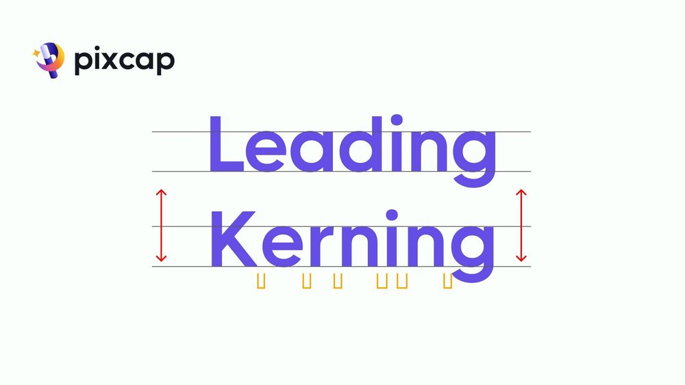
What Is Leading?
Leading is the space you leave between multiple lines of text.
If the line spacing is too close together, it can make the text look crowded and can mess with your flow while reading. But if they're too far apart, your eyes have to work harder to move from one line to the next.
Also, some letters, like 'd', 'h', or 'l', stick up higher, and others, like 'g', 'y', or 'j', hang down lower. Leading helps make sure these letters don't bump into each other by adjusting the space between the lines they're on. This space is measured as vertical distance from one line's base (where the letters sit) to the next.
Think of a book—notice the space between the lines of text. The leading in a novel is usually tighter than that of a web page to optimize reading comfort.
When adjusting leading, a best practice is to aim for around 120-145% of the type size. This is the default setting for most word processors and design software because it offers the best compromise between legibility and economy of space.
Practice line spacing, letter spacing with 100+ creative font styles on Pixcap design tool. Or use our design templates to experiment with different spacing techniques and layout styles.
What Is Kerning?
Kerning is about adjusting the space between two letters.
If letters are too spread out or squeezed too close together, it can make reading hard. This spacing is super important in design because it affects how easy it is to read and look at the text. The aim is to achieve proportional spacing between characters.
Special attention is needed for letters with extra bits (like serifs) or ones that aren't straight (like "A", "W", or "V") to make them look consistent with the rest of entire word. Some fonts need specific tweaks for certain pairs of letters to make sure they sit together nicely.
Remember, kerning is especially key for bigger text like titles because any weird spacing is much more noticeable. Getting kerning right means everything looks clean and easy to read.
Easy Kerning Rules
When kerning text, it’s important to consider factors such as ascenders (letters that extend above the x-height of your text, such as "d", "h", or "l"), descenders (letters that dip below the baseline, such as "g", "y", or "j"), and the overall letterforms.
Additionally, it is important to examine the intended medium and size of the text, as kerning may need to be adjusted for readability and legibility. Each typeface has its own inherent kerning values, but designers often have to manually adjust the spacing between certain letter combinations to improve the overall quality of the typography.
Good kerning is essential in typography and can greatly enhance the overall visual impact and professionalism of a design.
What Is Tracking?
Tracking refers to the overall spacing between all letters in a block of text. It is different from kerning, which adjusts the spacing between individual letters.
When tracking is set too wide, it can make the text look loose and disconnected, while setting it too tight can cause letters to merge together and make reading difficult.
In general, tracking should be used sparingly and only to adjust the overall appearance of a block of text. It is often used in headlines or titles, but not recommended for body copy as it can negatively affect readability.
It is important to note that tracking affects all letters in a block of text equally, so it should be used with caution to avoid making the typography look unbalanced or uneven.
The designer should consider the font size intended medium and size of the text when adjusting tracking. For example, a large headline may require tighter tracking for visual impact, while smaller body copy may need looser tracking for readability.
Leading vs Kerning vs Tracking
Generally, leading, kerning, and tracking play a role in adjusting letter spacing to make text look better and easier to read in designs. However, each has its own purpose:
Visual outcome: Designers use kerning for a balanced, attractive look, tracking when they don't like how a font's spaced, and leading for bold effects that grab attention.
Design process: Kerning and leading finish the design, tracking can be done anytime. Tracking adjusts space between words first, then leading does the same for lines of text, and kerning fine-tunes headings or logos.
Uses: Kerning is for medium to large fonts and headlines to fix spacing issues. Leading corrects ascenders or descenders like h, t, g, or y to prevent overlap. Tracking helps with hard-to-read fonts or bold letters that spread into other areas.
When to Adjust Leading, Kerning, or Tracking?
Adjusting leading, kerning, and tracking are crucial steps in typography that can significantly impact the readability and aesthetic appeal of text. Here are specific scenarios when adjustments might be necessary:
Leading adjustments are often required when the text is dense or when working with a variety of font sizes within the same document. Increase leading in dense blocks of text to improve readability, especially in long paragraphs or academic texts.
Kerning adjustments are essential when working with large display fonts in titles, logos, or headings. Adjust kerning to correct awkward spaces between specific letter pairs, ensuring that the text looks cohesive and visually pleasing.
Tracking adjustments are beneficial in several instances, including fine-tuning the overall density of text in titles or headings for impact. It’s also adjusted in body text for certain typesetting environments, such as small print in legal documents or captions, to enhance legibility.
In each scenario, the goal is to achieve a harmonious and accessible text presentation that serves its intended purpose effectively. The adjustments to leading, kerning, and tracking should always be made with the target audience and the medium of the text in mind.
Conclusion
Understanding the concepts of leading, kerning, and tracking allows you to manipulate text for optimal readability and aesthetic appeal. With this knowledge, you can fine-tune text in various scenarios to ensure that it meets its intended purpose and captures the attention of readers. Keep exploring different techniques and experimenting with text presentation to find what works best for your specific needs.


