We all know that first impressions matter, and in the digital world, your login page often sets the tone for a user's entire experience. It’s more than just a gateway; it’s a crucial touchpoint where functionality meets aesthetics. A well-crafted login page can enhance usability, build trust, and even boost conversions.
In this article, we’ll dive into the essential techniques and tips for designing an effective login page that not only looks great but also provides a seamless user experience. Whether you’re working on a personal project or contributing to a larger platform, we’ll explore inspiring examples and best practices that can elevate your design game. Grab your favorite design tool, and let’s get started!
Key Elements of a Login Page
Let’s quickly review the essential elements of a login page. These are key components that every login page should have to ensure a smooth and secure user experience.
Input Fields
Input fields are the heart of any login page, so making them user-friendly is key! Clearly label your username and password fields to guide users effortlessly. Adding placeholder text can provide helpful hints about what information is needed. Consider including a password visibility toggle—this simple feature allows users to check their entries, reducing the chance of frustration from typos. A well-designed input field not only looks good but also makes users feel confident as they log in.
Buttons
Buttons are your gateway to action, and they should grab attention without being overwhelming. The “Login” button should stand out, so use a bright color that contrasts with the rest of the page. Make it large enough to be easily clickable, and consider adding a hover effect to enhance interactivity. Don’t forget about secondary actions, like “Forgot Password?” These should be accessible but less prominent, creating a clear visual hierarchy that guides users to their next steps with ease.
Imagery
Imagery can bring your login page to life, but it’s important to strike the right balance. Opt for high-quality images or illustrations that resonate with your brand message without distracting from the login process. A beautifully placed background image can create a warm and inviting vibe, while still keeping the focus on the input fields. Remember, the goal is to enhance the user experience, so choose visuals that complement the overall design.
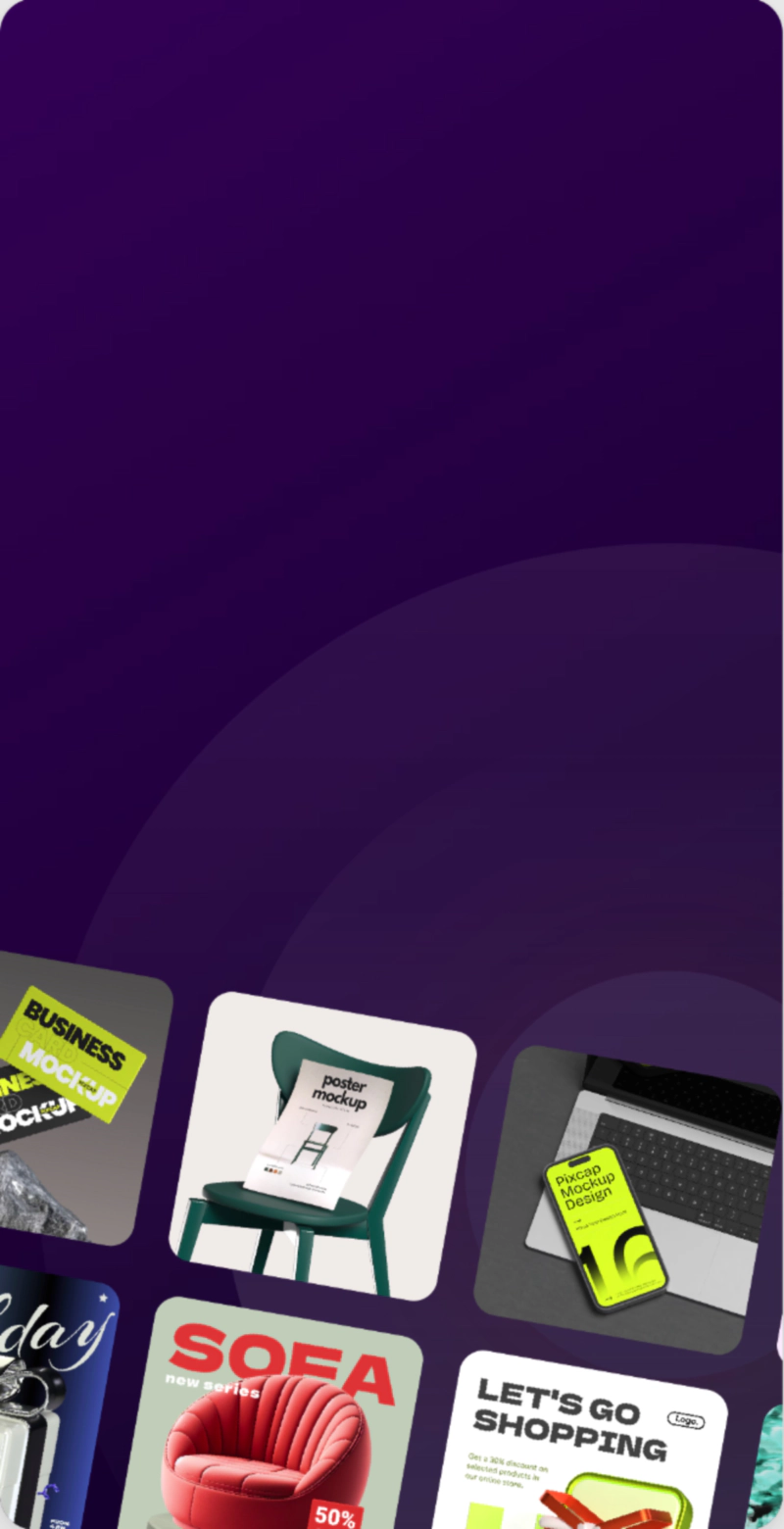
Use 3D icons, illustrations and characters to create a fun and friendly atmosphere that encourages users to engage with your login page. Explore and customize 15,000+ 3D design assets for your web, app design projects for free!

Branding Elements
Branding elements play a vital role in making your login page feel familiar and trustworthy. Incorporate your logo and brand colors thoughtfully to create a cohesive experience. This not only reinforces your brand identity but also makes users feel secure while logging in. Choose typography that reflects your brand's personality and maintain consistency throughout the page. Subtle branding can enhance user confidence and create a welcoming atmosphere, encouraging users to return.
Layout and Flow
A thoughtful layout is essential for a smooth login experience. Position your input fields, buttons, and any additional options in a way that feels natural and easy to follow. Ample spacing is crucial—nobody likes a cluttered page! This not only improves readability but also helps users navigate effortlessly. Don’t forget to place error messages and tips in strategic locations to guide users if they run into issues. A clean and intuitive layout invites users to engage confidently and efficiently.
Login Page Design Techniques
Depends on the nature of your website or application, you can experiment with different design techniques to make your login page stand out. Whether it’s a minimalistic approach or a bold and vibrant one, each technique has its own benefits.
Minimalistic Design
Minimalistic design focuses on simplicity, stripping away unnecessary elements to enhance usability on login pages. By using ample white space, it creates a clean and distraction-free environment that helps users concentrate on entering their credentials. For instance, Apple’s login page exemplifies this approach, featuring essential fields and a clear call-to-action button, guiding users effortlessly through the process.
Thoughtful typography is another hallmark of minimalism. Google’s login page utilizes a modern font against a white backdrop, ensuring clarity and readability. Essential features are prioritized; for example, a straightforward “Forgot Password?” link is often included without cluttering the interface.
Subtle color accents, like Dropbox’s gentle blue on their login button, add visual appeal without overwhelming users. Ultimately, minimalistic design fosters an intuitive login experience that invites users in and enhances engagement, setting the stage for a positive interaction right from the start.
Responsive Design
Responsive design is essential for login pages, especially given the rise of mobile device usage. A mobile-friendly login experience ensures users can access their accounts seamlessly, regardless of screen size. This adaptability enhances user satisfaction and reduces frustration.
To achieve responsive layouts, use flexible grid systems and CSS media queries that adjust elements based on the device's dimensions. Techniques like fluid images and scalable typography also ensure that text and visuals maintain their integrity across devices. For example, a login page might stack input fields vertically on mobile while displaying them side-by-side on desktop.
Prioritizing responsiveness not only improves usability but also boosts user engagement, making it easier for individuals to log in on any device they choose.
Security Indicators
Visual cues play an important role in online security. For instance, SSL certificates help users recognize that a website is secure by displaying a padlock symbol in the address bar. Likewise, password strength indicators guide users to create stronger passwords by showing how secure their chosen password is, often with a color-coded bar that changes from red to green.
Trust elements are another key aspect of maintaining security and building user confidence. Links to privacy policies are crucial because they inform users about how their data will be handled and protected. Security badges, often found on websites, also assure users that the site has met certain security standards. These elements work together to make users feel safer while browsing or shopping online.
Best Practices for Login Page Design
Clear Call-to-Action (CTA)
A login page should have a clear CTA that stands out and guides users to the next step. This could be a simple "Log In" or "Sign In" button, along with accompanying text or instructions. It's also important to include navigation options for users who may need assistance, such as a link to reset their password or contact customer support.
Use Feedback to Guide Users
Providing real-time feedback can greatly improve the user experience on a login page. This could include displaying errors when a user enters incorrect information or showing the progress of the login process. Small details like these help users understand what is happening and reduce frustration.
Browse Pixcap's library of UI feedback icons and illustrations, such as loading bars or checkmarks, to keep users engaged and informed throughout the login process. Customize by changing colors, rotations, and materials to match your brand's aesthetic.
Error Handling
Mistakes happen, so it's important to have error handling in place on a login page. This could include displaying clear error messages when a user enters incorrect information or forgets to fill out a required field. It's also helpful to provide suggestions for correcting the error, such as highlighting the specific field that needs attention.
Social Login Options
Integrating social media logins into websites or apps offers several benefits. It simplifies the user experience by allowing people to sign in quickly with their existing social media accounts, eliminating the need to create and remember new usernames and passwords. This ease of access can increase user engagement and retention, as users are more likely to return when they face fewer barriers to entry.
Common Mistakes to Avoid When Designing a Login Page
Login page design may seem simple, but there are some common mistakes that can be easily avoided. These include:
Overcomplicating the Design
A login page should be simple and straightforward. Avoid cluttering the page with unnecessary elements or overwhelming users with too many options. Stick to the essentials and focus on making the login process as smooth as possible.
Not Making it Mobile-Friendly
With more people using their mobile devices to browse the internet, it's crucial for a login page to be mobile-friendly. This means designing for smaller screens, ensuring buttons and fields are easily clickable, and optimizing loading times.
Requiring Too Much Information
Only ask for essential information during the login process. Asking users for excessive personal details may cause them to feel uncomfortable or suspicious of your website or app. Keep it simple by only requiring basic information such as email or username and password.
Ignoring Accessibility Guidelines
Accessibility is often overlooked when designing a login page, but it's essential to ensure that everyone, regardless of ability, can access and use your website. This includes using high-contrast colors, providing alternative text for images, and ensuring screen readers can navigate the page easily.
Examples of Good Login Page Designs
Login Page UI of Pixcap
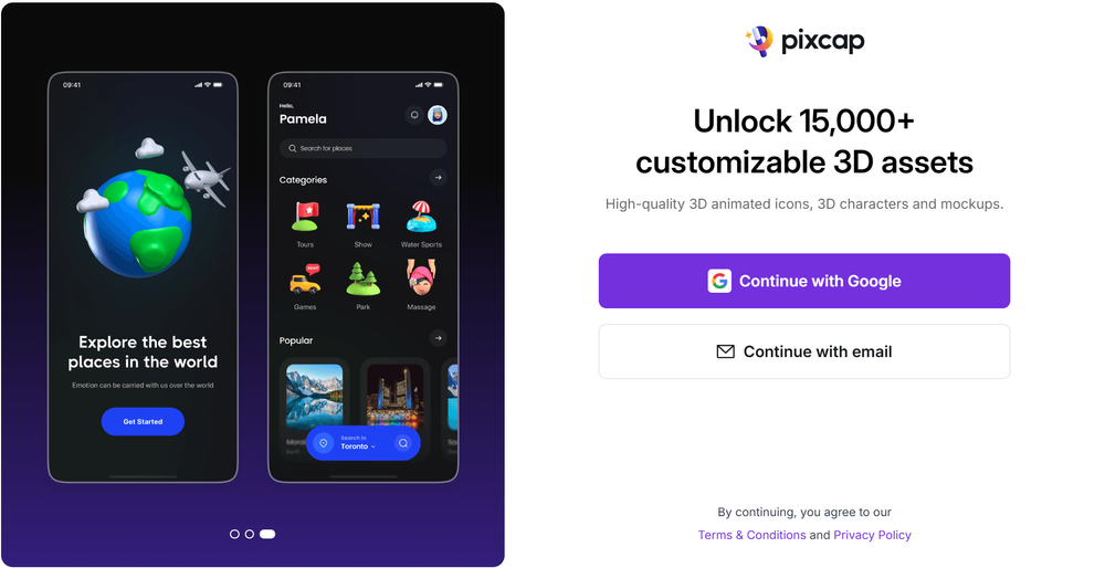
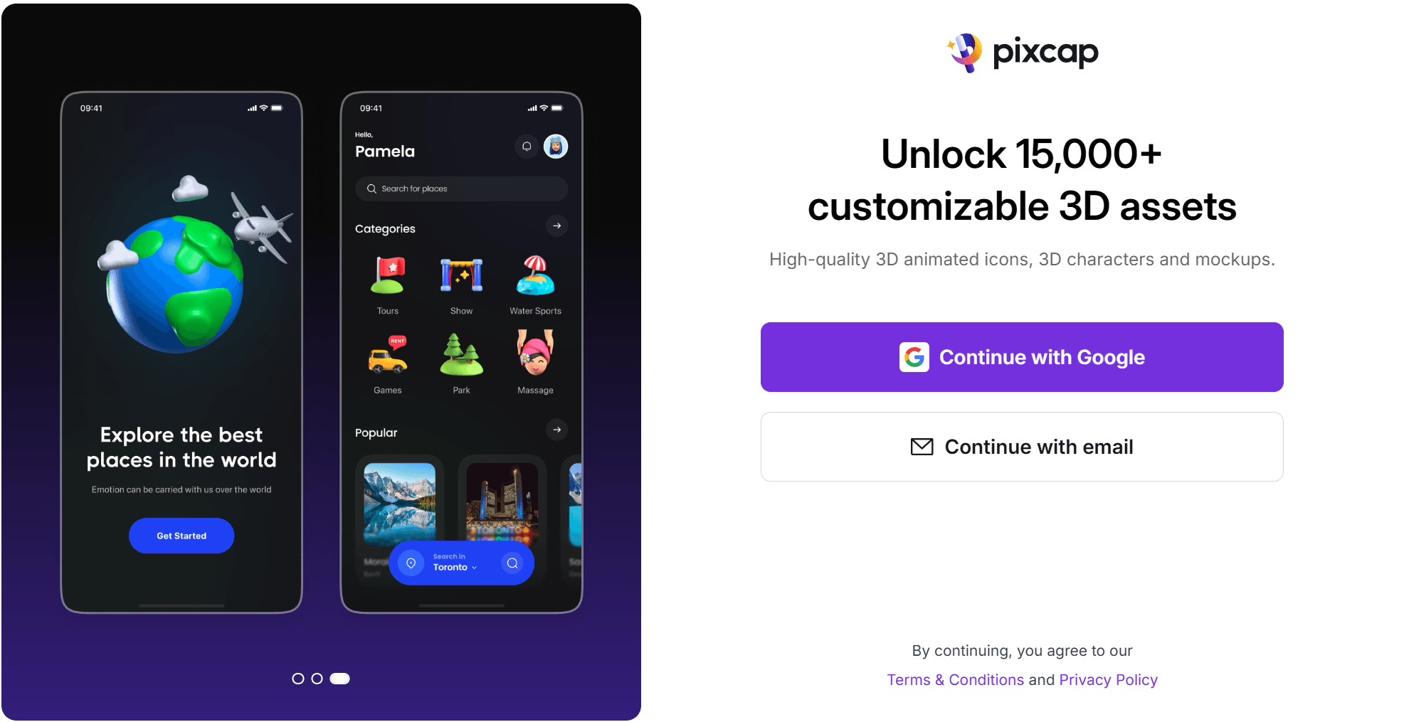
At first glance, users are presented with clear options to log in via Gmail or with an email and password. This dual pathway simplifies the login process, catering to different user preferences right from the start.
The inclusion of a headline and subheadline effectively communicates the value of signing up, highlighting the benefits users can expect. This not only helps in setting the right expectations but also adds a motivational element, encouraging potential users to join.
On the left side, the rotating slides showcasing 3D design assets in various use cases are a fantastic touch. This visual element not only enhances the overall aesthetics but also provides immediate context about what Pixcap offers.
Login Page UI of Terra
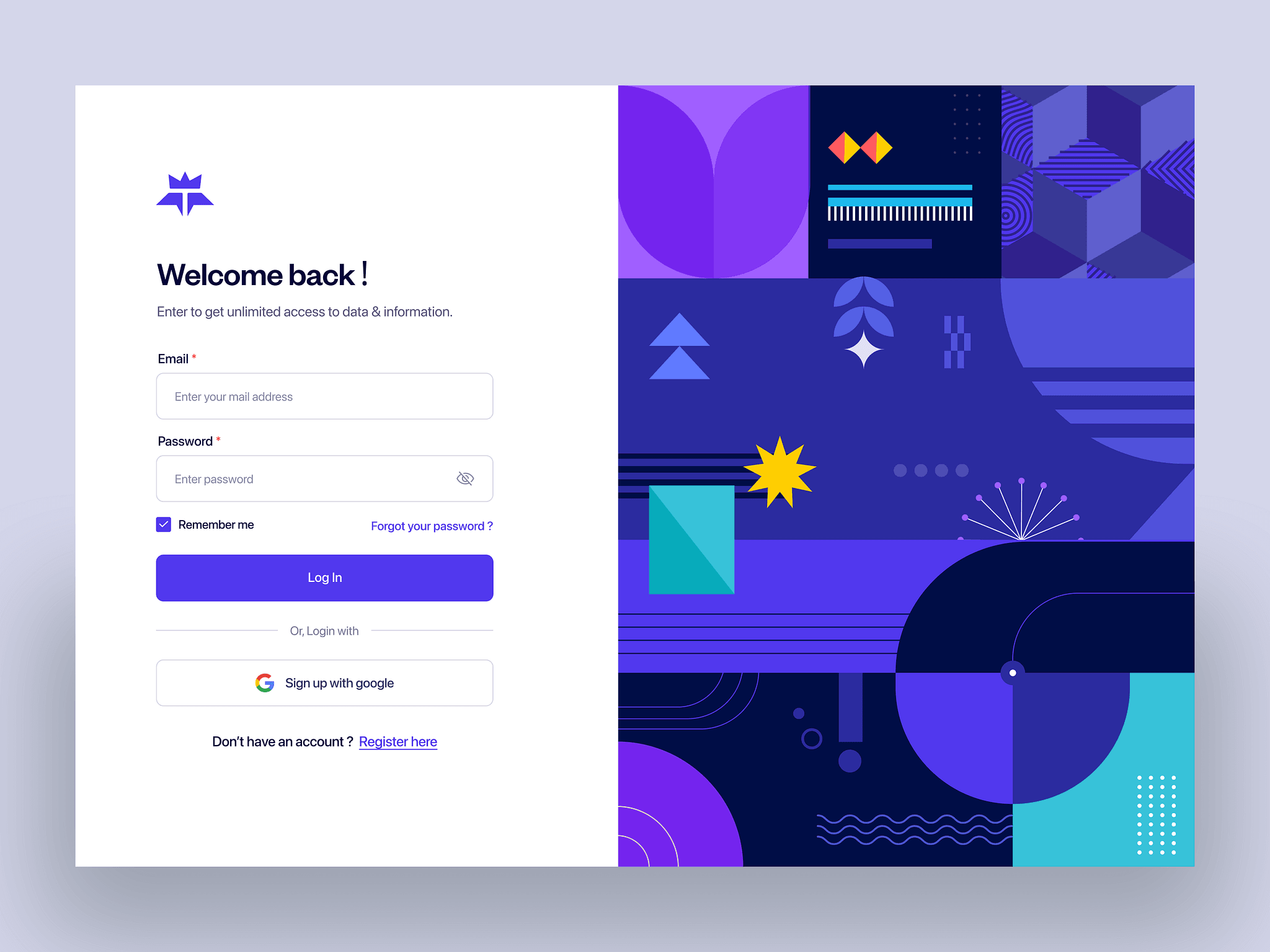
The Terra login page embraces a traditional layout that many users will find familiar and straightforward. Featuring all necessary input fields prominently, it ensures a seamless login experience. Users can easily enter their credentials without any distractions, which is a significant advantage for usability.
The option to log in with Google is a thoughtful addition, catering to those who prefer quicker access. Placing the “Sign Up” option at the end encourages new users to create an account without cluttering the main login process.
On the right side, the 2D illustration adds a nice visual touch, breaking up the text and making the page feel more inviting.
SaaS Website Login Page
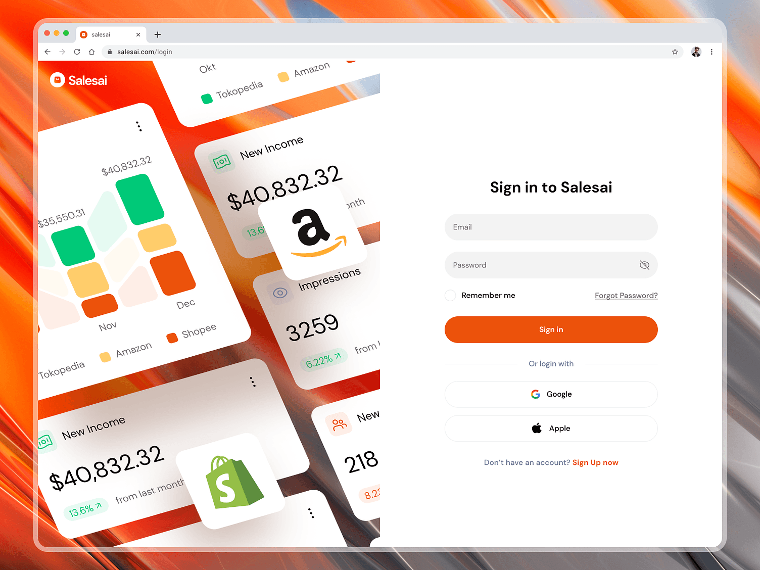
The login page for this SaaS website does a great job of being simple and user-friendly, similar to Terra but with some nice updates. It features clear input fields for email and password, making it easy for users to log in.
One great addition is the "Login with Apple" option. This choice is perfect for users who prefer to use their Apple ID for convenience and security.
On the left side, the display of the platform's dashboard is a nice touch. It gives users a sneak peek of what they can expect after logging in, highlighting the features they can look forward to.
Conclusion
Designing a login page is very important because it is often the first interaction users have with a website. A well-designed login page can make a great first impression and ensure a smooth user experience. It helps in building trust and encourages users to engage with the site.
It is important to follow best practices when creating a login page. This means making it simple and easy to use, ensuring it is secure, and keeping the design clear and straightforward. By implementing these best practices, you can create a more effective and user-friendly login process.
