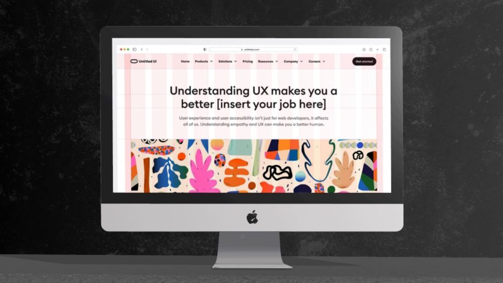
Minimalist graphic design is a trend that's really caught on worldwide. The saying of "less is more" certainly applies to this style. Although it's a newer design trend, emerging mainly in the late 1960s and early 1970s in American visual art, it's become quite popular.
In this article, we will explore what minimalist graphic design is all about and provide practical tips on how to create effective minimalist designs.
What Is Minimalist Graphic Design?
In essence, minimalism centers on the functionality of items, cutting out any unnecessary extras or decorations. Now that we understand what minimalism is, let's see how it can be applied to graphic design.
Minimalist graphic design puts the purpose first rather than how it looks. By applying the basic rules of graphic design, we create a design that is simple, balanced, and concentrates on what's vital. It's all about keeping things clutter-free, without any additional items that could steer your attention away from the main focus. This approach is often characterized by clean lines, negative space, and a limited color palette.
Minimalist graphic design is widely used in branding, packaging design, web design, and even fine art. It's an excellent way to convey a clear message without any distractions. By stripping away all the unnecessary elements, minimalist designs allow for a more direct and powerful communication between the creator and the viewer.
7 Key Principles of Minimalist Graphic Design
Minimalist graphic design sounds simple, but it requires careful consideration and planning. Here are seven key principles to keep in mind when designing with a minimalist approach:
1. Simplicity
This first point might seem like common sense given the minimalist approach, but it's essential to stress. The heart of minimalist graphic design is all about simplicity. This means we'll steer clear of overloading our design project with too many elements.
We'll limit ourselves to using one or two fonts at most, stick to a calm and limited color palette, and only include the information that's absolutely necessary. By taking this approach, we can create a clean and uncluttered design that is pleasing to the eye.

2. Negative Space
Negative space, also known as white space, is just as crucial as the elements within a minimalist design. It allows for balance, contrast, and breathing room in our designs. When used effectively, negative space can add depth and create a sense of elegance. Remember, just because there is space doesn't mean it needs to be filled.
3. Typography
In minimalist design, typography plays a significant role in delivering the message. By using simple, clean and modern fonts without any elaborate decorations or serifs, we can keep our designs uncluttered while still conveying our message effectively.
Choosing the right font size, weight, and spacing can make all the difference in creating a harmonious and visually appealing design. There are bad fonts such as Comic Sans, Papyrus, and Curlz MT that should be avoided in minimalist design.
4. Functionality
Minimalism is not just about aesthetics; it's also about functionality. When designing with a minimalist approach, we need to consider the purpose of our project and how it will be used by the audience.
For example, if designing a website, we must ensure that the navigation is easy to use and that the content is easily accessible. By focusing on functionality, we can create a design that not only looks good but also serves its purpose effectively.
5. Visual Hierarchy
In minimalist design, it is important to establish a clear visual hierarchy so that the most important elements stand out. This can be achieved through the use of contrasting colors, font sizes, and spacing.
By creating a clear visual hierarchy, we can guide the viewer's eye and draw their attention to the most essential aspects of our design.
6. Grids and Layouts
Grids and layouts are essential tools in minimalist design. By using a grid, we can create a sense of order and structure while maintaining simplicity. Grids also help with alignment and spacing, ensuring that our design is visually balanced and pleasing to the eye.
When it comes to layouts, less is more in minimalist design. By keeping the layout clean and simple, we can create a sense of openness and allow the content to shine.
7. Limited Color Palette
Many people think minimalism in graphic design means only using black and white colors. This isn't accurate. While you can use black and white, the most important rule regarding color in minimalistic design is to keep it simple.
Usually, this means choosing two main colors and sometimes one extra color for a bit of accent. You can play around with different color pairs in your minimalist designs, or even just stick to one color. Just remember to avoid gradients and keep the design flat.
Why Is Minimalist Graphic Design Important?
Web Design
Minimalism is a perfect fit for web design. With minimalist graphic design, websites can become more user-friendly and easy to navigate. By eliminating unnecessary elements and distractions, users are more likely to focus on the main content, ultimately improving their experience.
A minimalistic website is good for SEO as well. With fewer elements, load times are faster, improving the website's overall performance. Furthermore, minimalist web design is optimized for mobile devices, making it easier for users to access on-the-go.
Are you looking for minimal web design elements? Browse thousands of customizable 3D elements for web design, UX/UI, and marketing materials on Pixcap.
Branding
Minimalist graphic design is a popular choice among companies and businesses for branding purposes. The simplicity of minimalist designs makes them easily recognizable, memorable, and timeless. By focusing on the essential elements, minimalist branding sends a strong message to potential customers.
In addition, minimalist designs are more versatile compared to cluttered ones. They can be used across different platforms and media without losing their impact. This makes it easier for companies to maintain consistency in their branding efforts.
Packaging Design
The use of minimalist graphic design in packaging is becoming increasingly popular. With the rise of eco-friendly and sustainable products, more brands are adopting a minimalist approach to packaging design. By using simple yet striking designs, companies can convey their message of sustainability while also standing out on shelves.
Minimalist packaging also reduces waste as it uses fewer materials, making it a more environmentally friendly option.


Conclusion
Choosing minimalist graphic design can be advantageous for projects where clarity and simplicity are paramount. It's particularly well-suited for brands aiming for a modern, sleek, and elegant identity. Minimalist design can effectively reduce visual noise, making the brand message more prominent and easy to understand. By choosing this style, you'll be conveying a modern and sophisticated image that resonates with consumers while also being sustainable and efficient.


