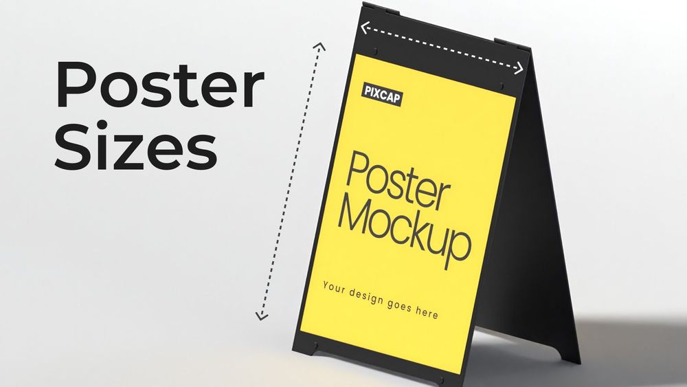
Posters are everywhere in our daily life, catching our eye on city streets, decorating our favorite coffee shops, or standing out at busy events. They're really good at getting messages across.
Graphic designers, event planners, and marketers all want to make posters that grab your attention and clearly share their messages. But, what many people don't think about is how important the size of the poster is. If it's too big or too small, it might not work as well.
In this easy guide, you'll learn about standard poster sizes and how to pick the best size for your own poster. Knowing about different standard paper sizes will help you make better design decisions and help your posters get noticed more.
What Are Standard Poster Sizes?
The most commonly used poster sizes are 18x24, 24x36, and 27x40 inches. However, the size can vary depending on your specific needs and preferences. We recommend considering both the display area and intended impact when choosing a size for your poster.
In the next section, we will dive into the details of each standard poster size and other preferred sizes for specific purposes.
Common Poster Sizes
To better understand how poster sizes can serve specific objectives, we will explore 14 different dimensions and the contexts in which each excels.
8.5" x 11" (Letter-sized posters)
Known as "flyer-sized" or "A4-sized," these are the smallest standard poster size and work well where there's not much room. You often see them on community boards, in art galleries, and on street posts. They're perfect for sharing news, giving out info, showing company rules, or sharing schedules. If you're making one, remember to not make your pictures or words too small to read or see. Keep your message simple with clear pictures and straightforward words.
Use cases:
- Events
- Announcements
- Information sharing
Design considerations:
- Keep design simple and clutter-free
- Use readable font sizes
- Highlight only important information
11" x 17" (Bulletin posters)
At a slightly larger size than the typical letter-sized poster, the 11" x 17" format is a popular choice for community bulletin boards, flyer distribution on street lights, lamp posts and other tight spaces. These posters are big enough to grab attention and convey messages effectively for indoor notices and event promotions. Ideal for placements in high-traffic indoor areas such as lounges, waiting areas, restrooms, concerts, trade shows or movie screenings.
Use cases:
- Flyer distribution
- Event promotion
- Indoor notices
Design considerations:
- Use eye-catching visuals
- Include relevant information in a concise manner
- Consider the placement location for visibility
Make every design pop! Use Pixcap's icons, illustrations, and characters to create stunning banners, flyers, and social media visuals. Click here!


12" x 18" (Mini-sized Posters)
If you want a poster that's slightly bigger than the bulletin size, but still compact enough to hang in tight spaces, then the 12" x 18" mini poster is for you. These mini posters are commonly used for marketing materials such as advertising new products or services, promoting special deals and offers, or showcasing limited-time events. They can also be used as decorative pieces for personal or office spaces.
Use cases:
- Product or service advertising
- Promotional offers and deals
- Limited-time events
Design considerations:
- Use attention-grabbing headlines
- Keep the design clean and uncluttered for easy reading and understanding
18" x 24" (Medium-sized Posters)
If you're looking for the sweet spot in poster sizes, the 18" x 24" medium poster is it. This regular-sized poster is a practical choice when you need a bit more space. You can easily see them at places like doctor's offices, clinics, schools, photo posters for parties, bands, sports teams, celebrities where a large photo is the main part of the design.
Use cases:
- Informational posters
- Personal wall art
- Event promotion with larger visuals
Design considerations:
- Use a mix of text and visuals to convey information
- Make sure the design elements are well-balanced for an appealing look
- Use high-quality images for best print results
19" x 27"
The 19" x 27" poster size is your go-to for regular-sized posters. With this size, you get plenty of room for big pictures and just enough text to get your message across. It's perfect for showing off sales in your shop window, or getting the word out about music gigs, festivals, and sports games. Also, it's a fantastic choice for putting together a product or service menu, letting your customers know at a glance what you offer. It balances visibility and detail perfectly, making it a solid option for various needs.
Use cases:
- Retail stores
- Event and concert posters
- Menu boards for restaurants or cafes
Design considerations:
- Incorporate relevant images or graphics related to the event, product, or service being promoted
- Limit the amount of text for a cleaner and more visually appealing design
- Use bright and bold colors to catch attention, but avoid overcrowding with too many different colors


20" x 30"
The 20" x 30" poster size is perfect for businesses looking to advertise products, office decor, or announce sales and events. It's big enough to catch the eye, whether placed outdoors or inside a retail store or office. This size also works well for informational posters, such as infographics or educational materials. With more space to work with on large format posters, you can incorporate detailed graphics and text while still ensuring readability.
Use cases:
- Indoor or outdoor advertising posters
- Office or store decoration
- Academic posters
Design considerations:
- Utilize the extra space to include more detailed information or graphics
- Choose a cohesive color scheme and font styles to maintain a professional look
- Consider adding QR codes for easy access to additional information or promotions


22" x 28"
This large format is versatile, perfect for a mix of photo images paired with text, advertising materials, and informational posters. The key to making the most of this size is to focus on a large, impactful central message or image. Surround this focal point with smaller details that deliver all the necessary information to your audience. Whether you're looking to promote an event, showcase a product, or simply decorate your space, this poster size is enough.
Use cases:
- Event posters
- Product advertisements
- Decorative posters
Design considerations:
- Use a high-resolution image or bold font for the main message to capture attention
- Keep the surrounding text minimal and to-the-point for easy readability
- Incorporate a call-to-action to encourage viewers to take action after seeing the poster


22" x 34"
This poster size is similar to the previous one, but with a slightly elongated shape. This makes it ideal for landscape-oriented images or designs. It's also a popular size for movie posters, music posters, and other promotional materials.
When designing for this size, make sure your main visual element is still the focal point and that any text or additional graphics complement it.
Use cases:
- Music or film posters
- Promotional materials
Design considerations:
- Use photos or graphics with a strong horizontal composition to make the most of the elongated shape
- Incorporate bold and eye-catching typography for the title or main message
- Consider using borders or frames to add structure and dimension to the design.
24" x 36" (Large Posters)
Favored for outdoor advertising, these posters are the go-to for making a splash in high-traffic areas due to their ability to accommodate large text, high-resolution images, and vibrant graphics. Want to catch eyes in the bustling city streets? Go for large poster dimensions.
Use cases:
- Outdoor advertisements
- Large event posters
Design considerations:
- Use high-quality images to ensure they don't appear blurry when blown up to this size
- Make use of white space to balance out large blocks of text or graphics
- Incorporate bold and contrasting colors to make the large poster stand out in a crowded environment.
27" x 40" (Movie Poster)
As the name suggests, this movie poster size is a popular choice for movie posters due to its large and dramatic size. It's also commonly used for advertising live events or shows, such as trade shows, concerts or theater productions. When designing for this size, it's important to carefully consider how all elements will work together to create a cohesive and attention-grabbing design.
Use cases:
- Movie posters
- Concert or event promotion
Design considerations:
- Keep the focus on the main visual element, such as the movie's title or a featured performer
- Don't overcrowd the poster; less is often more when it comes to this size
40" x 60" (Bus Poster)
This size is perfect for posters you see at bus stops or in subway stations. Because of its big size, it's important to make smart design choices so that people can see and understand the poster from both far away and close up. It's designed to grab your attention, whether you're quickly passing by or waiting nearby. Consider a billboard poster, 46”x67”, if this subway poster is not sufficient.
Use cases:
- Bus stop or subway station advertisements
- Large event promotions in high traffic areas
Design considerations:
- Incorporate bold and eye-catching visuals to stand out among other posters in busy areas
- Keep text concise and legible, as viewers may only have a few seconds to read it while passing by
The Impact of Poster Sizes
A seemingly simple change in dimensions can alter the mood of the design, emphasize different elements, and ultimately influence the way your audience receives the displayed content. Therefore, understanding which size best serves your purpose is the first step toward creating posters that resonate with viewers on a profound level.
Why Size Matters in Visibility
Consider a towering skyscraper adorned with a series of miniature posters. It’s not hard to imagine how such a disparity in scale would diminish the impact of the messages.
Size dictates visibility – and, by extension, the ability to capture attention. When competing for a viewer's gaze in a crowded environment, the right poster size is your strongest ally.
Legibility and Design Integrity
Practical concerns also come into play when discussing poster sizes. A poster that is too small might force text to become illegibly condensed, while a poster that is too large may leave overly broad spaces that are challenging to fill with cohesive design elements.
Selecting the appropriate size ensures that your text remains easily readable and your design maintains its intended proportions.
Emotional Response and Perception
Intuitively, we tend to associate large with impactful and small posters with intimate. By selecting a poster size that aligns with the emotional resonance you wish to convey, you can guide viewers towards the desired response.
A compact poster might create a sense of exclusivity, while a larger-than-life display signals grandeur and importance.
Choosing the Right Poster Size for Your Message
Selecting the right poster sizes is a confluence of factors including your message, audience, and the environment in which it will be displayed. Whether you aim to create a striking presence or foster a more intimate connection, your choice of dimensions will be pivotal to your poster's effectiveness.
Analyzing the Context of Display
Will your poster linger in a confined gallery space or catch attention in a bustling urban thoroughfare? Understanding the context of display helps determine the appropriate size to ensure your message is neither lost in the noise nor uncomfortably conspicuous.
Matching Size with Message
Cohesion between the size of your poster and the nature of your message is vital. Public service announcements may require a larger format for clear visibility, while boutique invitations for an art show may benefit from a smaller, more personal touch.
Aligning with Aesthetic and Venue Constraints
The aesthetic harmony of your poster within its display environment is important. Additionally, be aware of any physical constraints in the display area to avoid issues with space or readability.
Designing and Printing Posters for Maximum Effect
Once you've decided on the right poster sizes, it's time to focus on the design and poster printing process. This step is crucial in bringing your poster project to life.
Designing for Impact
Your poster should be designed with its intended impact in mind. Utilize bold colors, striking imagery, and a clear focal point to draw attention and communicate your message effectively.
Ensuring Quality in Print
Invest in high-quality poster printing to ensure your design translates well to the physical poster. Proper resolution, color fidelity, and paper stock are key elements in producing a professional result that enhances your message.
Post-Production Considerations
Lamination, mounting, and the insertion of grommets are post-production services that can add durability and versatility to your posters, enabling them to withstand various display and environmental conditions.
Conclusion
Posters can be powerful tools for communication, whether it's promoting an event, raising awareness for a cause, or delivering important information. By carefully considering factors such as size, design, and printing quality, you can create a visually appealing and impactful poster that effectively delivers your message to your intended audience.


