When spring arrives, it brings with it a palette of colors that can breathe life into branding and design projects. This season is about renewal and freshness, qualities that can be mirrored in your brand to attract attention and evoke positive emotions. Whether you're looking to revamp your logo, refresh your website, or spice up your marketing materials, incorporating spring colors can make your brand feel more vibrant and relevant.
Spring color palettes have the power to communicate a sense of joy, growth, and new beginnings. Choosing the right colors for your branding during this season can set you apart and help your message resonate with your audience.
What Are Spring Colors?
Spring colors are a collection of hues and shades that represent the natural beauty of the season. These colors often include pastel shades and vibrant tones inspired by blooming flowers, fresh greenery, sunny skies, and other elements associated with springtime.
Let's explore some of the top spring colors you can use:
1. Serenity Blue
As tranquil as the sky on a clear day, Serenity Blue exudes a sense of calm that's perfect for home and wellness brands aiming to promote relaxation and serenity. This hue can be used in clothing, and even as an accent color for a soothing effect.
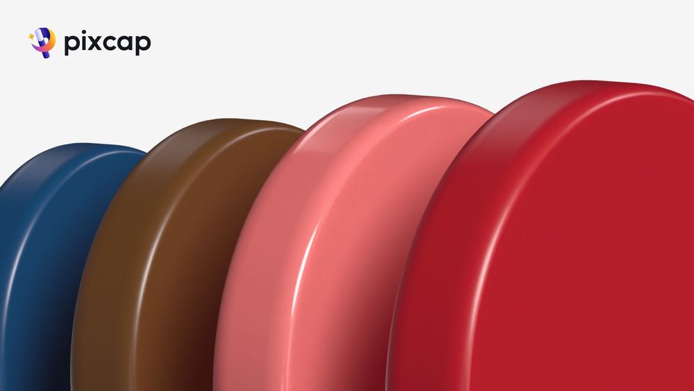
EDIT THIS PRODUCT BACKGROUND TEMPLATE

2. Rose Quartz
With its gentle, pinkish tone, Rose Quartz embodies compassion and warmth. It resonates with brands that aim to foster connections and a nurturing atmosphere. Consider using it in beauty products, as it's known to be a universally flattering color.
EDIT THIS PRODUCT BACKGROUND TEMPLATE

3. Yellow
A symbol of joy and optimism, Yellow is a standout hue for spring campaigns. It's an attention-grabbing color that encourages feelings of happiness and energy. Ideal for lifestyle and food brands, it can be used to highlight promotions or draw the eye to key products.
EDIT THIS PRODUCT BACKGROUND TEMPLATE

4. Mint Green
Fresh and invigorating, Mint Green is the epitome of spring's lively charm. This versatile hue represents growth and balance, making it a natural fit for wellness and sustainable brands. In design, it's an excellent color for creating a calming yet lively space.
5. Lavender
Lavender is a color often associated with refinement and femininity. It complements a variety of skin tones and is great for fashion and beauty branding. This gentle spring color also has hints of luxury, making it a choice for high-end designs and packaging.
6. Coral
Coral is a spirited and sociable color that symbolizes life and the outdoors. It's great for brands that cater to a younger audience and is also ideal for outdoor and adventure companies. This lively hue can be used to encourage action and enthusiasm from consumers.
7. Periwinkle
A harmonious blend of blue and purple, Periwinkle is a color that encourages creativity and inspiration. It's a great choice for brands looking to communicate sophistication and imagination, especially in the tech and education sectors. Periwinkle also carries a calming undertone, making it suitable for wellbeing products.
EDIT THIS PRODUCT BACKGROUND TEMPLATE

8. Peach
Peach is the personification of sweetness and simplicity. It's a soft and approachable color, ideal for baby products, stationery, and feminine fashion lines. Peach can convey feelings of innocence and can add a touch of lightness to any design.
9. Sky Blue
Light and airy, Sky Blue embodies freedom and tranquility. It's a versatile color that can be used in countless ways across various industries. Sky Blue works exceptionally well for healthcare and baby brands, and its calming nature can reduce the perceived waiting time in service-oriented businesses.
10. Canary Yellow
Brighter than Sunshine Yellow, Canary Yellow is a hue that can't be ignored. It's a fantastic color to inject energy and positivity into any design. Canary Yellow is often used in bold marketing statements and can draw attention to calls-to-action, promotions, and sales.
11. Eggshell
A classic and reliable choice, Eggshell is a neutral spring color that is both soft and sophisticated. It's a popular choice in interior design, offering a serene and unobtrusive background that works with nearly any accent color. In fashion, it's a staple for those who prefer a subtler approach to seasonal trends.
12. Tangerine
Vivid and warm, Tangerine is a color that demands attention and ignites the senses. Often associated with creativity and enthusiasm, Tangerine is a bold choice for brands looking to make a memorable statement. This color suits music festivals, culinary events, and any business that wants to be seen as a trendsetter.
EDIT THIS PRODUCT BACKGROUND TEMPLATE

13. Sage Green
A sibling to Mint Green, Sage Green is associated with nature, wisdom, and growth. A favorite among organic and sustainable brands, Sage Green is a versatile color that inspires trust and stability. Combining the tranquility of green with a hint of earthiness, it's also perfect for interior paints and textiles in modern businesses.
14. Salmon Pink
Salmon Pink is a warm, inviting hue that evokes the gentle warmth of the sun. It's a color of resilience and understanding, making it a great choice for brands focused on personal development and support services. When used in design, it can create spaces that feel both comforting and uplifting.
15. Celadon
A pale shade of green that is cool and misty, Celadon carries an air of elegance and mystery. It's a color that can be perceived as calming or even magical, making it a good choice for brands focused on the arts, metaphysics, and high-end products that cater to a sophisticated clientele.
Implementing Spring Colors in Branding and Design
Psychology of Color
Understanding the psychological impact of colors is crucial when integrating them into branding and design. Spring hues are often associated with renewal and vitality, which can positively influence consumer perceptions of your brand.
Use these shades strategically to convey the intended message and evoke the desired emotions in your audience.
Seasonal Marketing
Spring colors can breathe new life into your campaigns. Consider the timing of the season, upcoming holidays, and what resonates with your target demographic.
Remember to keep your brand's personality in mind—whether it's playful, sophisticated, or adventurous—and ensure the colors you choose align with your identity.
Consistency is Key
While it's important to stay current with seasonal color trends, it's equally vital to maintain a consistent brand image. This doesn't mean your palette has to remain static, but rather that any updates or seasonal changes should still uphold your brand's recognition.
Ensure all visual elements and messaging are in harmony with your brand's core colors to avoid diluting your image.
Tips for Spring-Inspired Design and Marketing
Mix and Match Smartly
Spring colors work beautifully together, but use them thoughtfully. Choose a primary color and then select complementary or analogous shades to support it.
This spring color palette approach creates a harmonious and engaging visual scheme that guides the viewer's eye through your design.
Contextual Application
Different spring colors may be suitable for various applications depending on context.
Soft pastels may work well for an Easter campaign or baby product line, while brighter hues could be ideal for an outdoor event or seasonal sale.
Tailoring your color usage to the context boosts the overall effectiveness of your design and marketing efforts.
Check the Trends
Before finalizing your design or launching a campaign, it's important to ensure your spring color choices are on-trend. This doesn't mean you have to follow the crowd, but being aware of popular color schemes can help you stay contemporary and relevant.
Engage with industry forecasts, monitor competitors, and pay attention to what's resonating with your audience to keep your palette fresh.
Conclusion
In branding and design, spring colors offer a perennial chance to innovate and connect with consumers in a colorful way. By understanding the significance of each color and the stories they tell, brands can craft compelling narratives that enhance their identity and market presence.
The palette of spring is rich with possibilities, and as seasons change, so do our methods of communication. There's never been a better time to experiment with the vibrancy of spring colors and invigorate your approach to design and marketing.


