Typography is more than just choosing fonts; it’s the art of guiding users through a seamless digital experience. In the realm of UI design, well-crafted UI typography style guides are crucial for creating consistent, readable, and visually appealing interfaces.
This article dives into the best practices for developing effective UI typography style guides and showcases real-world examples that illustrate these principles in action.
Whether you're a seasoned designer or just starting out, understanding and implementing these typographic strategies will help you enhance user experience, ensure brand coherence, and elevate the overall aesthetic of your digital projects.
What is a UI Typography Style Guide?
A UI style guide is a comprehensive document or toolkit that outlines the design standards and principles for a digital product’s user interface. It provides clear guidelines on how various design elements—such as typography, color palettes, iconography, spacing, and button styles—should be used to ensure consistency and cohesion across the entire user interface.
Think of it as a rulebook for designers and developers that ensures every part of the product looks and behaves in a predictable and harmonious way. By adhering to these guidelines, teams can create a unified and professional user experience, streamline the design process, and maintain brand identity across different platforms and devices.
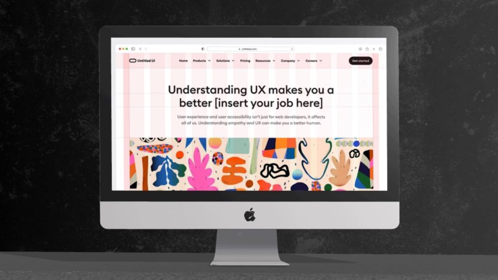
UI Typography Style Guide Examples
Many famous brands have meticulously crafted style guides to ensure consistency and recognition across all their platforms. Here are some examples of typography style guides from well-known brands, along with descriptions of their key elements:
Apple
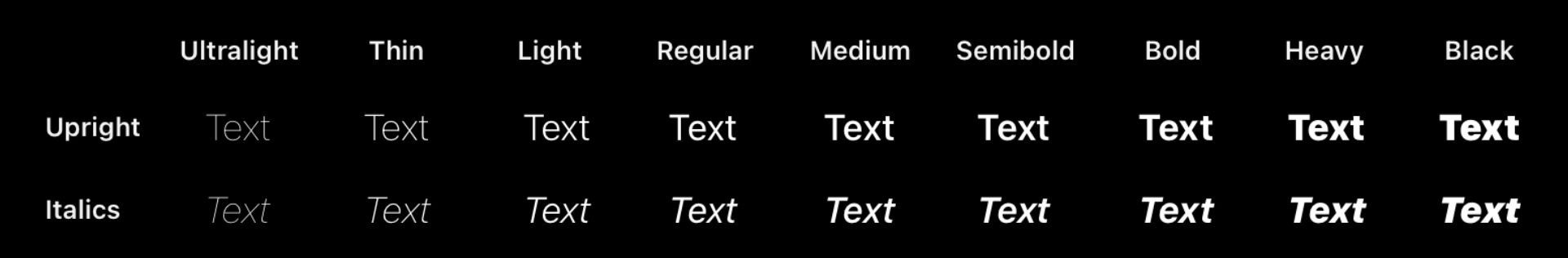
Apple's UI typographic style guide is defined by its use of the San Francisco typeface, which plays a central role in creating a seamless and intuitive user experience. The font is characterized by its clean lines and balanced proportions, which contribute to the sleek and modern aesthetic Apple is known for. Apple uses a hierarchical approach to typography, employing different weights and sizes to create a clear visual hierarchy.
For example, headlines might use a heavier weight to grab attention, while body text utilizes a lighter weight for readability. Apple also emphasizes ample white space and alignment to enhance the overall user experience, making sure that text is both easy to read and visually appealing.
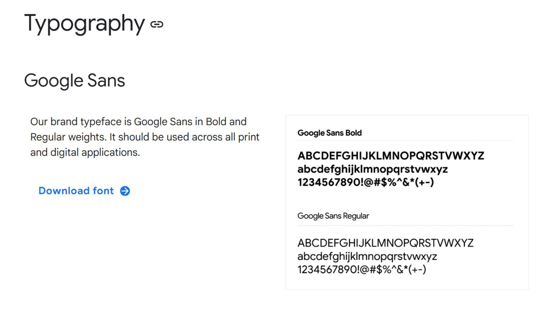
Google's UI typography style guide reflects its commitment to simplicity and accessibility. Google Sans is designed with a modern, clean aesthetic that complements the company's brand identity. The typeface’s geometric shapes and consistent stroke widths enhance readability and ensure a cohesive appearance across different devices and screen sizes.
Google’s style guide emphasizes the use of bold and regular weights to differentiate between headings, subheadings, and body text. The guide also advocates for generous line spacing and alignment to improve text legibility and user engagement. This focus on clarity and functionality is a hallmark of Google's design philosophy, aiming to provide a seamless experience for users around the world.
Microsoft
Microsoft’s typography style guide centers around the Segoe typeface, chosen for its readability and contemporary appearance. Segoe UI is used extensively in Microsoft’s user interfaces, providing a clean and modern look that enhances user experience. The typeface is designed to be highly legible even at smaller sizes, which is crucial for interfaces where clarity is paramount. The guide outlines specific usage rules for different typeface weights and sizes to maintain visual consistency and hierarchy
For instance, headings are typically set in bolder weights to capture attention, while body text uses lighter weights for readability. The guide also emphasizes the importance of spacing and alignment to ensure that text is not only functional but also aesthetically pleasing.
Adobe
Adobe's typography style guide showcases the Adobe Clean typeface family, which underscores the company’s focus on precision and sophistication. Adobe Clean’s design combines elements of both serif and sans-serif types to achieve a balanced and versatile typographic system. The serif variant is used for more traditional and formal communications, while the sans-serif variant lends a modern touch to digital content.
The style guide specifies the use of different typeface weights and sizes to create a clear hierarchy and enhance the overall readability of text. It also highlights the importance of maintaining consistent spacing and alignment to preserve the clean and professional look that Adobe is known for.
Netflix
Netflix’s typography style emphasizes clarity and ease of use, reflecting its commitment to a streamlined viewing experience. Netflix Sans was developed to be legible across various screen sizes and resolutions, enhancing readability in both mobile and desktop environments. The typeface features a geometric sans-serif design with subtle curves, creating a contemporary and approachable aesthetic. The style guide includes specifications for different weights and sizes to delineate headings, subheadings, and body text.
By utilizing consistent typographic hierarchy and spacing, Netflix ensures that content is visually engaging and easy to navigate, contributing to a user-friendly interface and cohesive brand identity.
Essential Elements of a UI Typography Style Guide
A UI typography style guide ensures consistency, readability, and a cohesive visual identity across your digital products. Here are the key elements to include:
- Font Families: Specify the primary and secondary typefaces. Include details on their usage—e.g., serif for headings, sans-serif for body text.
- Font Sizes: Define sizes for different text elements like headings, subheadings, body text, and captions. Provide guidelines for scaling and responsive adjustments.
- Font Weights and Styles: Detail the different weights (e.g., regular, bold) and styles (e.g., italic) to be used and their specific applications.
- Line Height and Letter Spacing: Set guidelines for line height (leading) and letter spacing (tracking) to ensure text is legible and aesthetically pleasing.
- Text Alignment and Justification: Describe how text should be aligned (left, center, right) and the use of justification for different types of content.
- Color and Contrast: Provide information on text colors, including primary and secondary options, and ensure adequate contrast for readability and accessibility.
- Hierarchy and Scale: Establish a clear visual hierarchy through font size, weight, and style variations to guide users’ attention and organize content effectively.
- Accessibility Considerations: Ensure your typography choices support accessibility standards, such as adequate contrast ratios and legible font sizes for users with visual impairments.
- Responsive Typography: Outline how typography should adapt across different screen sizes and devices to maintain readability and design integrity.
- Text Decoration and Emphasis: Specify the use of text decoration (underline, strikethrough) and emphasis (bold, italic) for various elements and contexts.
- Usage Examples: Provide visual examples showing how typography should be applied in different scenarios—headings, body text, quotes, buttons, etc.
- Technical Specifications: Include any technical details, such as font file formats (e.g., WOFF, TTF), web font embedding techniques, or licensing information.
Having these elements clearly defined in your typography style guide will help maintain a cohesive and user-friendly design across all your digital platforms.
Benefits of UI Style Guides
Adopting a user-friendly design for digital products can make people feel more confident and at ease when using them. When users find it easy and comfortable to interact with a product, they are more likely to engage with it. This increased engagement can lead to stronger brand loyalty, which in turn can boost the product's success.
Having a clear design style guide is beneficial for both designers and users. It ensures that the product is consistent and well-designed, making it easier for users to navigate. For designers, a style guide provides clear guidelines on what to include and what to avoid when creating the product's user interface. This helps ensure that the final product meets the needs and expectations of its users.
Creating a UI Style Guide for Your Brand
Here’s a concise breakdown of creating a UI typography style guide for your brand:
1. Define Your Brand’s Typographic Identity
Start by understanding your brand’s personality, values, and target audience. Typography should reflect and reinforce these elements. Research how competitors use typography to identify opportunities for differentiation and ensure your choices align with your brand's character.
2. Select Typefaces
Choose a primary typeface for most content that aligns with your brand’s personality and is versatile across different uses. Pair it with a complementary secondary typeface for variety and specific content types. Ensure these typefaces work well together and are suitable for both digital and print contexts if needed.
3. Establish Font Sizes, Weights, and Styles
Define specific font sizes for headings, subheadings, body text, and captions to create a clear visual hierarchy. Specify font weights (e.g., regular, bold) and styles (e.g., italic) for emphasis and different content uses. This helps maintain consistency and readability throughout your materials.
4. Set Line Height, Letter Spacing, and Text Alignment
Determine line height and letter spacing to ensure text readability and visual appeal. Provide guidelines for text alignment (left, center, right) and justification to maintain a clean and organized layout. This ensures your typography is both functional and aesthetically pleasing.
5. Define Color and Contrast
Specify text colors and ensure adequate contrast between text and background to enhance readability and accessibility. Include primary and secondary color choices that align with your brand's visual identity.
6. Provide Usage Examples and Guidelines
Offer visual examples showing how typography should be applied in different contexts—headings, body text, buttons, etc. Include do’s and don’ts to guide users in maintaining consistency and avoiding common mistakes.
Best Practices for UI Typography Style Guides
In addition to the above guidelines, here are some best practices to consider when creating a UI typography style guide:
- Use web-safe fonts for consistency across different devices and browsers.
- Limit the number of font families used to avoid overwhelming users.
- Consider the readability of your chosen font, particularly when used in smaller sizes.
- Test your chosen font on different backgrounds to ensure contrast and legibility.
- Keep the size of headings and body text consistent throughout your materials.
- Use hierarchy (e.g., heading sizes, font weights) to distinguish between different types of content.
- Use appropriate spacing between letters and lines to improve readability.
- Avoid using all caps for long blocks of text as it can be difficult to read.
- Consider using a mix of serif and sans-serif fonts for contrast and visual interest.
- Continuously review and update your style guide as needed to keep it relevant and reflective of your brand identity.
By following these best practices, you can create a comprehensive and effective UI typography style guide that will help maintain consistency and improve the overall user experience. Remember, good typography is not just about aesthetics; it also plays a crucial role in making your content easy to read, understand, and engage with. So take the time to carefully consider all aspects of typography when creating your style guide, and watch as it elevates the design of your digital products.