When designing a website, one of the most important elements to consider is the banner. This is usually the first thing that visitors see when they land on your site, making it crucial for creating a good first impression.
However, choosing the right website banner size can be challenging. Too big and it might overwhelm your page, too small and it could go unnoticed.
In this guide, we will discuss how to find the perfect website banner size for your specific needs.
What Is a Website Banner?
A website banner is a graphic or image that spans across the top of a webpage. Web banners usually contain important information such as the name of your business or website, tagline, and call-to-action.
Website banners come in various forms - from static images to animated graphics or even videos. They can also serve different purposes such as promoting products or services, showcasing special offers, or simply adding visual appeal to your site.
Common Website Banner Sizes
Leaderboard Banner (728×90px)
Leaderboards are horizontal banners typically placed at the top of a webpage, above the main content. This prime location ensures high visibility and often results in higher click-through rates compared to other banner ad sizes.
Due to their larger size, leaderboards can accommodate more text and visuals, making them suitable for promoting events, sales, and other time-sensitive offers. They also allow for creative flexibility, enabling advertisers to experiment with different layouts and messaging strategies. Overall, leaderboards are a popular choice among advertisers looking to make a bold statement and capture a large audience quickly.
Large Rectangle (336×280px)
Large rectangles are a popular option for advertisers who want more ad space. They perform well when placed within text content or at the end of a post. This positioning allows the ad to integrate naturally with the flow of the article, making it less intrusive and more likely to capture the reader’s interest.
Due to their size and visibility, large rectangles can effectively highlight promotional messages or special offers, encouraging users to engage and click through. They are suitable for a variety of advertising goals, from driving website traffic to increasing conversions. This makes them an excellent choice for display ad campaigns, ensuring high campaign performance and effectiveness.
Medium Rectangle (300×250px)
Medium rectangles are the most compact and best-performing banner unit. They are suitable for both desktop and mobile devices. Due to their manageable size, medium rectangles can be placed in various locations on a webpage, such as within article content, sidebars, or at the end of posts.
This flexibility allows advertisers to reach their target audience without disrupting the user experience. The balanced dimensions and prominent placement options make medium rectangles a versatile choice for diverse advertising campaigns, aiming to boost engagement and drive conversions effectively. Utilizing medium rectangles in Google Ads can further enhance reach and targeting options, providing access to a massive audience across various websites, mobile apps, and digital platforms.
Mobile Banner (300×50px)
Mobile ads, including mobile banners, are optimized for mobile devices. They are suitable for top or bottom placement on smartphone screens, ensuring they are seen without obstructing the main content. This strategic positioning helps maintain a seamless user experience while still capturing the viewer’s attention.
Mobile banners are particularly effective for promoting mobile apps, local services, and time-sensitive offers, leveraging their visibility and convenience to boost user engagement and conversions. Due to their compact size, mobile banners load quickly, contributing to improved website performance on mobile devices.
Wide skyscraper (160×600px)
Wide skyscrapers are usually displayed on the left side of a webpage. They are a good option for advertisers who want to create stunning visuals and impactful messaging. With a tall, vertical design, wide skyscrapers capture attention effortlessly as users scroll through content.
This ad size provides ample space to showcase intricate designs, bold headlines, and compelling calls to action, making it ideal for campaigns aiming to leave a lasting impression. Additionally, the prominent placement ensures a consistent presence throughout the user’s browsing session, enhancing brand visibility and recall. Another effective banner size is the Half Page (300 x 600 pixels), which attracts users' attention due to its larger space and can entice them to click on the banner ad.
Factors to Consider When Choosing Website Banners
Target Audience and Demographics
The first factor to consider when selecting website banners is the target audience. Understanding the demographics, interests, and online behavior of your potential customers can help determine which ad sizes and formats are most likely to resonate with them.
For example, if your target audience primarily uses mobile devices, investing in mobile banner ads would be a wise decision. Similarly, if you are targeting a younger demographic, incorporating eye-catching visuals and interactive elements may be more effective.
Placement of the Banner
Considering the banner placement on the webpage is crucial for maximizing its impact. Above-the-fold ad placements are the most desirable because they are visible without scrolling, immediately catching the user's attention. These prime positions can lead to higher click-through rates and greater visibility for your campaigns.
Below-the-fold placements, while less immediate, benefit from users’ intent to scroll and engage with content, and can still be effective if the design captures interest. Sidebar banners, positioned along the webpage's side, can be prominent and consistent, providing persistent visibility as users navigate the site.
When choosing banner sizes, consider the overall website layout and design. Ensure your banner ads fit seamlessly into the website’s design without disrupting the user experience. Banners that integrate smoothly with the site’s visual style can enhance the appeal of your ads and make them feel like a natural part of the browsing experience. This harmony can help maintain user engagement and make your advertisements more effective.
Budget and Advertising Goals
When planning your banner ad campaign, consider the cost-per-click (CPC) and cost-per-thousand impressions (CPM) models to manage your budget. These costs typically vary with banner sizes and materials. Larger or interactive banners often cost more. Balance your budget with your goals by choosing a banner size and format that align with your strategy while staying cost-effective.
Also important is evaluating conversion rates and return on investment (ROI). Conversion rates measure how well your ads turn viewer interactions into actions, like clicks or purchases. Analyzing these metrics helps you adjust banner sizes, designs, and placements to boost performance. Selecting a banner size that maximizes visibility and engagement can significantly enhance your ROI, making your ad spend more profitable.
Designing Effective Banner Ads
Aside from selecting the right size and budget, a well designed banner that follows several design principles can help captivate viewers and encourage them to take action. Here is a few tips:
Clean and Simple Design Principles
Keep the design visually simple and avoid overcrowding. A minimalist approach ensures the message stands out without overwhelming the viewer. Use whitespace to create a clean design and guide the viewer’s eye to the essential elements of the ad. Whitespace enhances readability and adds elegance to the overall design. By focusing on minimalism, your banner ads can deliver a clear message with fewer distractions.
Use contrasting colors to attract attention and highlight key elements. A strong contrast between the background and text improves visibility and readability. For example, pairing a dark background with light text, or vice versa, can make your ad stand out. Leveraging color theory can evoke the right emotions and reactions from your audience. Choose a harmonious color palette that aligns with your brand and message. By thoughtfully using color, your banner ads can become more engaging and effective without using colors that hurt the viewers' eyes.
High-quality Images and Graphics
Use high-quality images and graphics with high PPI (pixels per inch) or DPI (dots per inch) in your image ads. High-resolution visuals create a professional look, attracting viewers and conveying credibility. Ensure your images are sharp and clear, as pixelated graphics can detract from your message and negatively impact your brand.
Optimize images for web use to ensure fast loading times. Large, unoptimized images can slow down your site, leading to poor user experience and higher bounce rates. Compress your images without sacrificing quality to maintain visual appeal while improving load speed. Use appropriate file formats like JPEG or PNG, and consider modern formats like WebP for better compression. Balancing image quality and performance is crucial for creating effective banner ads that engage your audience.
Clear Call-to-Action and Messaging
A clear, concise call-to-action (CTA) is crucial for prompting viewers to act. Design a prominent CTA button that stands out by using contrasting colors, bold typography, and ample whitespace. The button text should be action-oriented, like "Buy Now," "Sign Up," or "Learn More," to guide users. A well-designed CTA can significantly boost conversion rates by providing a clear path.
Compelling headlines and copy are vital for quickly grabbing attention. Craft headlines that are bold, concise, and relevant. Use action verbs and emotional language to create urgency or solve a problem. Supporting copy should be clear and reinforce the headline. Avoid jargon and keep the language simple. Effective copywriting can engage viewers, convey your message, and persuade them to act.
Avoiding Website Banner Common Mistakes
Spelling or Grammar Mistakes
Proofread your copy or text on your banner thoroughly before going live. Avoid spelling or grammar mistakes that can hurt your brand identity. Even minor errors can distract your audience and undermine your professionalism. Take the time to review your text carefully or use tools like grammar checkers to ensure accuracy.
Consider having a colleague or team member review the content as well, as a fresh set of eyes can catch mistakes that you might have missed. Ensuring your text is error-free will maintain your credibility and enhance the overall impact of your banner.
Avoiding Contact Info and CTAs
Ensure that your banner includes essential contact information like your phone number and address. This information reassures viewers that your business is legitimate and accessible. Display your contact details prominently yet unobtrusively, so they do not overwhelm the primary message.
Additionally, link to your website or specific landing page to provide viewers with more information or allow them to take further action. Use a clear and concise CTA to encourage this action.
Remember, an effective CTA coupled with readily accessible contact information makes it easier for potential customers to reach out and engage with your business.
Adding Too Many Elements in One Banner
Avoid overcrowding your banner with too much text or information. A cluttered design can confuse and overwhelm viewers, making it difficult for them to absorb your message. Focus on a clean and simple design to ensure maximum impact.
Keep your text concise and to the point. Use bullet points or short sentences to convey key information quickly. Limit the number of images and graphics to avoid visual overload. Instead, use white space effectively to create a balanced layout that guides the viewers' eyes.
By maintaining a minimalist approach, you can highlight the most important aspects of your message and create a more memorable and effective banner. Remember, less is often more when it comes to design.
Avoiding Colors that Hurt Viewers’ Eyes
Use brand-specific colors to avoid hurting viewers’ eyes, and consider Google Adsense's recommended banner sizes for optimal ad placement. Incorporating brand colors reinforces recognition and ensures the design is appealing and readable. Avoid overly vibrant or neon hues that strain the eyes. Instead, choose colors that complement each other and provide enough contrast for readable text.
Choose a color palette that matches your brand’s personality while maintaining visual balance. Use background colors that do not overshadow or clash with text and images. For example, a soft pastel background with darker text can create harmony. Consider color theory principles to find combinations that offer optimal visibility and comfort.
By selecting brand-specific colors that are easy on the eyes, you create a pleasant viewing experience and make your message stand out.
Optimizing Website Banner for Mobile and Desktop
Responsive Design and Breakpoints
Ensure that your banner ads are responsive and optimized for mobile devices. To achieve this, employ responsive design techniques and breakpoints, which allow your banners to adapt seamlessly to various screen sizes. Breakpoints are specific screen widths where the layout adjusts to provide an optimal viewing experience.
By strategically setting breakpoints, you can ensure that your banner looks great on both desktops and mobile devices, offering a consistent and polished appearance across all platforms.
Mobile-Specific Design Considerations
Consider mobile-specific design considerations such as image optimization and loading times. Since mobile users often have slower internet connections and smaller screens, it's crucial to ensure that your banner ads are lightweight and load quickly. Use appropriately compressed images to maintain high quality while reducing file size.
Additionally, prioritize important content and make sure buttons and interactive elements are easily tappable. By optimizing your banner ads for mobile devices, you can provide a smooth and engaging experience for mobile users, increasing the likelihood of interaction and conversion.
Tools and Resources for Making Website Banners
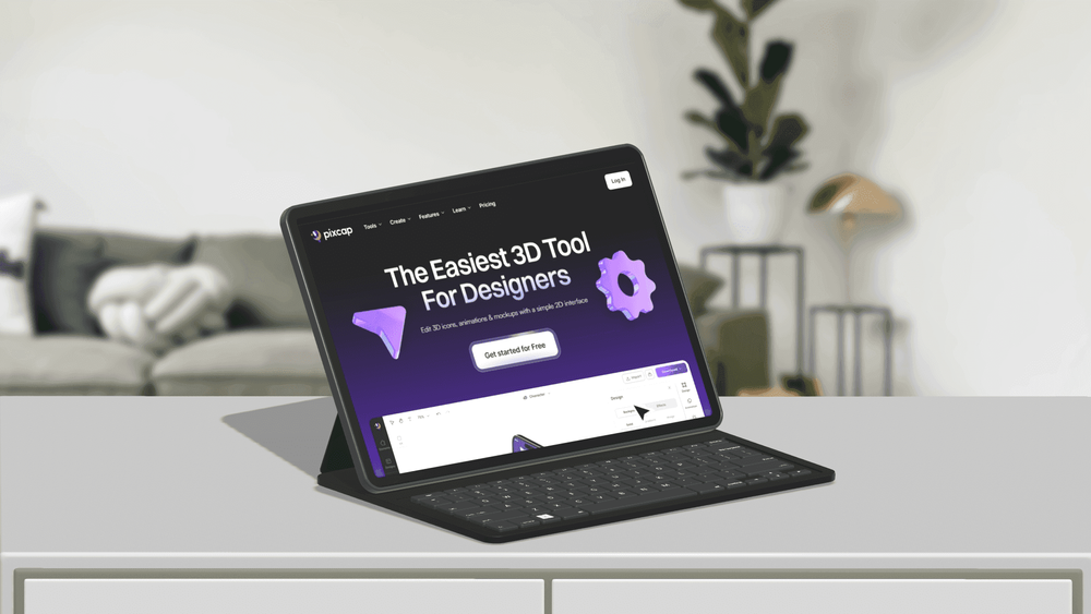
Use Pixcap's high-quality 3D creative assets for your website banners. Whether you need 3D icons, illustrations, or characters, Pixcap provides an intuitive platform that simplifies the design process.
Pixcap's quick resizing offers functionalities to resize and adjust your assets without losing quality. It not only saves time but also ensures that your banners retain their visual appeal, providing a cohesive experience for all users. Start designing now!


Conclusion
Effective website banners can significantly impact user engagement and conversion rates. By following best practices and utilizing tools, you can create beautiful website banners that help drive your business forward. So, start designing your website banners today and watch as they attract attention and bring in results for your website.


