Saturation
Saturation
Saturation
Saturation in the realm of graphic design refers to the intensity or purity of a color. It is a crucial element in the design process as it can greatly impact the overall look and feel of a design. Saturation is often used in conjunction with hue and brightness to create visually appealing compositions.
Saturation is measured on a scale from pure color to gray. A highly saturated color is vivid and intense, while a desaturated color is more muted and subdued. By adjusting the saturation of colors, designers can evoke different emotions and create various moods within their designs.
Understanding saturation is essential for creating balanced and harmonious designs. Too much saturation can overwhelm the viewer and make the design appear garish, while too little saturation can make the design appear dull and lifeless. Finding the right balance of saturation is key to creating visually pleasing designs that effectively communicate the intended message.
In addition to its aesthetic impact, saturation also plays a practical role in design. By manipulating saturation levels, designers can create hierarchy and emphasis within a design. For example, using highly saturated colors for focal points can draw the viewer's eye and create a focal point within the design.
Overall, saturation is a fundamental concept in graphic design that can greatly influence the success of a design. By understanding how to effectively use saturation, designers can create visually striking compositions that effectively communicate their intended message.
15,000+ customizable 3D design assets
for UI/UX, website, app design and more

quote post
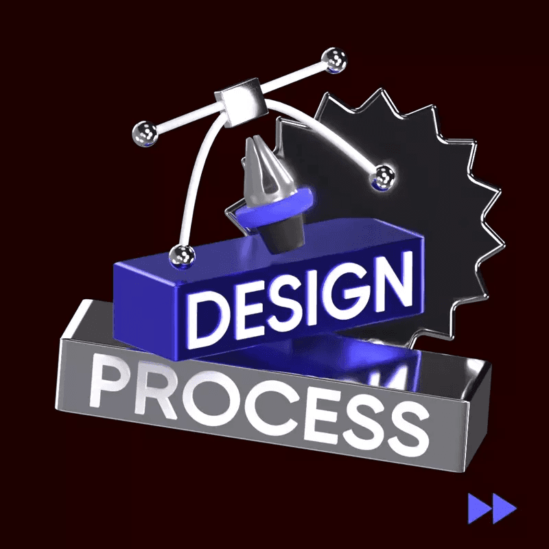
Information post
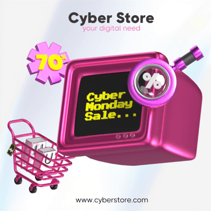
marketing post
Sign up for free
View All
A
B
C
D
E
F
G
H
I
J
K
L
M
N
O
P
Q
R
S
T
U
V
W
X
Y
Z
#
View All
A
B
C
D
E
F
G
H
I
J
K
L
M
N
O
P
Q
R
S
T
U
V
W
X
Y
Z
#
View All
A
B
C
D
E
F
G
H
I
J
K
L
M
N
O
P
Q
R
S
T
U
V
W
X
Y
Z
#
Tools
Create
Tools
Create