As a designer, it’s important to have a solid understanding of the basic UI elements. These common UI elements are the building blocks of any user interface and knowing how to use them effectively can greatly enhance your designs.
In this article, we’ll explore the must-know UI elements for designers and provide tips on how to use them in your projects.
What are UI Elements?
UI elements are components or building blocks used in software and website design to create the interface through which users interact with an application. These elements are important for all products because they help designers build better apps or website layouts.
User interface elements guide how users interact with a product. They show information clearly or make the interface look nice. By organizing these elements well, users can have a smoother and more enjoyable experience.
Importance of UI Elements in UI Design
UI design elements are crucial in UI design because they directly impact how users interact with an application or website. Here’s why they are so important:
- User Interaction: UI design elements are the primary way users interact with a system. Well-designed elements make it easier for users to perform tasks, find information, and navigate through the interface. Effective UI elements enhance usability by making interactions intuitive and straightforward.
- Accessibility: Proper use of UI elements can significantly impact accessibility. Elements like buttons, labels, and text fields need to be designed so that they are easily accessible to all users, including those with disabilities. For instance, ensuring that buttons are large enough to click and providing text alternatives for icons can improve accessibility.
- Consistency: Consistent use of UI elements helps users predict how the interface will behave and reduces the learning curve. Consistent design patterns and elements (like button styles and navigation structures) create a cohesive experience, making it easier for users to understand and use the application.
- Visual Hierarchy: UI elements help establish a visual hierarchy, guiding users’ attention to the most important parts of the interface. By varying the size, color, and placement of elements, designers can highlight key actions or information, making the interface more effective and user-friendly.
- Aesthetic Appeal: UI elements contribute to the overall look and feel of an application or website. Well-designed elements enhance the aesthetic appeal, which can make the user experience more enjoyable and engaging. Good design can also help build brand identity and trust.
- Feedback and Communication: UI elements provide feedback to users about their actions. For example, a button might change color when clicked, or a loading spinner might appear when a process is ongoing. This feedback helps users understand what’s happening in the system and whether their actions have been successful.
- Error Prevention and Recovery: Thoughtful design of UI elements can help prevent errors and make it easier for users to recover from mistakes. For instance, using form validation elements can prevent incorrect data entry, while clear error messages can guide users to correct their input.
- Efficiency and Productivity: Well-designed UI elements streamline tasks and workflows, making it easier for users to complete their objectives quickly. For example, intuitive navigation elements can help users find what they need faster, while shortcuts and contextual actions can improve productivity.
Common Types of UI Elements
A. Input Elements
Text Fields
Text fields are essential for users to input text into a system, designed for single-line or multi-line entries as needed. Commonly in forms or search fields, they help users provide information or find content. Effective text field design ensures a smooth and intuitive user experience, making information entry and submission easy for efficient interaction with an application or website.
Checkboxes
Checkboxes are simple tools that let people choose between two options by either checking or unchecking a box. You often see them in forms where you need to select preferences or make decisions. They're common in designing databases too, where organizing and filtering data is important. As a basic part of user interfaces, checkboxes help in gathering and entering information easily and efficiently.
Radio Buttons
Radio buttons are a type of user interface element that give people several choices but only let them pick one option at a time. They work similarly to checkboxes, but with a key difference: checkboxes allow multiple selections, while radio buttons do not. Because of their straightforward functionality, radio buttons are commonly used in forms and surveys for gathering information.
Toggles
Toggles are simple tools that let users show what they prefer in a setting. They provide a clear and visual way to switch a setting on or off. Because of this, toggles have become a popular choice in user interfaces for entering information. They make it easy for people to interact with technology by offering straightforward options and immediate feedback.
Buttons
Buttons are essential in handling user actions like submitting forms, sending messages, uploading files, and downloading content. They are a fundamental part of most applications' user interfaces. Using buttons effectively is crucial for ensuring a positive experience for users, making it easy for them to interact with the application.
B. Navigational UI Elements
Navigation Bars
Navigation bars are essential tools that help users find their way around a website or app. They guide users to the information they need, making browsing easier and more intuitive. Typically, you'll find navigation bars at the top of the screen, where they're easy to spot. These bars are a common feature in user interfaces and play a crucial role in helping users navigate smoothly.
Menus and Drop-down Menus
Menus and dropdown menus are tools that help users find their way around a website or application by presenting different options in an organized manner. They are especially useful because they save screen space, making the user experience more pleasant and efficient. By keeping the interface simple and tidy, these menus improve how users interact with the system. As a result, menus and dropdown menus have become popular elements in user interfaces for navigation purposes.
Sidebars
Sidebars are useful tools on websites or app pages. They typically appear on the left or right side of the screen and show a list of navigation options or actions. This setup helps users find their way around easily. Additionally, sidebars contribute to a clean and simple design, making them a popular choice for creating a neat look while keeping navigation straightforward.
Tab Bars
Tab bars are a handy tool in mobile apps that help users switch between different parts of an app quickly and easily. This feature is widely used in many mobile applications because it makes navigation simpler. By using tab bars, users can move back and forth between sections without any hassle, making their experience more enjoyable and efficient.
Breadcrumbs
Breadcrumbs are helpful tools on websites that show users a trail of links, so they can easily see where they are within the site. This feature is especially useful for finding information quickly and navigating smoothly from one page to another. As a popular part of website design, breadcrumbs make it simpler for users to explore and understand the website’s layout.
Search Bars/Fields
Search bars or fields help users find pages, sections, or content by letting them type in keywords or tags. They play a big role in user interface design because they make it easier for people to navigate websites or apps. These search tools are popular because they simplify the process of finding information quickly and efficiently.
C. Informational Elements
Labels
Labels are important tools that help give context and information to users. You often see them in forms and when designing databases. By clearly identifying what each field or section is about, labels help users know exactly what information they need to provide. As a basic part of user interfaces, labels play a key role in making information understandable and accessible.
Messages
Messages, including pop-up messages, are tools for sharing important information with users. They help communicate feedback, warnings, or errors in a clear way. As a common part of user interfaces, messages play a key role in keeping users informed and guiding them effectively.
Notifications
Notifications are a helpful tool to let you know when something changes, updates, or goes wrong in a task, project, or team. They often serve as reminders to check out what's new or important. As a common part of user interfaces, notifications make it easy for you to stay informed and aware of the latest information.
Loaders
Loaders are tools used on websites and apps to inform users that something is being processed in the background. When a user clicks a button or requests information, loaders show that the system is working on it. They help make the waiting time more pleasant by showing that progress is happening. As a popular part of user interfaces, loaders give people useful feedback and help keep them informed during the wait.
Modals
Modals are useful tools in user interfaces that help guide users by preventing them from moving forward until they address an issue. They often offer additional details or prompt users to close another window before proceeding. As a common element in UI design, modals assist in delivering important information clearly and effectively.
Message Boxes
Message boxes are a common part of user interfaces, designed to give users helpful information without stopping them from completing their tasks. They often appear to offer feedback, warnings, or alert users to errors. Because they are straightforward and easy to understand, message boxes are widely used to communicate important information to users.
D. Containers
Cards
Cards are a common tool in web design, used to organize and display different information on a page. They can hold elements like buttons, text, images, and more, making them versatile and useful. This helps users quickly find the information they are looking for. Because of these benefits, cards have become a popular choice for presenting content in a clear and effective way.
Carousels
Carousels are a popular way to display several images, cards, or pieces of content in a small area on a webpage. They help users browse through information quickly without taking up too much space. By using carousels, websites can offer a more enjoyable and smooth browsing experience for visitors, making it easier to view different pieces of content in an organized manner.
Accordions
Accordions are a useful design feature that helps organize a list of items vertically. They are especially great for displaying a lot of information in a small area, making everything look neat and tidy. Because of this, accordions have become a popular choice for user interfaces when there's a need to contain and manage content efficiently.
Forms
Forms are tools used to gather user details like shipping, account, and registration information. They play a crucial role in designing user interfaces, as they are commonly used to organize and present information in a clear and accessible way. By structuring data efficiently, forms help users interact with systems smoothly and effectively.
Scroll Boxes
Scroll boxes are helpful tools for creating content that users can scroll through, allowing them to see lots of images, cards, or information within a small space on a page. This feature is often used to make browsing more enjoyable and smooth. As a common user interface element, scroll boxes are great for organizing and displaying information efficiently.
Best Practices for Using UI Elements
When working with UI elements, it's essential to consider a few best practices to ensure they are used effectively and enhance the user experience.
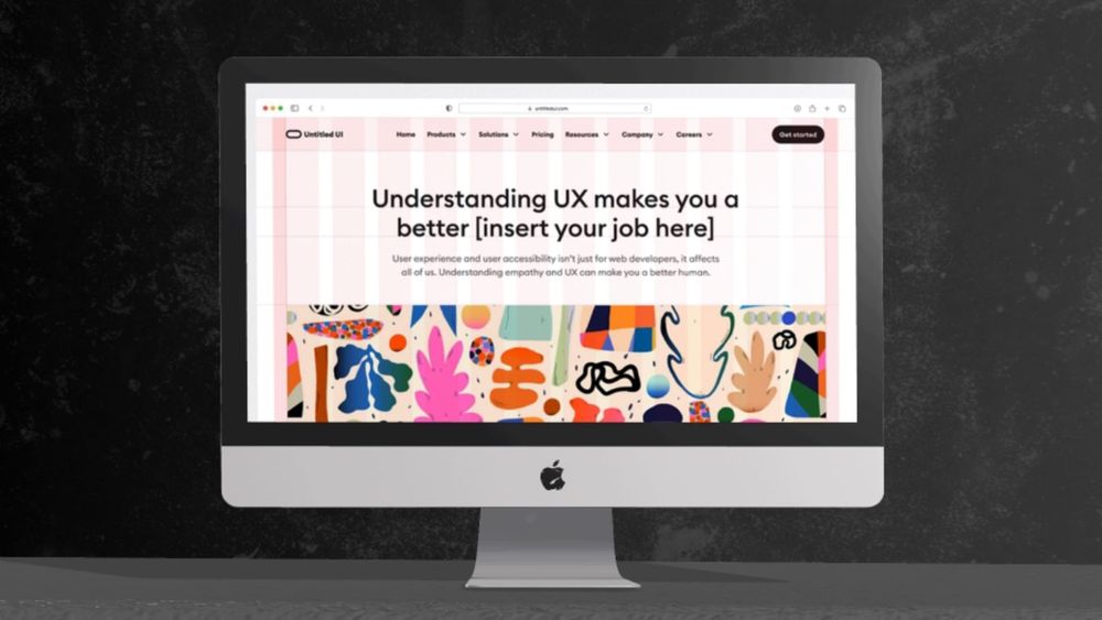
Consistent Visuals
Incorporate visually appealing design elements such as images, icons, and graphics to make the interface more engaging and easy to understand. These design elements can also help break up blocks of text and add visual interest to the design.
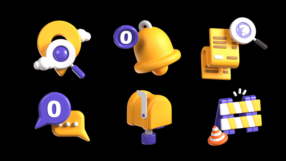
Pixcap offer various customizable UI element packs so you can easily incorporate visuals into your design. Each icon in a pack has been designed to maintain consistency in style, color, and size. This makes it easy to achieve a cohesive look and feel for your user interface.
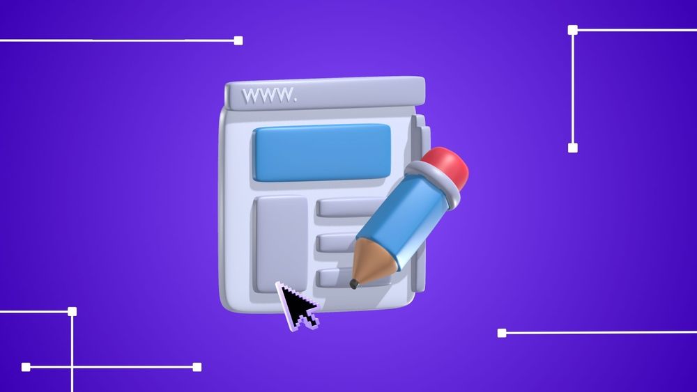
Microanimations
Microanimations are short, subtle animations that add delight to an interface. They can be as simple as a button changing color when hovered over or more complex like animated loading screens or transitions between pages.
Using microanimations can help guide users through the interface and provide feedback on their interactions.
Browse and download Pixcap's collection of customizable animated icons for your website and app.
Clear Navigation
Navigation is a crucial aspect of any user interface. It helps users find their way around an app or website easily, making it more user-friendly.
When designing navigation menus, consider the placement and hierarchy of elements. Keep the menu simple and easy to understand, with clear labels and visual cues.
Feedback Mechanisms
Providing feedback to enable users is essential in any user interface. It lets them know their actions have been acknowledged and helps prevent confusion or frustration.
Include visual cues such as loading animations and progress bars to indicate the system is processing a command. Error messages should also be clear and concise, informing the user of what went wrong and how to fix it.
Wrapping Up
And that's it! You now have a better understanding of the elements that make up a great user interface design.
Start incorporating these best practices into your designs today and create an exceptional user experience for your users! And if you're looking for high-quality 3D icons, illustrations and characters, don't forget to check out Pixcap's library.