Visual design in UI/UX is more than just making things look pretty—it’s about creating engaging and intuitive experiences for users. For designers, understanding how to balance aesthetics with functionality is key to crafting interfaces that not only attract attention but also guide users seamlessly through their digital design journeys.
In this article, we’ll explore the essentials of visual design, from color choices to typography and layout. Whether you’re just starting out or looking to refresh your approach, we’ll share insights and tips to help you create designs that are as enjoyable to use as they are to look at. Let’s dive in and discover how great visual design can transform user experiences!
What Is Visual Design in UI/UX?
Visual design plays a vital role in user experience by doing more than just making things look nice. It enhances how users interact with a product, making it easier to use, and it can also evoke emotions in users, helping to create a strong connection with a brand.
The term “visual design” covers a wide range of fields, including graphic design, UI design , and web design, and involves the work of a graphic designer. A web designer focuses on creating the layout and interactive elements of websites, ensuring they are both functional and visually appealing. This means it involves working with various visual elements to create designs that are both attractive and easy to navigate.
In visual design, the goal is to arrange these elements in a way that follows design principles, ensuring everything looks cohesive and user-friendly. This helps users have a better and more enjoyable experience when interacting with a product or service.
Elements of Visual Design
Visual design comprises several key elements that work in harmony to create engaging and effective user interfaces. Let’s explore each element in more detail:
Line and Shape
Line and shape are two of the most basic elements of visual design. A line is a stroke connecting two points and is the simplest element of design. Lines can possess various properties, such as thickness, curvature, and uniformity, and can convey different emotions by using different properties. A shape is a self-contained area formed by lines or differences in color, texture, or value. Shapes are crucial elements used for quick and effective communication, as we tend to identify objects by their basic shapes.
Color
Color is a powerful tool in visual design that can evoke emotions, convey meanings, and influence user behavior. Color can also be used to create visual cues that guide users through an interface, indicating clickable elements and enhancing overall usability. Different colors can represent different feelings; for example, blue often conveys trust, while red can signify urgency or excitement. Designers should consider color theory, including the color wheel, which helps in selecting complementary and analogous colors.
Additionally, understanding cultural implications of colors is crucial, as perceptions can vary widely across different regions. Effective use of color contrast ensures readability and accessibility, making content easy to digest.
Typography
Typography encompasses not only the choice of typefaces but also their arrangement and presentation. The right typography can enhance brand identity and improve user experience. Key considerations include font pairing, which involves selecting fonts that complement each other, and establishing a typographic hierarchy using varying sizes, weights, and styles to guide users through the content.
Legibility is paramount; sans-serif fonts are often preferred for digital interfaces due to their clarity. Additionally, line spacing and letter spacing can significantly affect readability, especially on smaller screens.
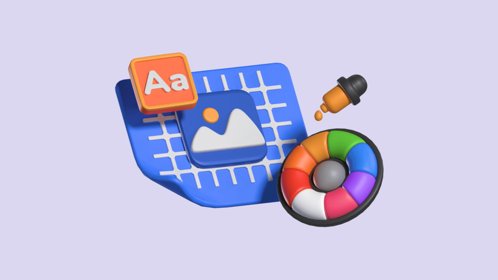
Imagery
Imagery includes photos, illustrations, icons, and graphics that enrich the user experience. High-quality visuals can quickly communicate ideas, break up text, and create emotional connections. When selecting images, consider their relevance to the content and the target audience.
Consistency in style—whether using realistic photography or flat illustrations—helps maintain a cohesive look. Furthermore, images should be optimized for fast loading times without sacrificing quality. Using alt text for accessibility ensures that all users can engage with the content, regardless of their abilities.
Layout
Layout refers to the spatial arrangement of elements within a design. A well-organized layout enhances usability by guiding users’ eyes in a logical flow. Grid systems are fundamental in creating balanced and harmonious designs, as they help in aligning elements consistently. Effective use of visual hierarchy within the layout emphasizes important information, allowing users to scan content efficiently. White space, or negative space, plays a critical role here; it prevents overcrowding, making the interface feel more open and inviting while improving focus on key elements.
Texture
Texture adds a tactile quality to visual design, creating depth and interest. It can be achieved through patterns, gradients, and even photographs that introduce a sense of realism. Texture can influence how users perceive a design—smooth textures may evoke a sense of modernity, while rough textures can suggest a more organic feel.
When used thoughtfully, texture enhances visual appeal without overwhelming the user; it should complement the overall aesthetic rather than detract from functionality.
Negative Space
Negative space, or white space, is often underestimated, but it’s essential in creating a clean and organized interface. Effective use of space helps separate distinct elements, making content more digestible and navigation more intuitive. Whitespace reduces cognitive load, allowing users to focus on what matters most.
A balance of positive space (elements) and negative space (empty areas) creates an elegant design that feels intentional. Remember, too much clutter can lead to confusion, while ample whitespace can enhance user comfort and satisfaction.
Hierarchy
Visual hierarchy organizes content in a way that highlights its importance. This can be achieved through size, color, contrast, and placement of elements. For instance, larger headlines immediately draw attention, while contrasting colors can emphasize calls to action.
Establishing a clear hierarchy helps users understand what to focus on first, guiding them through the interface effectively. This principle is particularly important in responsive design, where elements may rearrange based on screen size; maintaining a strong hierarchy ensures clarity across devices.
Consistency
Consistency in visual design fosters familiarity and trust among users. It involves using the same colors, fonts, and styles throughout the interface to create a unified experience. This consistency helps users form expectations, making navigation more intuitive.
Designing a style guide can be beneficial, outlining rules for how elements should be applied across the design. This approach not only streamlines the design process but also enhances usability, allowing users to feel comfortable and confident while interacting with the interface.
Visual Design Principles
Understanding the principles of visual design is crucial for creating effective and engaging user interfaces. These principles guide designers in making decisions that enhance usability and aesthetic appeal. Here are some key visual design principles to consider:
Unity
Unity refers to the harmonious arrangement of elements within a design, ensuring that all components work together as a cohesive whole. Achieving unity involves consistent use of colors, fonts, shapes, and styles throughout the interface. This sense of harmony helps users navigate more intuitively, as they can easily recognize related elements.
By fostering unity, designers create a seamless experience that feels organized and professional, allowing users to focus on content without distractions.
Gestalt
The Gestalt principle emphasizes our tendency to perceive the entire composition rather than its individual parts. This psychological theory suggests that people instinctively group elements based on proximity, similarity, continuity, and closure. For designers, leveraging Gestalt principles means arranging elements in a way that enhances comprehension and fosters connection.
For example, closely grouped elements may be perceived as a single unit, helping users quickly understand relationships between different pieces of information. By applying Gestalt principles, designers can create interfaces that are more intuitive and easier to navigate.
Hierarchy
Hierarchy establishes the importance of elements within a design, guiding users through content in a structured manner. This can be achieved through variations in size, color, font weight, and placement.
For instance, larger headlines indicate key information, while smaller text denotes secondary details. A clear hierarchy helps users prioritize their attention, ensuring they absorb the most critical information first. By effectively utilizing hierarchy, designers can improve the usability of their interfaces, making it easier for users to navigate and understand content.
Balance
Balance pertains to the distribution of visual elements within a design, contributing to its overall stability and harmony. It can be achieved through symmetrical arrangements, where elements are mirrored on either side of a central axis, or asymmetrical arrangements, where balance is created using contrasting elements of different sizes and weights.
A well-balanced design feels stable and comfortable, allowing users to engage with content without feeling overwhelmed. By considering balance, designers can create visually appealing layouts that guide users effortlessly through the interface.
Contrast
Contrast is a powerful principle used to make specific elements stand out by manipulating differences in color, value, size, and other factors. Effective use of contrast enhances readability and accessibility, helping users easily distinguish important information.
For example, a bright button on a muted background draws attention, making it clear where users should click. Contrast can also be used to create visual interest and depth, adding layers to the design. By incorporating contrast thoughtfully, designers can ensure that key elements are highlighted and easily recognizable.
Scale
Scale describes the relative sizes of elements within a design, influencing perception and focus. Adjusting scale can convey importance; larger elements typically attract more attention, while smaller elements may suggest lesser significance.
This principle can also be used to create visual relationships between items, guiding users in understanding how different components relate to one another. By thoughtfully manipulating scale, designers can enhance clarity and create a more engaging visual narrative.
Dominance
Dominance creates a focal point within a design, directing users’ attention to a single element. This can be achieved through variations in size, color, or contrast, making one element stand out amidst the rest.
Establishing dominance is crucial for highlighting key actions, such as calls to action or important messages, ensuring that users know where to direct their attention. By effectively employing dominance, designers can create a more compelling and user-friendly experience, guiding users toward desired interactions.
The Role of Visual Design in UI/UX
Visual design is a vital component of UI/UX, serving as the interface's aesthetic backbone while enhancing usability. It encompasses elements like color, typography, imagery, and layout to create a cohesive experience that guides users intuitively. Effective visual design communicates information clearly, using hierarchy and contrast to highlight key elements, which minimizes user frustration and improves navigation.
Additionally, a consistent visual style builds trust and credibility, making users more likely to engage with a product. The emotional impact of design cannot be overlooked; colors and visuals can evoke feelings that enhance user connection and satisfaction. In today's multi-device landscape, responsive visual design ensures that interfaces maintain their effectiveness across various platforms. Ultimately, strong visual design not only beautifies but also enriches user interactions, making it essential for creating meaningful and enjoyable digital experiences.
Collaboration with UX Design
Visual design and UX design are closely related fields that work together to create a cohesive and effective user experience. UX designers focus on the functional experience of a product, while visual designers focus on the visual aesthetic. By working together, UX and visual designers can create a product that is both functional and visually appealing. Visual designers can use their skills to enhance the user experience by creating intuitive and user-friendly interfaces, while UX designers can provide valuable insights into user behavior and needs.
Visual Designer Skills
To do their job well, visual designers need to have strong skills in visual messaging and communication. They use popular software tools like Adobe and Sketch to bring their ideas to life. It’s important for them to understand key design principles, such as visual hierarchy and design systems, which help organize and present information clearly.
Successful visual designers are able to work both on their own and as part of a team. They need to be excellent communicators and have strong problem-solving abilities, which allow them to handle challenges and find creative solutions.
Visual Designer Vs. UI Designer
A visual designer and a UI designer share some overlapping skills but have distinct roles. While visual designers focus on aesthetics, graphic designers often work on both digital and print media, creating visual content that communicates a message effectively.
- Visual Designer: This role focuses on the aesthetics of a product, including color, typography, imagery, and overall visual style. Visual designers aim to create an engaging and cohesive look that enhances the user experience and aligns with brand identity. Their work often encompasses both digital and print media.
- UI Designer: A UI designer specifically concentrates on the layout and interactive elements of a digital product. They design how users interact with an interface, ensuring functionality and usability while maintaining visual appeal. UI designers focus on elements like buttons, menus, and input fields, often working closely with UX designers to enhance the overall user journey.
While both roles prioritize aesthetics, visual designers may have a broader scope, while UI designers have a more focused responsibility within digital interfaces.
Conclusion
Visual design is an important part of UX as it helps make products easier to use, evokes emotions, and boosts how people view a brand. Visual designers are vital in crafting interfaces that are both user-friendly and visually appealing.
By learning about the basics of visual design, like its elements and principles, designers can create designs that are both cohesive and easy to use, fitting well with the overall UX goals. Additionally, visual designers must consider design systems and ensure accessibility. Testing and making improvements are also key steps in the design process to ensure effectiveness.